
Simbol dari lingkaran
Simbol logo vektor datar yang seluruhnya tersusun dari lingkaran: satu lingkaran besar, dua setengah lingkaran berjari-jari sama yang bertemu di titik tengahnya, dan satu titik kecil padat. Titik itu bergeser ke kanan atas. Ketiganya membentuk figur abstrak yang terbaca sebagai matahari terbit di atas air. Tebal garis seragam di bagian yang memakai garis, dan semua sudutnya bersinggungan sempurna. Satu warna tinta hijau teal tua di atas latar putih gading hangat, tanpa gradasi, bayangan, atau garis tepi. Posisinya di tengah dengan margin lega dan rata di semua sisi, tepi tajam, 1:1 persegi.
Edit prompt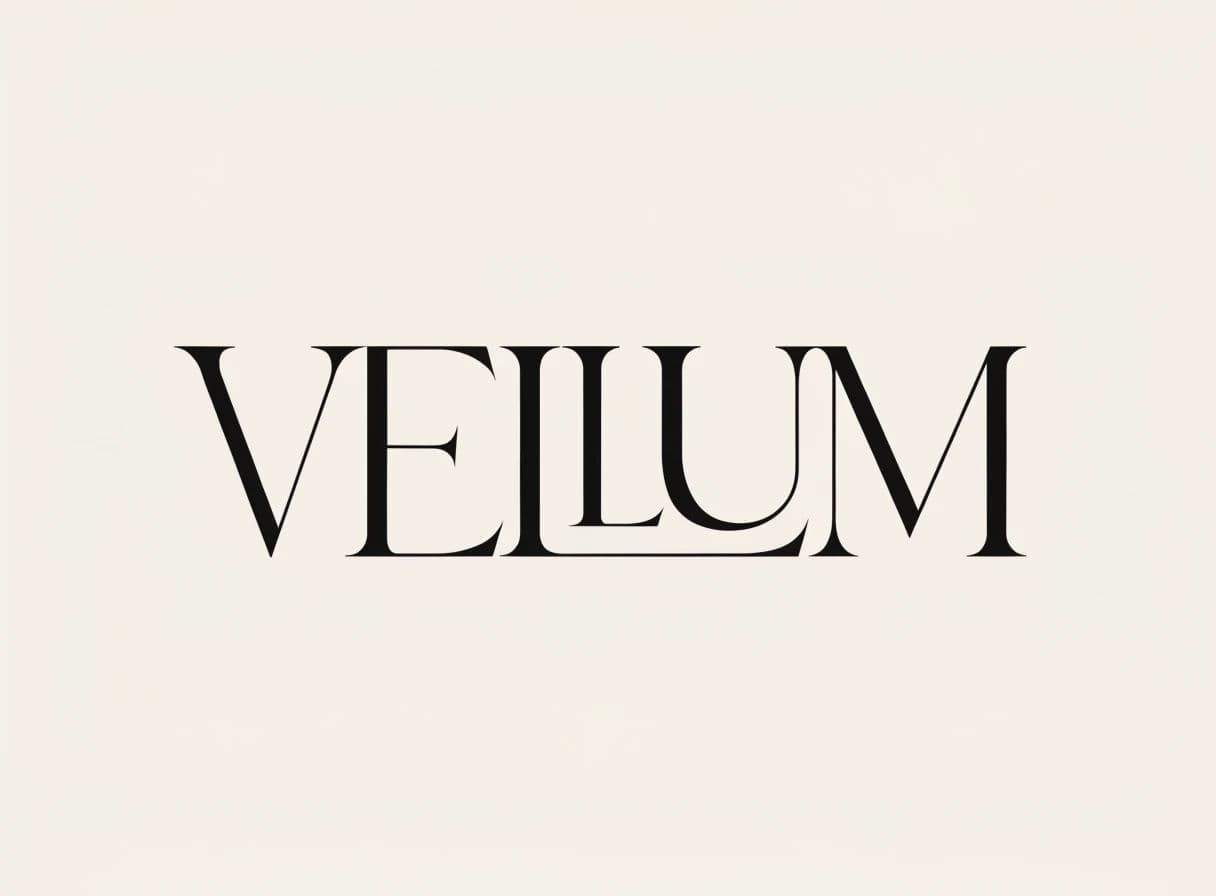
VELLUM dengan ligatur khusus
Wordmark vektor datar bertuliskan VELLUM dalam serif kontras tinggi dengan garis rambut halus dan kaki serif tajam berpenyangga. Hurufnya kapital dengan jarak antarhuruf lega. Hanya ada satu detail khusus: dua huruf L dihubungkan oleh palang bersama di garis dasar, sehingga keduanya terbaca sebagai satu ligatur. Semua bagian lain digambar secara konvensional. Satu warna hitam hangat yang padat di atas latar putih tulang, tanpa efek. Kata ditempatkan di tengah dengan ruang kosong lebar di atas dan di bawah, dan setiap garis rambut tampil tajam, 4:3.
Edit prompt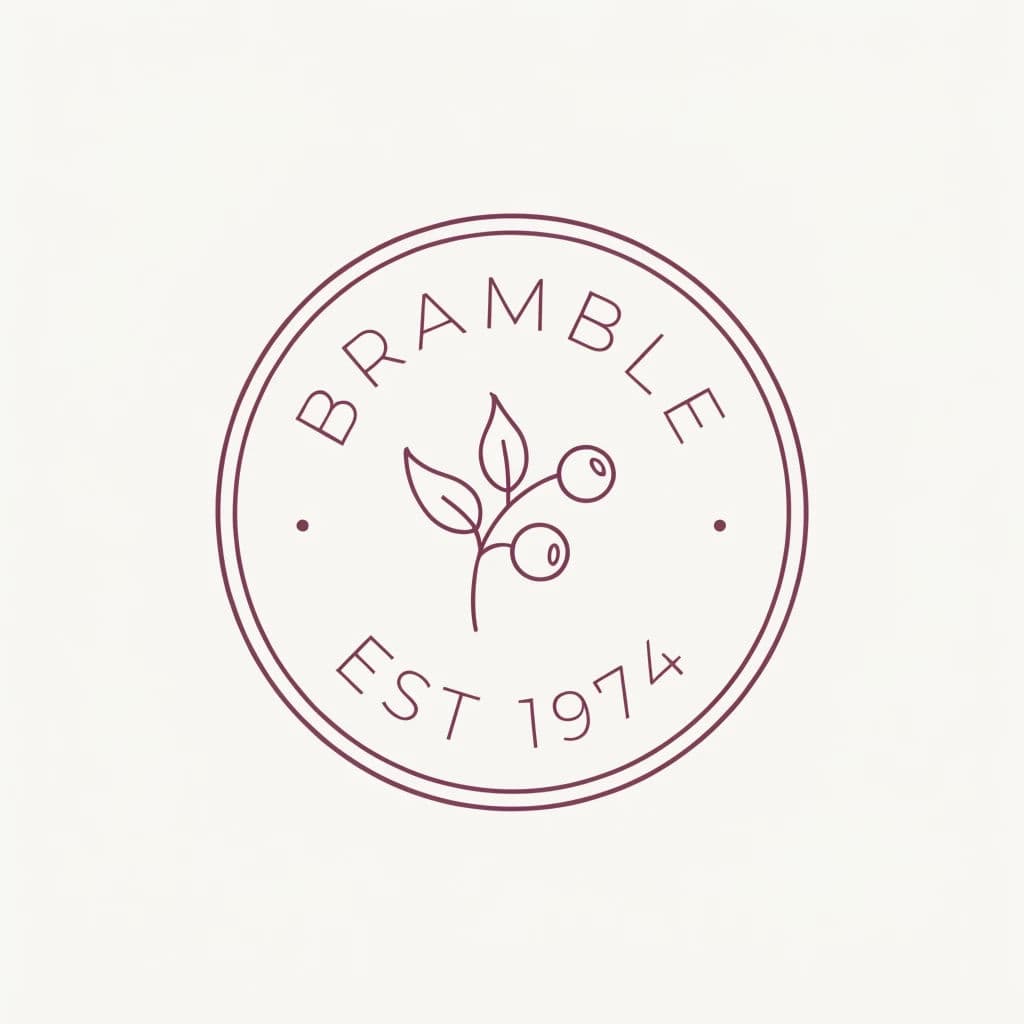
Dua kata pada cincin ganda
Emblem bulat vektor datar dengan tepi cincin ganda. Kata BRAMBLE melengkung di bagian atas cincin dan terbaca dari kiri ke kanan. Kata EST 1974 melengkung di bagian bawah dengan arah baca yang sama. Keduanya memakai huruf kapital kecil berjarak lega, dengan titik kecil sebagai pemisah di tiap sisi. Di tengahnya ada gambar garis sederhana setangkai ranting semak berduri dengan tiga daun dan dua buah beri. Satu tinta ungu plum pekat di atas krem, tebal garis seragam, cincin konsentris sempurna, 1:1 persegi.
Edit prompt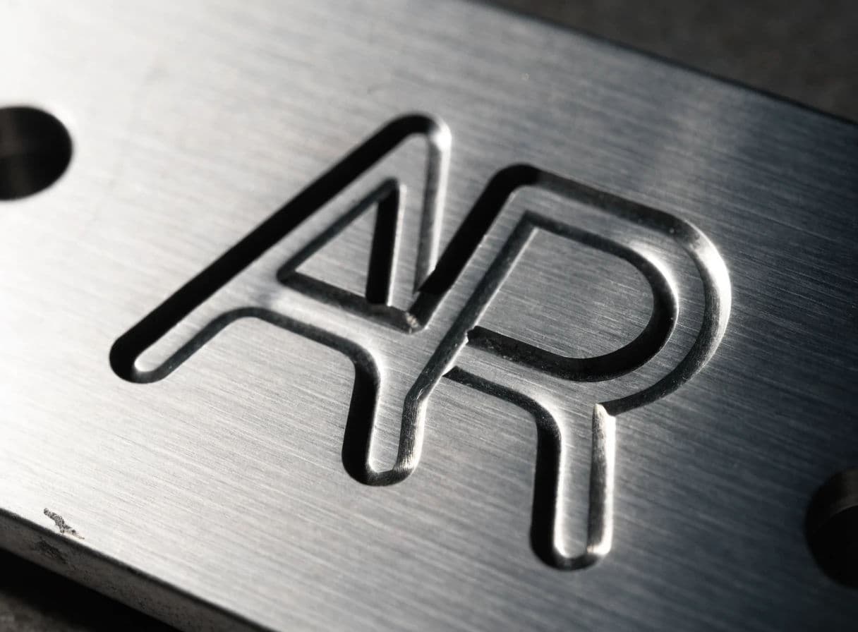
Terukir pada baja sikat
Foto makro logo yang diukir pada pelat baja tahan karat sikat. Ukirannya sedalam sekitar setengah milimeter dengan profil V yang bersih. Bayangan keras jatuh di dalam setiap goresan pada satu sisi, dan sorot terang muncul di sisi lain. Tandanya monogram A dan R yang saling mengait dengan tebal garis seragam. Serat sikat memanjang horizontal di sepanjang pelat, ada satu goresan kecil di dekat sudut, dan dua lubang sekrup benam. Cahaya rendah menyamping dari kanan, palet abu dingin, 4:3.
Edit prompt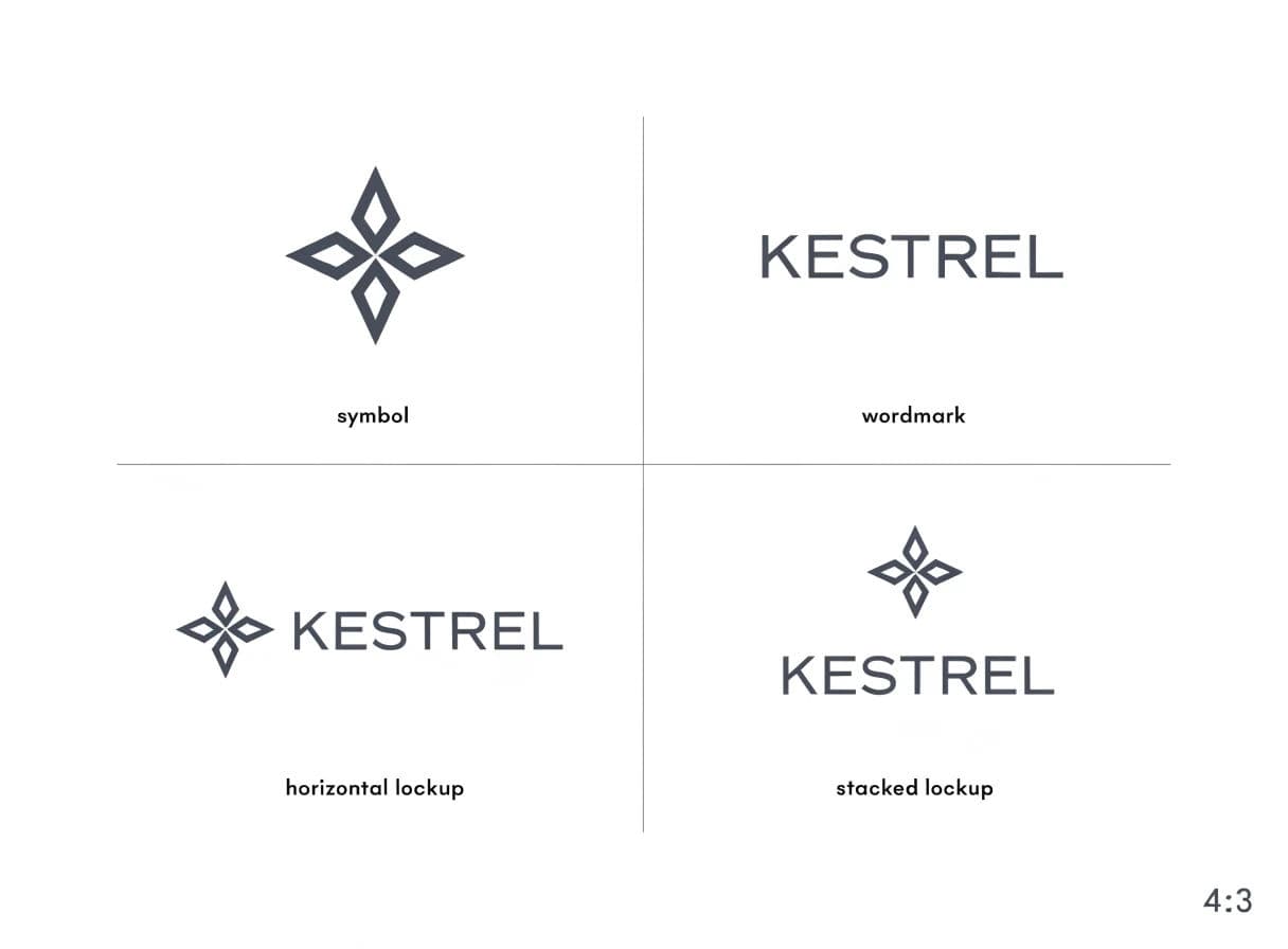
Satu identitas, empat lockup
Lembar brand vektor datar yang ditata sebagai grid empat sel di atas latar putih hangat, dengan garis rambut tipis di antara sel. Kiri atas, simbol saja: kompas mawar abstrak yang tersusun dari empat bentuk layang-layang. Kanan atas, wordmark saja, yaitu KESTREL dengan sans serif geometris. Kiri bawah, lockup horizontal dengan simbol di sebelah kiri wordmark. Kanan bawah, lockup bertumpuk dengan simbol di tengah, di atas wordmark. Semuanya dalam satu tinta abu slate gelap dan sejajar secara optik di dalam selnya, 4:3.
Edit prompt
SALT dengan satu takik
Wordmark vektor datar bertuliskan SALT dalam huruf kapital grotesque tebal dengan jarak antarhuruf rapat. Detailnya hanya satu: takik segitiga bersih yang dipotong pada palang huruf A, tepat di garis tengah vertikal, sedangkan sisa bentuk hurufnya utuh. Semua huruf lain konvensional. Satu warna tinta pekat padat di atas latar abu pucat, datar tanpa efek. Kata menempati sepertiga tengah dari frame yang lebar dengan ruang sama di kedua sisi, dan semua sudutnya tajam, 16:9.
Edit prompt
Tumpang tindih yang melahirkan warna ketiga
Simbol logo vektor datar dari dua persegi panjang bersudut bulat yang saling tumpang tindih, dengan sudut 45 derajat di antara keduanya. Satu berwarna koral hangat dan satu hijau teal pekat. Irisannya tercetak sebagai ungu plum yang lebih gelap, seolah dua tinta saling dikalikan. Ketiga area datar tanpa gradasi, dengan tepi sangat bersih di tempat bentuk saling menyilang. Seluruh tanda berada di tengah latar putih hangat dengan ruang bebas lega, tanpa garis tepi dan tanpa bayangan. Seimbang, sederhana, dan siap cetak, 1:1 persegi.
Edit prompt
Gagasan di ruang negatif
Simbol logo vektor datar yang memakai ruang negatif: dua bentuk daun padat yang saling condong. Celah di antaranya membentuk siluet jelas seekor burung terbang dengan sayap terangkat. Celah itu digambarkan sebagai subjeknya, bukan sisa ruang, sehingga burungnya langsung terbaca. Hijau hutan tua yang padat di atas krem, tanpa garis tepi dan tanpa warna kedua. Bentuk negatifnya terbaca sebagai kertas itu sendiri. Bobot visual seimbang di kedua sisi, di tengah frame dengan margin rata, 1:1 persegi.
Edit prompt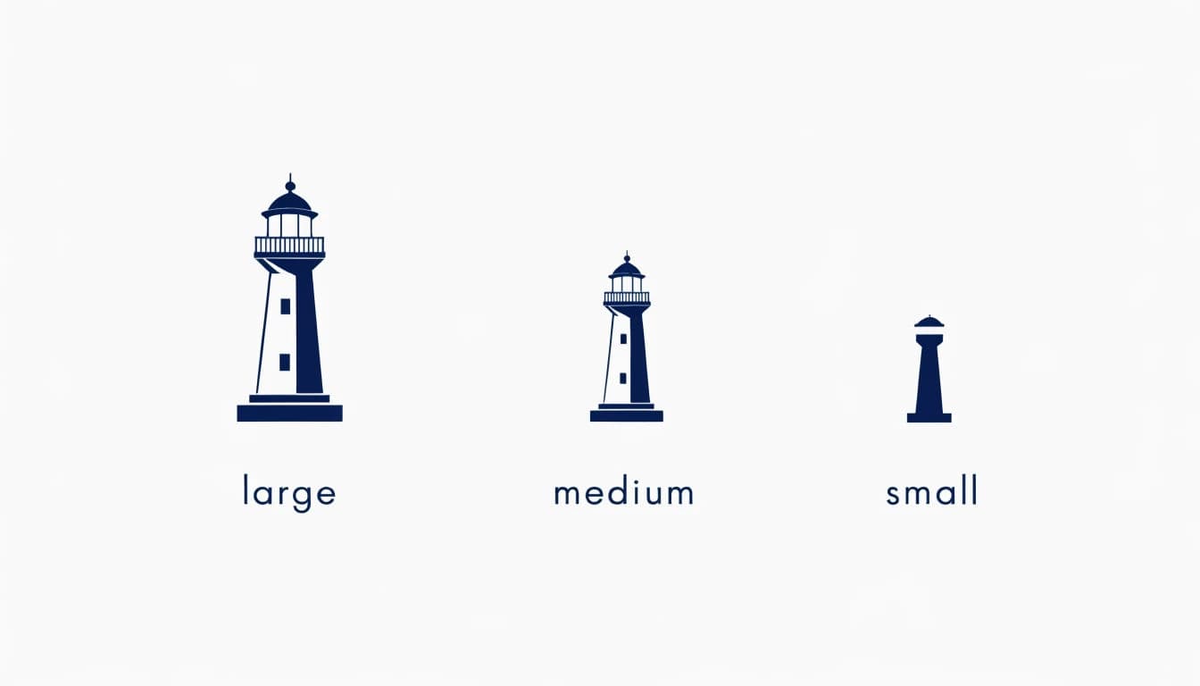
Satu logo dalam tiga ukuran
Presentasi vektor datar satu logo dalam tiga ukuran, berjajar horizontal di atas latar abu pucat, dan setiap versi lebih sederhana daripada yang sebelumnya. Di kiri ada versi lengkap: mercusuar detail dengan jendela, pagar pembatas, dan alas. Di tengah ada versi menengah yang pagar dan jendelanya dihilangkan. Di kanan ada versi kecil yang hanya menyisakan siluet menara dan satu pita horizontal. Semuanya dalam satu tinta biru dongker, rata tengah secara vertikal, dan berjarak sama. Di bawah masing-masing ada label ukuran kecil, 16:9.
Edit prompt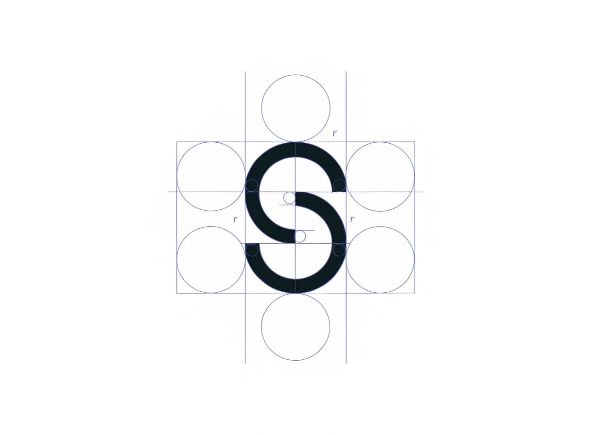
Lembar konstruksi dengan grid
Lembar konstruksi logo vektor datar di atas latar putih hangat. Tandanya huruf S abstrak dari dua busur, digambar padat dengan tinta gelap. Di belakang dan sekelilingnya ada geometri konstruksi berupa garis rambut biru pucat. Isinya grid lima lingkaran sama besar, dua kotak panduan, satu garis tengah horizontal, dan dua garis perataan vertikal. Ada juga anotasi jari-jari kecil di tiga titik. Garisnya cukup tipis agar jelas berada di belakang tanda. Persinggungan presisi, teknis dan bersih, 4:3.
Edit prompt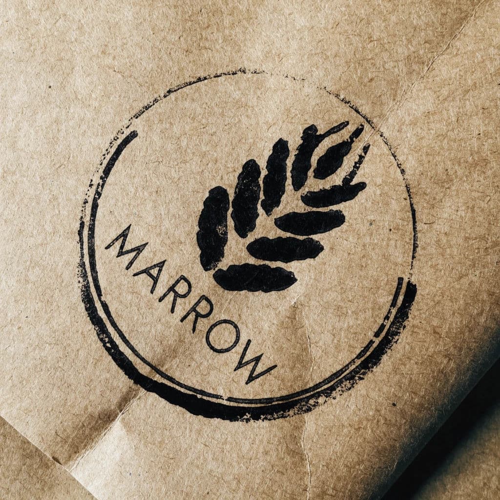
Stempel tidak rata di kertas kraft
Foto logo yang distempel dengan tinta hitam di atas kertas kraft, dengan bekas cap yang benar-benar tidak rata. Tinta lebih tebal di sepanjang tepi bawah. Ada dua celah kecil tempat karet tidak menyentuh kertas, dan di sekeliling tepi luarnya tampak halo tinta yang samar. Seluruh tanda miring sekitar tiga derajat dari posisi lurus. Tandanya segel bulat sederhana berisi bulir gandum bergaya, dengan kata MARROW di bawahnya dalam huruf kapital kecil. Serat kertas terlihat di bagian yang tintanya tipis, dan ada satu lipatan di sudut, 1:1 persegi.
Edit prompt
Huruf G dengan satu goresan diubah
Lettermark vektor datar berupa satu huruf kapital G, digambar dengan sans serif geometris yang tebal dan satu modifikasi sengaja. Palang horizontal G diperpanjang melewati lengkungannya ke kanan dan dipotong miring 45 derajat. Hasilnya terbaca sebagai huruf sekaligus anak panah. Bagian huruf lainnya dibiarkan konvensional, dengan tebal garis seragam dan lengkung bulat sempurna. Satu warna oranye tua padat di atas latar biru dongker pekat, tanpa garis tepi. Di tengah dengan ruang bebas yang lebar, 1:1 persegi.
Edit prompt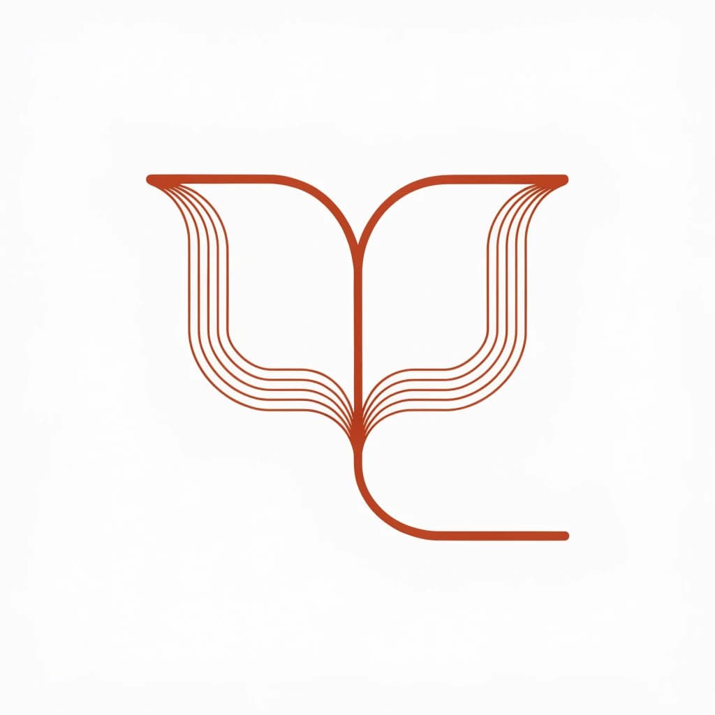
Satu garis menerus tanpa diangkat
Simbol logo vektor datar yang digambar sebagai satu garis menerus yang tidak pernah terangkat dan tidak pernah menyilang dirinya sendiri. Garis itu membentuk buku terbuka bergaya yang dilihat dari atas, dengan punggung buku di tengah dan dua halaman melengkung. Tebal garis seragam, ujung bulat di kedua ujung garis, dan jarak sama antara jalur yang sejajar. Garis terakota hangat di atas latar putih gading, tanpa isian apa pun. Di tengah frame dengan ruang bebas lebar, geometri presisi dan bisa ditelusuri, 1:1 persegi.
Edit prompt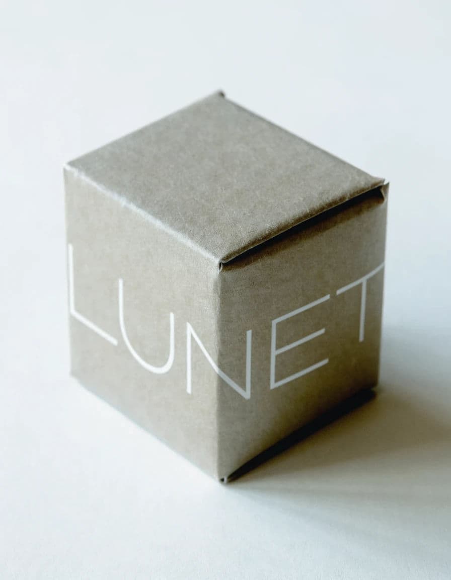
Kotak yang tandanya terpotong lipatan
Foto kotak karton kaku kecil dari karton hijau sage tanpa lapisan, dengan logo tercetak melintasi sudut lipatan. Tanda itu berlanjut dari sisi depan ke sisi samping dan dipotong rapi oleh lipatan. Tandanya wordmark sederhana, LUNET, dalam sans serif geometris tipis yang dicetak putih. Kotak difoto dari sudut tiga perempat di atas permukaan pucat, dengan cahaya lembut dari kiri atas agar kedua sisinya tampak berbeda terangnya. Tekstur karton terlihat, dan satu tepi sedikit tumpul, 4:5 potret.
Edit prompt
K dan V berbagi satu goresan
Monogram vektor datar dari huruf K dan V, digambar agar keduanya berbagi satu batang tegak. Tegak huruf K sekaligus menjadi diagonal kiri huruf V, dan sambungannya bersih serta tidak ambigu. Bentuk hurufnya sans serif geometris dengan tebal garis seragam, sudut miter yang tajam, dan tanpa kaki serif. Satu warna hitam tinta pekat di atas latar abu batu muda. Tandanya berada di dalam kotak ruang bebas, dengan batang bersama tepat di tengah. Presisi, simetris, tanpa dekorasi, 1:1 persegi.
Edit prompt
Dikosongkan dari latar arang
Logo vektor datar yang dikosongkan dari latar padat. Bidangnya abu arang pekat, dan tandanya dilubangi menjadi warna kertas, tanpa garis tepi, cahaya, atau bayangan di mana pun. Tandanya gunung bergaya yang terdiri dari tiga segitiga bertumpuk dengan tinggi makin besar. Di antaranya ada celah sempit agar latar tampak menembus dan memisahkannya. Di bawahnya tertulis NORTHFELL dengan huruf kapital kecil berjarak lega, dalam warna kosong yang sama. Margin rata di sekelilingnya dan tepi benar-benar bersih, 1:1 persegi.
Edit prompt
Wordmark sebagai papan nama tiga dimensi
Foto wordmark yang dipasang sebagai papan nama tiga dimensi pada dinding plesteran kapur. Huruf-huruf kuningan sikat terpisah mengeja ORRERY, dan tebal tiap huruf sekitar 15 mm. Huruf dipasang pada pin penyangga pendek, sehingga menonjol 20 mm dari permukaan dan menjatuhkan bayangan lembut ke kanan bawah. Jarak antarhuruf lebar dan rata, dan satu huruf memperlihatkan sidik jari samar di permukaan sikatnya. Cahaya siang lembut dari kiri atas, dan plesterannya menampakkan tekstur bekas sapuan alat plester yang asli. Palet netral hangat, kedalaman bidang dangkal di tepi, 16:9.
Edit prompt
Emblem bordir di atas denim
Foto makro emblem bordir pada jaket denim. Tandanya kepala rubah bergaya yang disederhanakan menjadi lima bentuk. Disulam dengan tusuk satin, sehingga arah benangnya jelas terlihat dan tiap area menangkap cahaya secara berbeda. Tepi merrow dari benang warna karat mengelilingi tepi bulatnya dan sedikit menonjol. Ada ketidaksempurnaan kecil di pertemuan dua warna, satu benang lepas di satu titik, dan kain sedikit mengerut di sekitar jahitan. Cahaya samping hangat dari kiri, kedalaman bidang dangkal, 1:1 persegi.
Edit prompt
Logo hewan dari enam bentuk
Logo hewan vektor datar yang digambar dengan tepat enam bentuk dan tidak lebih. Seekor bangau disederhanakan menjadi leher panjang melengkung, badan berbentuk baji, dua kaki lurus, paruh segitiga, dan satu titik mata. Tanpa detail dalam, tanpa tekstur bulu, tanpa garis tepi, tanpa gradasi. Tinta padat biru petrol pekat di atas latar pasir pucat, setiap bentuk tertutup dan bersih dengan radius sudut yang konsisten. Burung itu menempati proporsi tinggi di dalam bidang persegi, dengan ruang bebas lega, 1:1 persegi.
Edit prompt
Satu modul diulang empat kali
Simbol logo vektor datar yang dibangun dari satu modul yang diulang empat kali: satu baji seperempat lingkaran dengan takik persegi kecil di sudut dalamnya. Baji itu diputar 90 derajat tiap kali dan ditata mengelilingi satu titik pusat bersama, sehingga keempatnya menyisakan persegi kecil latar di tengah. Setiap salinan identik, jaraknya rata, dan sudutnya sejajar. Hijau tua padat di atas latar putih tulang, tanpa garis tepi dan tanpa bayangan. Di tengah bingkai yang sedikit lebih lebar dengan margin sama, bersih secara matematis, 4:3.
Edit prompt