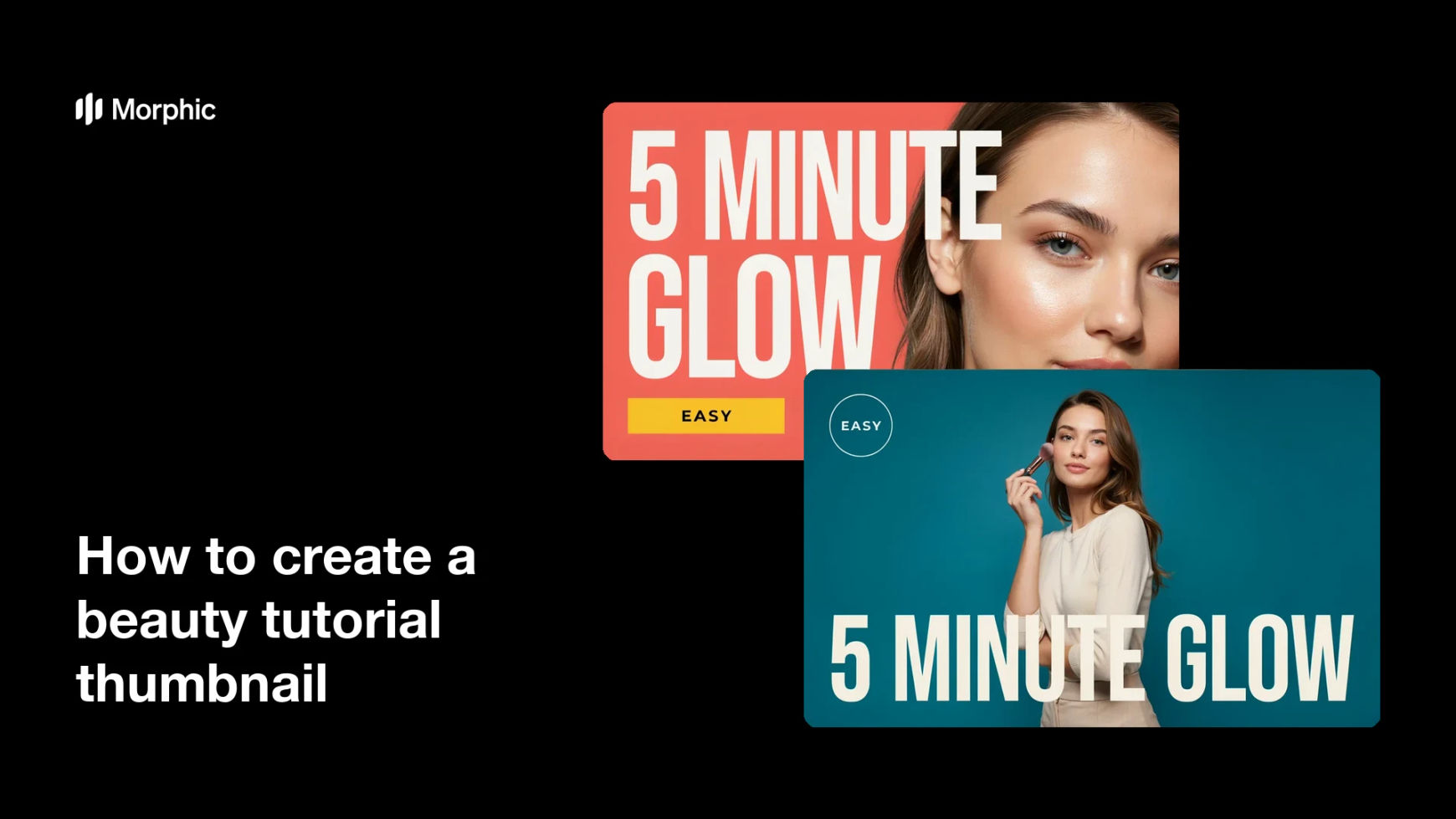
What is a beauty tutorial thumbnail?
A beauty tutorial thumbnail is the cover image for a makeup or skincare video, combining a close look at the finished result with a few words of promise. Creators and brands treat it as the most important frame of the whole video, because it decides whether anyone clicks in the first place.
With Morphic you describe the look, the framing, and the exact headline, and get a finished thumbnail in your browser. Set the colours and the crop in plain language, check that the text still reads at a small size, and download in HD.
Pick the one moment that sells the video
Choose the single most striking result from the tutorial, such as a graphic liner, a bold lip, or a glass-skin finish. A thumbnail has one job, which is to show what the viewer will be able to do by the end.
Write a short headline
Decide on three or four words that make the promise clear, such as a technique name or a time claim. Short text stays legible when the thumbnail shrinks to the size of a fingernail in a feed.
Describe the shot and the look
Tell Morphic the crop, the expression, and the makeup detail you want in frame, such as a tight face crop with the eye look filling the left side. Name the products' visual effect rather than brand names, so the finish comes through clearly.
Set high-contrast colour
Ask for a background colour that separates cleanly from skin tone and hair, and text that sits in a clear zone away from the face. Contrast is what makes a thumbnail survive a crowded results page.
Check it at thumbnail size
View the design small before you commit, since anything unreadable at that scale is wasted space. Download the final version in HD, cleared for commercial use and ready to upload.
Two design options for the same tutorial thumbnail, so you can test which one earns more clicks.
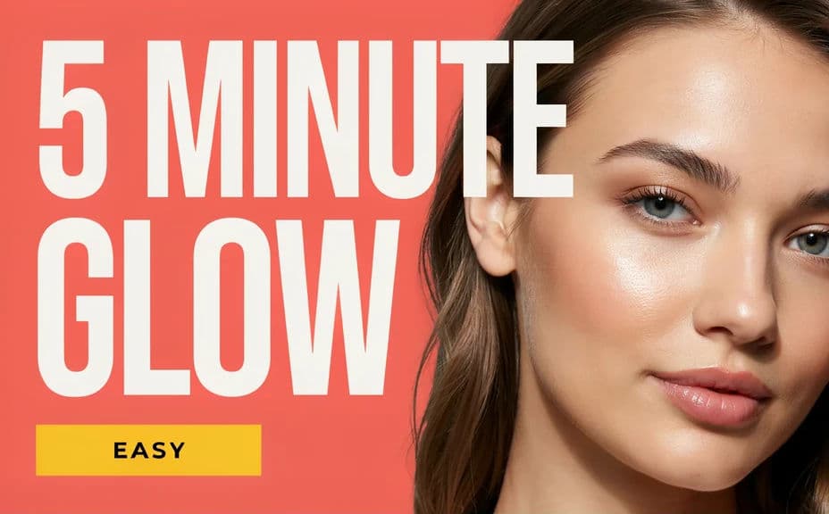
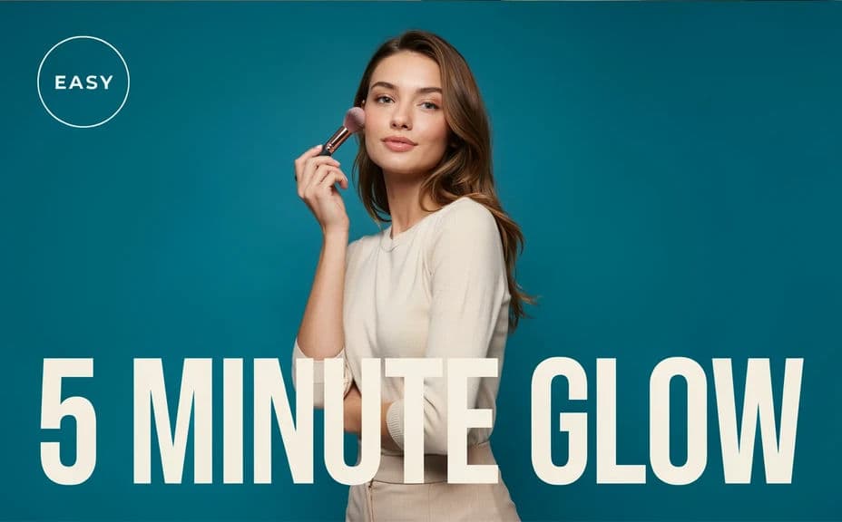
What makes a good beauty tutorial thumbnail
| Quality | What it means | Why it matters |
|---|---|---|
| Legible at small size | The headline reads as a fingernail-sized tile | That is the size most viewers actually see |
| Clear result | The finished look is obvious in one glance | Viewers click for the outcome, not the process |
| Strong contrast | Text and face separate from the background | Low contrast disappears in a crowded feed |
| Consistent style | Recognisable colours and layout every time | Regular viewers spot your videos without reading |
Morphic vs the traditional way
| Morphic | Shooting and editing thumbnails by hand | |
|---|---|---|
| Cost | Available on Morphic | Camera setup, lighting, and editing software |
| Time | A finished thumbnail in minutes | A reshoot plus an editing session per video |
| Skill needed | Describe it in plain language | Photo editing, masking, and type layout skills |
| Consistency | Reuse one description across a whole series | Every upload looks slightly different |
FAQs
Three or four words is usually the limit. Anything longer competes with the video title underneath and stops being readable when the tile shrinks.
Put it in a clear zone away from the face, usually one side or the upper area, with margin from every edge. Platforms overlay duration badges in the lower corner, so keep that space empty.
Yes. Generate two versions with different layouts and colour treatments, then run them against each other and keep whichever earns more clicks.
Fix your palette, text placement, and crop, then reuse the same description for every episode. Viewers start recognising your thumbnails before they read a word.
A 16:9 landscape image is standard for video platforms, with a vertical version if you also post shorts. Download in HD so the design stays sharp on large screens.
Yes. Downloads come without a watermark and are cleared for commercial use, so they suit monetised channels, brand partnerships, and paid promotion.