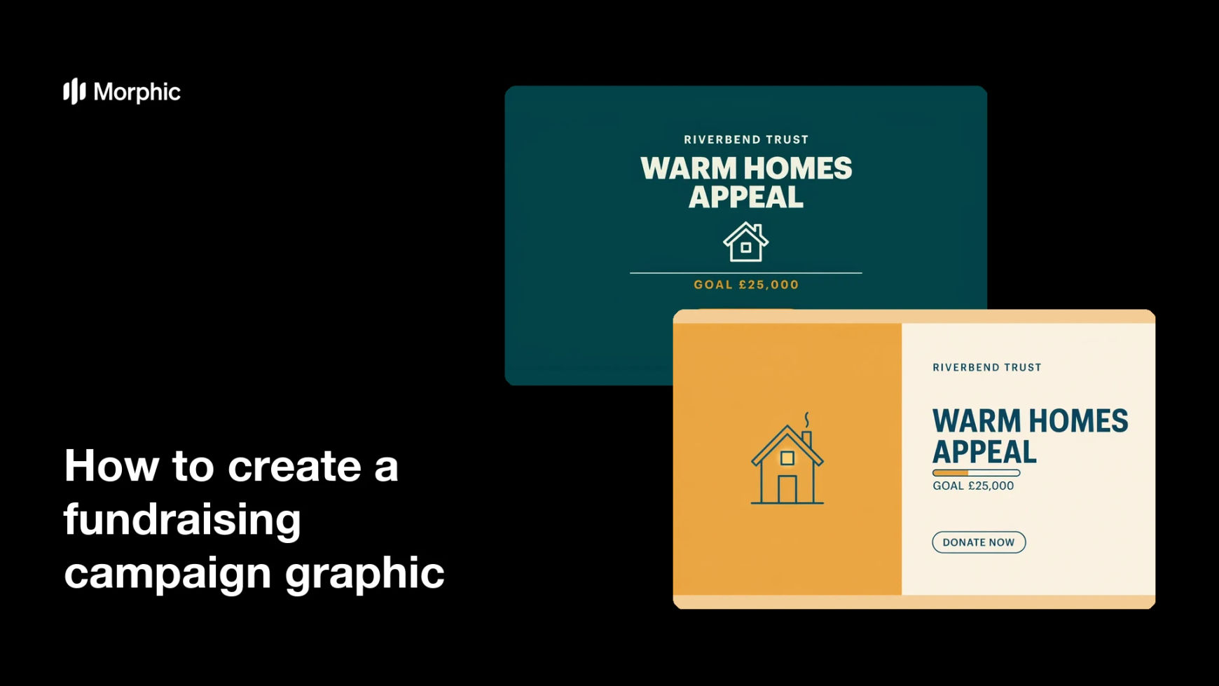
What is a fundraising campaign graphic?
A fundraising campaign graphic is the visual that anchors an appeal across social feeds, email, and a donation landing page. It usually carries the campaign name, the goal or progress figure, and a clear donate call to action, styled to match the organisation's identity. Charity communications teams rely on it because one recognisable graphic repeated across channels makes a campaign feel coordinated rather than scattered.
With Morphic you create this graphic from a text prompt in your browser. Describe the campaign name, the goal, the tone, and your brand colours, then refine and download in HD. You get a campaign-ready design without opening layout software or waiting on a studio.
Fix the campaign name and the ask
Decide the short campaign name and the single action you want, such as donate or set up a monthly gift. Write both lines out before you generate so the graphic has one clear job rather than three competing ones.
Choose an honest visual angle
Decide whether the graphic leads on the outcome your funding creates, the people you work alongside, or a simple symbolic image. Represent beneficiaries respectfully and with consent, and avoid staged hardship presented as if it were documentary reporting.
Describe the layout in Morphic
Open Morphic and describe the design: campaign name, goal figure, donate button, and clear space for your logo. Specify the aspect ratio you need, such as a square for feeds or a wide banner for an email header.
Apply your charity's look
Ask for your brand colours, an accent for the donate button, and type that stays readable at small sizes. Keep contrast high so the campaign name and the goal figure survive a fast scroll.
Compare versions and export
Produce two designs with different layouts so you can see which one draws the eye to the ask. Preview each at the size it will appear, then download in HD and roll it out across your channels.
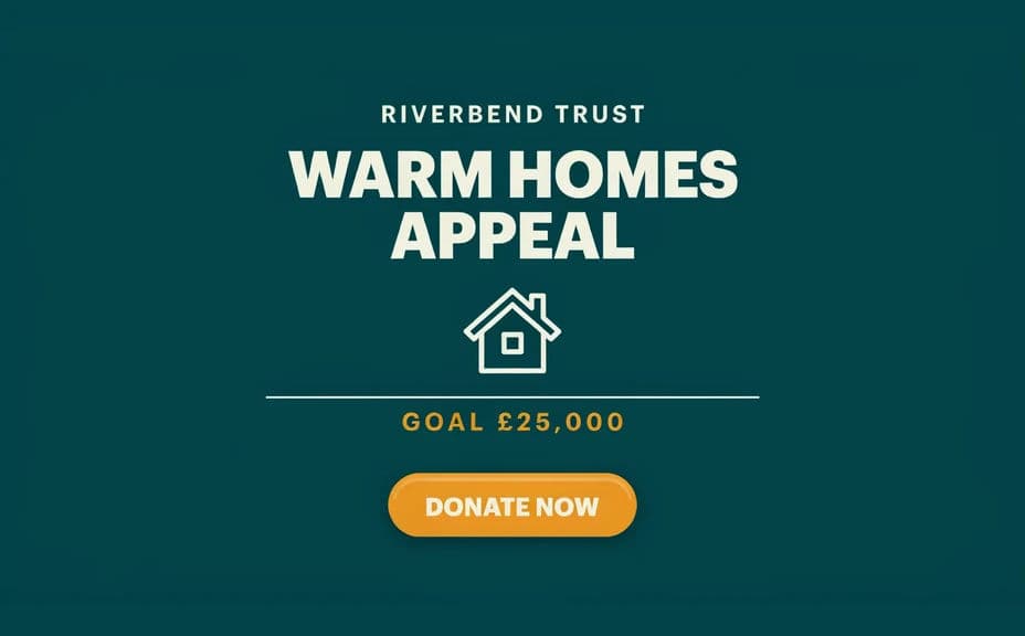
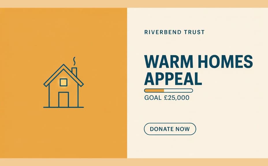
Two design options for the same fundraising campaign, each carrying the campaign name, goal, and donate button.
What makes a good fundraising campaign graphic
| Quality | What it means | Why it matters |
|---|---|---|
| One clear ask | A single action, stated plainly | Supporters know exactly what to do next |
| Visible progress | The goal or total reads at a glance | Momentum encourages people to join in |
| Dignified imagery | People shown with respect and consent | It protects the people you serve and your trust |
| On-brand styling | Colours and type match your identity | The campaign reads as one coordinated effort |
Morphic vs the traditional way
| Morphic | A design agency or in-house studio | |
|---|---|---|
| Cost | Available on Morphic | Agency fees or studio time per asset |
| Time | A finished graphic in minutes | Days of briefing, drafts, and revisions |
| Skill needed | Describe it in plain language | Layout, typography, and retouching skills |
| Consistency | Regenerate every size on brand | Manual rework for each channel and update |
FAQs
Yes. Specify the exact campaign name, goal figure, and button copy in your prompt, and the design renders around them. Regenerate whenever the total needs updating.
Describe people with agency and dignity rather than distress, and only use real supporters or beneficiaries with their informed consent. Generated imagery should never be presented as documentary evidence of a real person's situation.
Yes. Describe your palette, your donate button accent, and your type style, and the graphic renders to match. Keep contrast high so the ask stays readable.
Any placement you need. Specify the aspect ratio, such as a square for feeds, a story format for mobile, or a wide banner for email, and the layout adapts.
Yes. Generate designs with different layouts or emphasis, then compare them at real size before choosing the one that leads most clearly to the donate action.
Yes. Graphics you generate with Morphic are cleared for commercial use across your appeal pages, social channels, and supporter emails.