What is a marathon event graphic?
A marathon event graphic is the image that announces a race across registration pages, email, and social feeds. It carries the race name, the date, and the distance alongside a shot of runners in motion, so entrants can see at a glance what the event is. Race organizers, sponsors, and running clubs use it to drive sign-ups in the months before the start line.
With Morphic you create that graphic from a text prompt in your browser. Describe the runners, the setting, your event colors, and the exact wording, then compare options and download in HD. You get a polished announcement cleared for commercial use without a photo shoot or design software.
Fix the race details
Write out the exact race name, the date, and the distance before you start generating. Locking the wording first keeps the text on the graphic accurate and avoids repeated corrections.
Describe the scene
Open Morphic and describe the moment you want, such as a pack of runners on a city bridge at sunrise or a single runner crossing the finish. Say whether the mood should feel energetic and warm or clean and editorial.
Set the color and type direction
Name your event colors and ask for them in the banner, the date block, and the accents. Keep a calm area behind the text so the race name does not fight the background detail.
Compare two designs
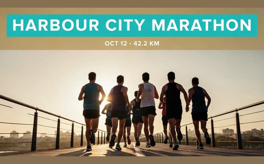
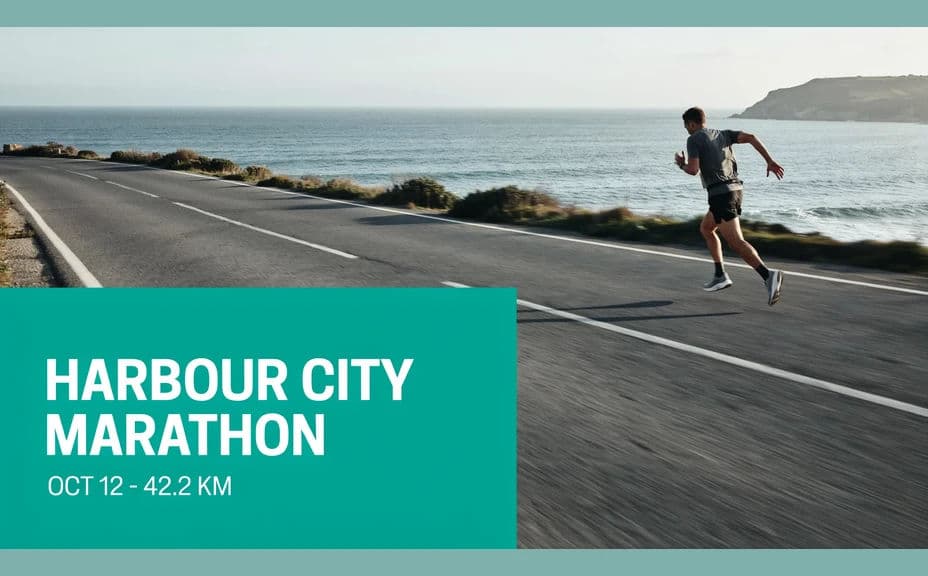
Ask for two treatments, one with the race name across the top and one with the details in a corner block. Comparing them shows which arrangement carries the date most clearly at thumbnail size.
Proof the text and export
Read every word and confirm the race name, date, and distance are correct and consistently formatted. Download in HD, then place it on your registration page and social channels.
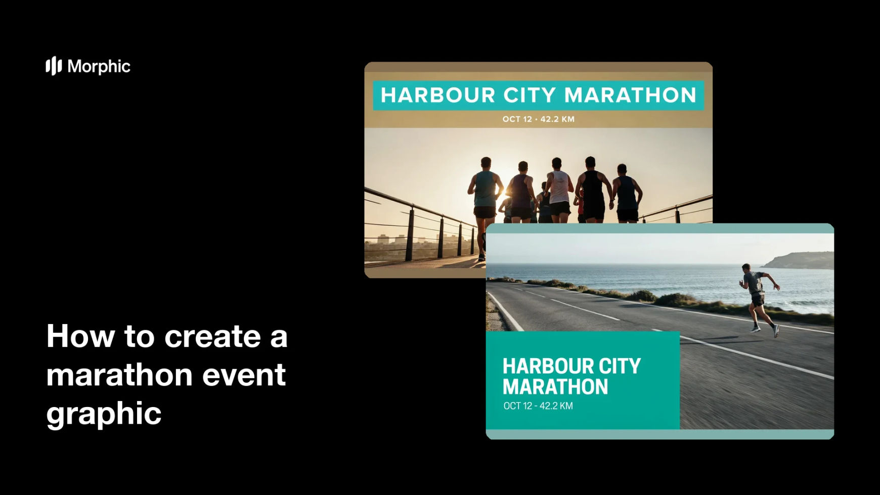
Two graphic designs for the same marathon, each carrying the race name, date, and distance.
What makes a great marathon event graphic
| Quality | What it means | Why it matters |
|---|---|---|
| Sense of motion | Runners look like they are moving | The graphic conveys energy instead of a static pose |
| Unmissable date | The date sits in its own clear block | Entrants can plan and register without hunting |
| Legible race name | The name reads at thumbnail size | The event is recognizable in a crowded feed |
| Consistent event colors | One palette across every asset | The race looks organized and well run |
Morphic vs the traditional way
| Morphic | A race day shoot and design software | |
|---|---|---|
| Cost | Available on Morphic | Photographer fees plus design software |
| Time | A finished graphic in minutes | Weeks between shooting and final artwork |
| Skill needed | Describe it in plain language | Action photography and layout skills |
| Consistency | Regenerate matching assets for every channel | Manual rework for each size and placement |
FAQs
Yes. Provide the exact wording in your prompt, then read the rendered text and regenerate if anything is misspelled or cramped.
Yes. Name your event colors and ask for them in the banner and accents. Keep contrast strong so the race details stay readable.
Yes. Keep the same visual style and swap the distance and wording, so the 10K, half, and full share one look.
Yes, if you prioritize legibility. Preview at posting size, keep a calm background behind the type, and regenerate any version that feels tight.
Yes. Describe each placement and generate a version framed for it. The layout adapts to the shape you ask for.
Yes. Graphics you generate with Morphic are cleared for commercial use across registration pages, sponsorship, and advertising.