What is a photography portfolio cover?
A photography portfolio cover is the front page of a printed book, PDF, or online gallery that presents a photographer's work. It usually carries the photographer's name, a specialty line such as weddings or editorial, and a single strong image or graphic treatment. Photographers, studios, and agencies use it to set the tone before a client sees a single frame inside.
With Morphic you design this cover from a text prompt in your browser. Describe the layout, the name and specialty text, and the mood you want, then compare a few options and download in HD. The result is a finished cover you can send to clients without opening design software.
Decide the name and specialty line
Write out the photographer or studio name and a short specialty line exactly as they should appear. Fixing the wording first keeps the text on the cover accurate and saves a round of edits later.
Describe the cover layout
Open Morphic and describe the cover you want: where the name sits, how much space the image takes, and how minimal or bold the type should feel. Ask for a couple of distinct layouts so you can compare hierarchy.
Set the mood and colour
Describe the palette and finish that match your work, such as warm film tones for weddings or high-contrast monochrome for editorial. A cover that matches the photography inside makes the whole book feel considered.
Check the text and spacing
Read the name and specialty line on each option and confirm the spelling and spacing are right. Regenerate any version where the type crowds an edge or fights the image behind it.
Export and use it
Preview the cover full size and as a small thumbnail to confirm it reads at both. Download in HD, then use it as the first page of your portfolio and as the preview image when you share the link.
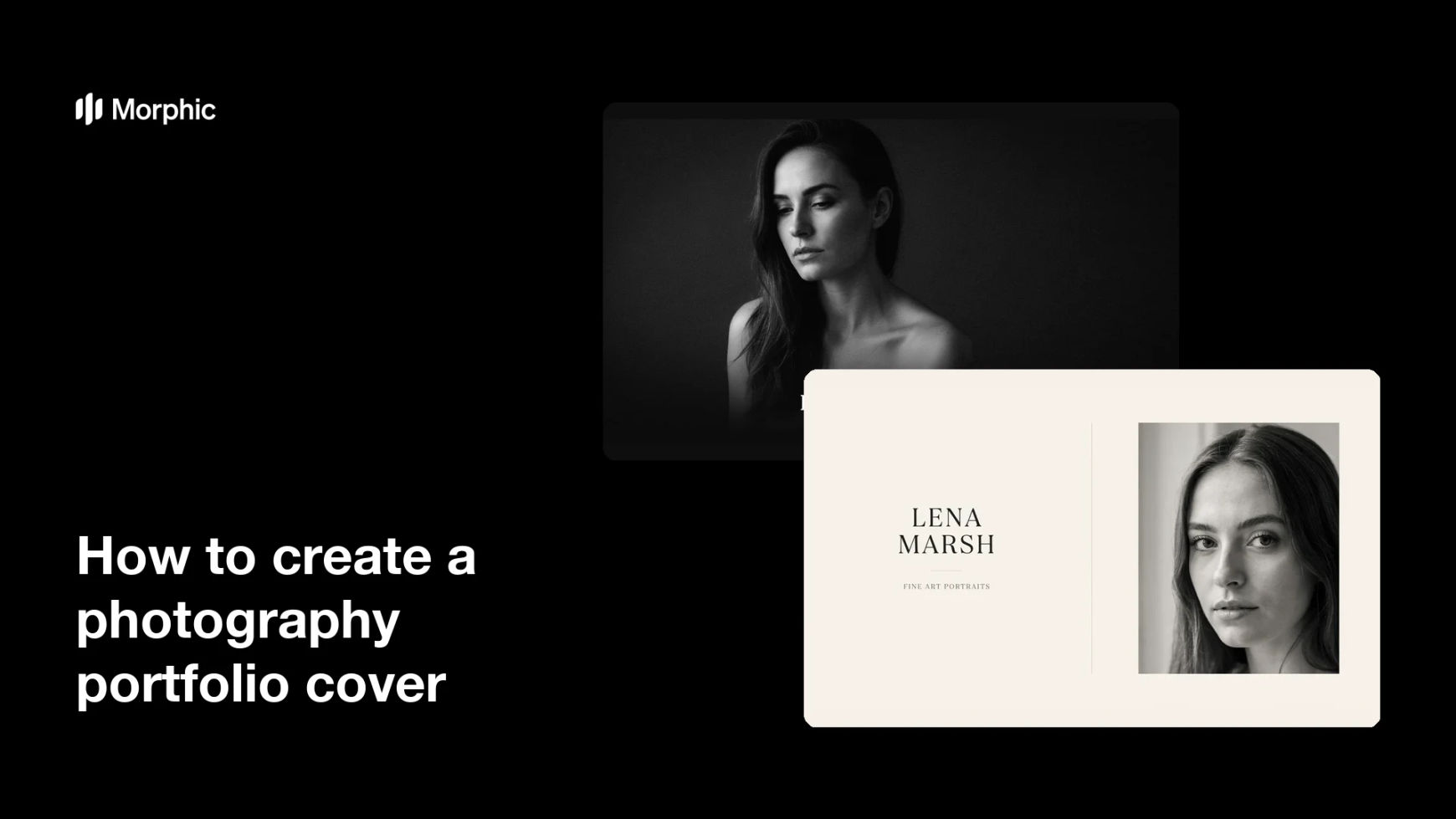
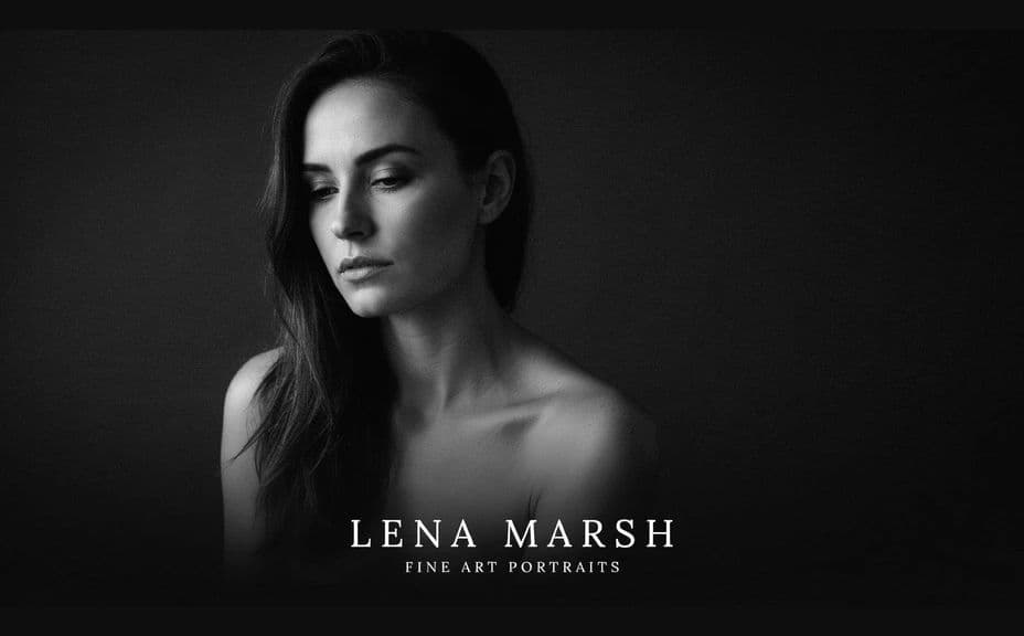
Two cover designs for the same photographer, each carrying the same name and specialty line.

What makes a good photography portfolio cover
| Quality | What it means | Why it matters |
|---|---|---|
| Clear name | The photographer reads instantly | Clients remember who the work belongs to |
| One strong idea | A single image or graphic leads | A busy cover weakens the work inside |
| Matching mood | The cover suits the photography | The book feels like one considered piece |
| Works small | It holds up as a thumbnail | The cover represents you wherever it is shared |
Morphic vs the traditional way
| Morphic | Design software or a designer | |
|---|---|---|
| Cost | Available on Morphic | Software subscription or design fee |
| Time | A finished cover in minutes | Hours of layout and revision |
| Skill needed | Describe it in plain language | Layout and typography skills |
| Consistency | Regenerate matching variations | Manual rework for every version |
FAQs
Yes. Include the name and specialty line in your prompt, then read the rendered text and regenerate if any wording or spacing looks off.
Yes. Ask for a few different layouts of the same cover and compare them side by side, then keep the one that reads best.
Yes. Describe the palette, contrast, and finish you shoot with, and the cover can be generated to sit alongside your work rather than clash with it.
Yes. Download in HD and preview it at full size and as a thumbnail so you know the name stays readable in both places.
Describe the change, such as a new specialty line or a different palette, and regenerate. There is no manual redraw involved.
Yes. Covers you generate with Morphic are cleared for commercial use across your portfolio, website, and client pitches.