What is a skincare product photo?
A skincare product photo is a controlled studio shot of a bottle, jar, or tube, built to show the packaging clearly and suggest how the product feels to use. It carries the label, the finish of the glass or plastic, and a set that hints at the brand's positioning, from clinical to spa-like. Beauty brands, retailers, and marketplace sellers rely on it for listings, ads, and social posts.
With Morphic you create this shot from a text prompt in your browser. Describe the container, the lighting, the surface, and any props, then compare a few setups before you commit. Download the result in HD, cleared for commercial use, with no studio booking involved.
Describe the product
Write down the container type, material, colour, and cap so the shot matches your real packaging. Precise wording here keeps the generated bottle close to the product you actually sell.
Choose the lighting
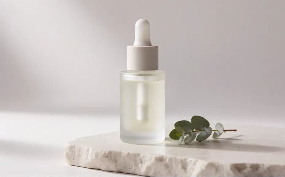
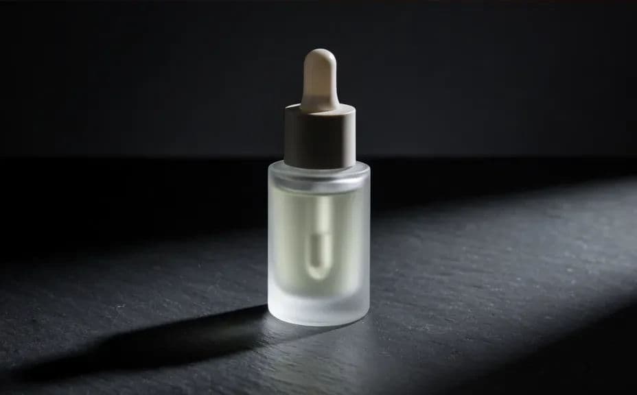
Open Morphic and ask for the light you want, such as soft diffused studio light for a calm look or crisp directional light for a clinical feel. Lighting sets the mood faster than any prop, so decide it early.
Set the surface and props
Describe the surface the bottle sits on and anything around it, such as stone, water droplets, or a single leaf. Keep props minimal so attention stays on the packaging.
Compare a few setups
Generate more than one version and place them side by side to judge shadow, reflection, and colour. Pick the setup that shows the bottle's shape most clearly.
Export for your channels
Preview the shot at listing size and at full size to confirm the label area stays clean. Download in HD and reuse the same description for the rest of the range.
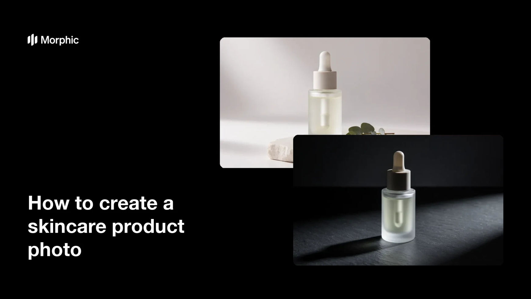
Two lighting and styling setups for the same skincare bottle, so you can pick the one that fits the brand.
What makes a good skincare product photo
| Quality | What it means | Why it matters |
|---|---|---|
| Clear packaging | The bottle shape and label read easily | Shoppers judge the product before reading a word |
| Controlled light | Highlights and shadows are deliberate | Glass and glossy caps look premium instead of flat |
| Simple set | Props support rather than compete | Attention stays on what you are selling |
| Accurate colour | Tones match the real product | Fewer returns and less disappointment on delivery |
Morphic vs the traditional way
| Morphic | A studio product shoot | |
|---|---|---|
| Cost | Available on Morphic | Studio hire, photographer, and stylist fees |
| Time | A finished shot in minutes | Days of scheduling, shooting, and retouching |
| Skill needed | Describe it in plain language | Lighting, styling, and retouching experience |
| Consistency | Reuse the same description across the range | Relight and rebuild the set for every product |
FAQs
Yes. Describe the container shape, material, colour, and cap in detail, then regenerate until the generated bottle matches the product you sell.
Yes. Keep one description of the lighting, surface, and background, and change only the product details for each item in the line.
Plain surfaces such as stone, matte paper, or soft gradients keep focus on the bottle. Add a prop only when it explains the product.
Yes. Ask for crisp directional light, cool tones, and a bare surface, and the same product will read as clinical instead of soft.
Images download in HD, which is enough for product listings, ads, and social posts without extra upscaling.
Yes. Images you generate with Morphic are cleared for commercial use across your store, ads, and social channels.