What is a travel blog header?
A travel blog header is the wide banner at the top of a blog, carrying the blog name over an image that sets the tone for everything below it. Travel writers, creators, and destination marketers use it as the first impression of the site, and often reuse it as a social cover and newsletter masthead. It has to look like somewhere worth reading about while leaving the name perfectly legible.
With Morphic you create that header from a text prompt in your browser. Describe the landscape, the mood, where the title sits, and your palette, then adjust the wording and download in HD. You get a banner sized for your site without hunting through stock libraries.
Pick the feeling of your blog
Decide whether your site is about coastlines, mountains, cities, or slow road trips, and choose one landscape that represents it. A header that matches your actual subject sets expectations better than a generic travel shot.
Set your title text
Write the blog name and any tagline exactly as you want them rendered. Short titles read better in a wide banner and survive being scaled down for mobile.
Describe the banner
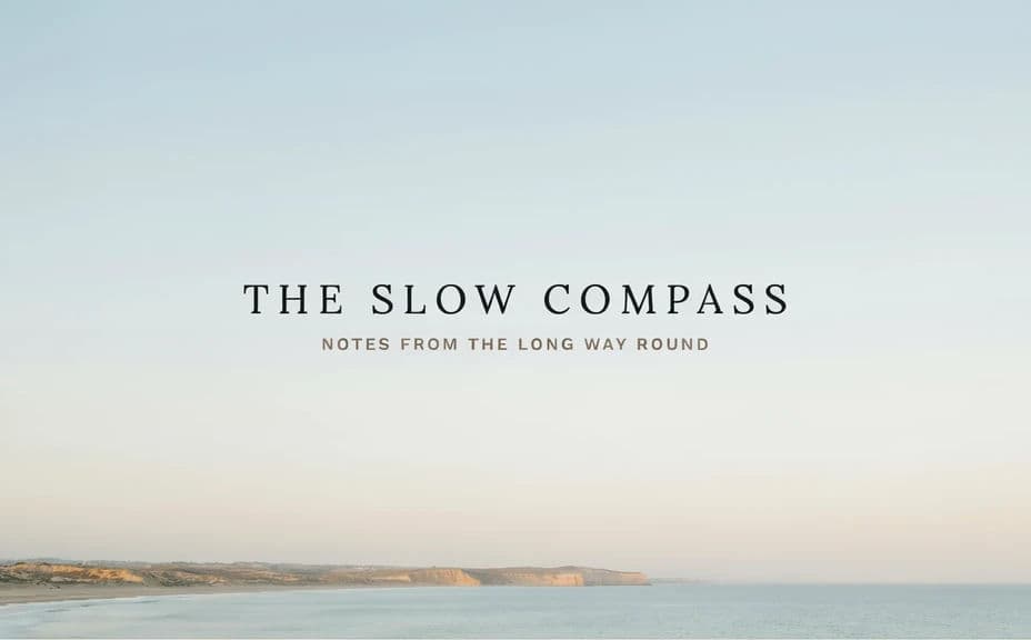
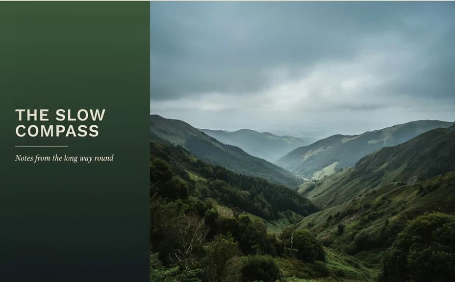
Open Morphic and describe a wide header: the landscape, the time of day, and where the title should sit with clear space around it. Ask for a couple of layout options so you can compare a centred title against an offset one.
Protect the legibility
Ask for a calm area of the image behind the title, open sky, water, or a soft gradient, so the text never fights the detail. Check the header at mobile width to confirm the name still reads clearly.
Export and place it
Preview the banner at your site's header dimensions and at social cover sizes. Download in HD, then upload it to your theme and reuse the crop where it fits.
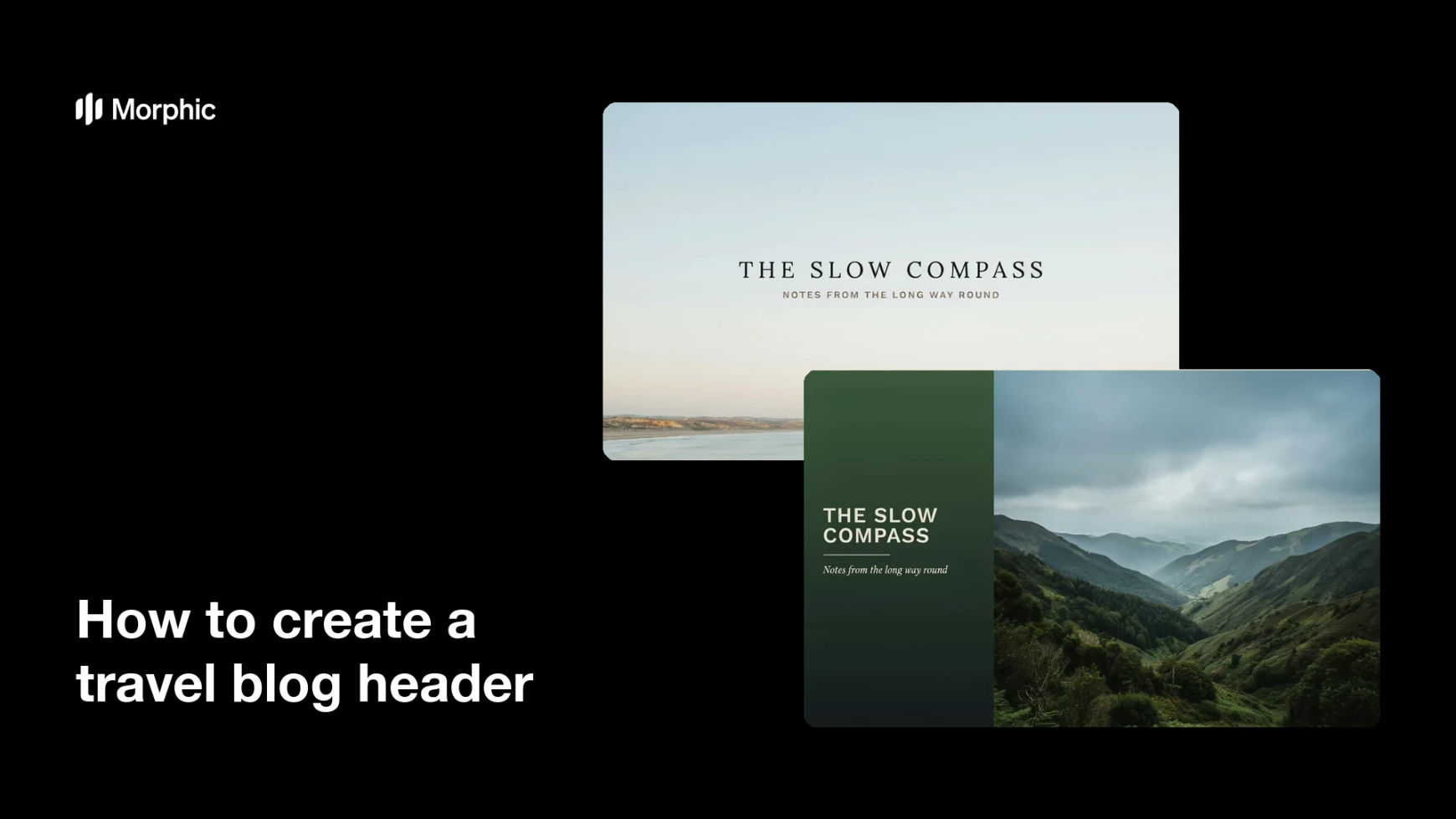
Two layout options for the same travel blog header, each carrying the blog title text.
What makes a good travel blog header
| Quality | What it means | Why it matters |
|---|---|---|
| Clear title area | Calm space behind the blog name | The name reads instantly instead of blending in |
| Wide-crop composition | The scene works in a short, wide frame | Nothing important is lost when the banner is cropped |
| A tone that matches your writing | The landscape reflects your subject | Readers know what the blog is about before scrolling |
| Mobile legibility | Type holds up at narrow widths | Most of your readers arrive on a phone |
Morphic vs the traditional way
| Morphic | Stock photos and design software | |
|---|---|---|
| Cost | Available on Morphic | Stock licences plus a software subscription |
| Time | A finished header in minutes | Hours of searching, cropping, and typesetting |
| Skill needed | Describe it in plain language | Photo editing and typography skills |
| Consistency | Regenerate matching banners per section | Mismatched stock across the site |
FAQs
Yes. Provide the exact title and tagline in your prompt, then read the rendered text and regenerate if any character looks wrong.
Describe a wide banner that matches your theme's header ratio, then download in HD and let your site scale it. Check the result at mobile width before publishing.
Yes. Describe each section's subject while keeping the same palette, light, and title placement. The set will read as one site rather than a collection.
Ask for open sky, water, or a soft gradient behind the text, and keep contrast high. Regenerate any version where the background competes with the type.
Yes. Generate a version framed for each platform's cover ratio using the same landscape and title so your profiles match your site.
Yes. Images you generate with Morphic are cleared for commercial use, including monetised blogs and sponsored posts.