What is a boarding pass style graphic?
A boarding pass style graphic borrows the look of an airline ticket, the route codes, the stub, the perforation, and uses it for something else entirely. Travel brands use it for giveaway announcements, agencies for trip reveals, and event planners for invitations to a destination wedding or an offsite. The format works because everyone recognises it instantly and reads it as the start of a journey.
With Morphic you design that graphic from a text prompt in your browser. Describe the route, the dates, the styling, and the stub detail, then adjust the wording and download in HD. You get a polished ticket-style asset without opening design software.
Decide what the pass announces
Settle what the graphic is for, a trip reveal, a competition, or an invitation, and what text it needs to carry. Knowing the purpose tells you which fields matter and which airline conventions to drop.
Write the ticket fields
Write the exact strings for the route codes, passenger or brand name, date, gate, and seat before you generate. Real, short values render far more cleanly than long placeholder phrases.
Describe the layout
Open Morphic and describe a boarding pass: a main panel with the route, a perforated divider, and a narrow stub on one side. Ask for a couple of layout options so you can compare where the emphasis lands.
Style it to your brand
Name your colours, an accent for the route codes, and the type feel you want, crisp modern or retro airline. Keep the background quiet so the ticket fields stay legible at thumbnail size.
Proof and export
Read every field off the graphic and confirm the codes, date, and names are correct. Download in HD, then place it in your post, email, or invitation.
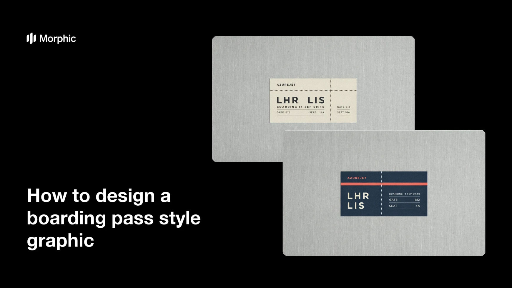
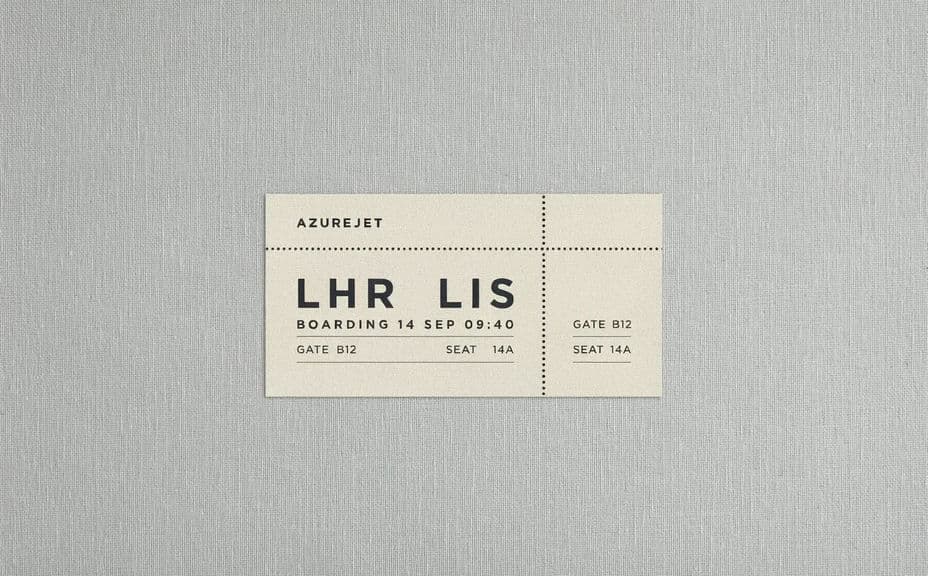
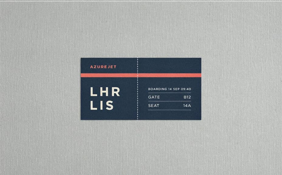
Two design options for the same boarding pass concept, each carrying the route and date text.
What makes a good boarding pass style graphic
| Quality | What it means | Why it matters |
|---|---|---|
| Recognisable format | Stub, perforation, and field grid are present | Viewers read it as a ticket in a fraction of a second |
| Short, real field text | Codes and dates instead of filler | The pass looks authentic rather than mocked up |
| Clear hierarchy | Route dominates, details support | The message lands before anyone reads the small print |
| Legible at thumbnail size | Fields stay sharp when scaled down | The graphic still works in a feed or an inbox |
Morphic vs the traditional way
| Morphic | Design software or a template | |
|---|---|---|
| Cost | Available on Morphic | Software subscription or template purchase |
| Time | A finished graphic in minutes | Hours of layout and field alignment |
| Skill needed | Describe it in plain language | Vector and typography skills |
| Consistency | Regenerate matching passes per trip | Manual edits to every field each time |
FAQs
Yes. Give the route codes, date, and any names in your prompt, then read the rendered fields and regenerate if a character looks off.
Yes. Describe the event details in place of the flight fields and keep the ticket structure. It reads as an invitation while borrowing the familiar format.
Yes. Describe your palette, accent, and type style, and generate the pass to match. Keep the background quiet so the fields remain readable.
No. Use your own brand name and styling rather than an existing carrier's marks, and keep the design clearly your own.
Yes. Ask for a print-oriented layout, download in HD, and keep margins generous so nothing is lost at the trim edge.
Yes. Images you generate with Morphic are cleared for commercial use across your campaigns and print materials.