What is a boutique sale graphic?
A boutique sale graphic is a promotional image that announces a discount, a seasonal clearance, or a limited window to shop. It carries the offer, the dates, and the shop name in a layout people can read in a single scroll-past. Independent shops and small fashion labels lean on them because a sale only works if the terms land instantly.
With Morphic you design the graphic from a text prompt in your browser. Describe the offer, the mood, and the palette, then adjust the composition until the headline carries and the details stay clear. Download in HD and post it across your channels, cleared for commercial use.
Write the offer
Open Morphic and state the exact offer, the dates, and the shop name you want on the graphic. Keep the wording short so the headline can stay large.
Set the look
Describe the mood and palette, whether that is soft and editorial or bold and graphic. Mention your brand colours so the graphic sits alongside your usual posts.
Choose the composition
Ask for a layout that puts the discount first, with the dates and shop name in a supporting position. A clear hierarchy is what makes the offer readable at a glance.
Size it for your channels
Request the aspect ratios you post in, such as a square feed tile and a vertical story. Ask for margin around the text so nothing is clipped by the interface.
Export and post
Check the offer, dates, and shop name are spelled correctly and easy to read. Download in HD, then schedule it across your feed, stories, and email header.
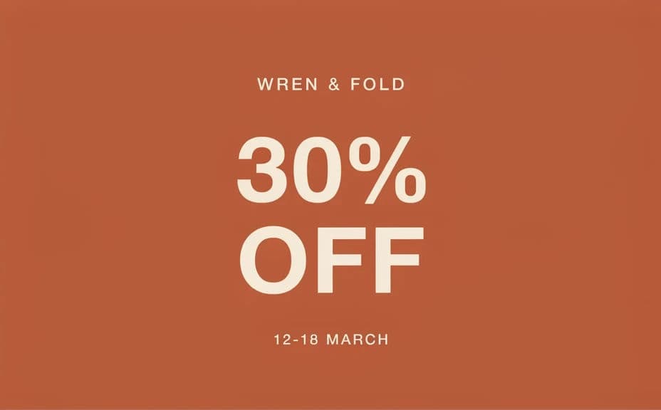
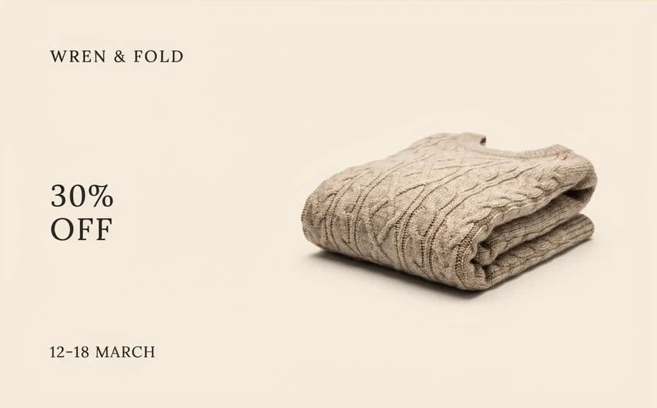
Two different designs for the same boutique sale, so you can choose the one that suits your feed.
What makes a good boutique sale graphic
| Quality | What it means | Why it matters |
|---|---|---|
| Clear hierarchy | The discount reads before anything else | The offer lands in a single glance |
| Short copy | A few words carry the whole message | Nothing competes with the headline |
| Dates on the graphic | The window to shop is stated plainly | Shoppers know when to act |
| On-brand palette | Colours match your usual posts | The sale still feels like your shop |
Morphic vs the traditional way
| Morphic | A designer or template tool | |
|---|---|---|
| Cost | Available on Morphic | Design fees or a subscription |
| Time | A finished sale graphic in minutes | Days of briefing and revisions |
| Skill needed | Describe it in plain language | Layout and typography skills |
| Consistency | Reuse the same look for every promotion | Rebuild the file for each sale |
FAQs
Yes. Give the exact shop name in the prompt and say where it should sit, usually under the discount so it supports rather than competes.
Yes. Ask for a bold version and a softer editorial version of the same offer, then compare them before you pick one for the campaign.
Ask for a square feed tile and a vertical story at minimum, and add a wide banner if you send email. Request margin around the text so nothing gets clipped.
Yes. Describe your palette in the prompt and reuse that wording for every promotion so your sale posts stay recognisable.
Yes. Ask for the same layout with a new discount and new dates, so only the offer changes while the look stays constant.
Yes. Graphics you create with Morphic are cleared for commercial use across your social channels, email, and in-store screens.