What is a pharmacy promotion graphic?
A pharmacy promotion graphic is the visual that announces an in-store offer, a new product line, or a seasonal service such as a flu clinic. It usually shows the product or category, a short offer line, and the store name, sized for a shelf card, a window poster, or a social post. Pharmacy owners and retail marketing teams use it because a clean, consistent graphic makes an offer readable from the aisle and keeps every branch looking the same.
With Morphic you design this graphic from a text prompt in your browser. Describe the product, the offer wording, and your store look, then adjust the layout and download in HD. You get retail-ready artwork without opening design software or booking a studio.
Define the offer
Decide exactly what you are promoting and write the offer line and store name out in full. Precise wording up front keeps the finished graphic accurate and quick to approve.
Describe the layout
Open Morphic and describe a clean retail graphic: the product in the centre, a short offer badge, and the store name with room for your logo. Specify the format you need, such as a shelf card, a window poster, or a square social post.
Set the store look
Ask for your brand colours, a bright accent for the offer badge, and a font that stays sharp at shelf distance. Keep the background simple so the product remains the focus.
Generate versions to compare
Produce two designs with different compositions or colour treatments while keeping the same offer and store name. Comparing them shows which one pulls the eye to the product first.
Proof the claims and export
Read the offer back for accuracy and keep the wording descriptive rather than a health promise, checking anything regulated against local advertising rules. Download in HD, then print the cards or schedule the post.
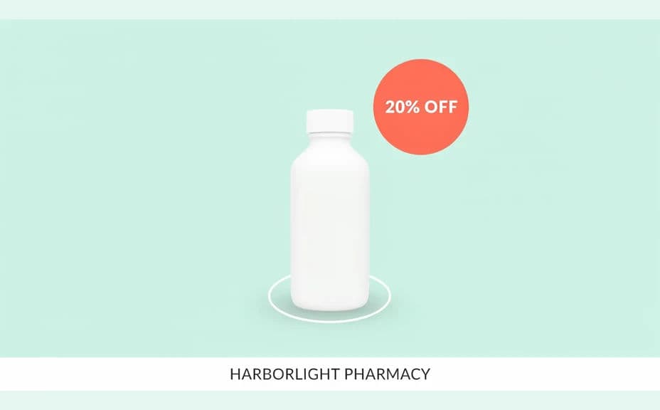
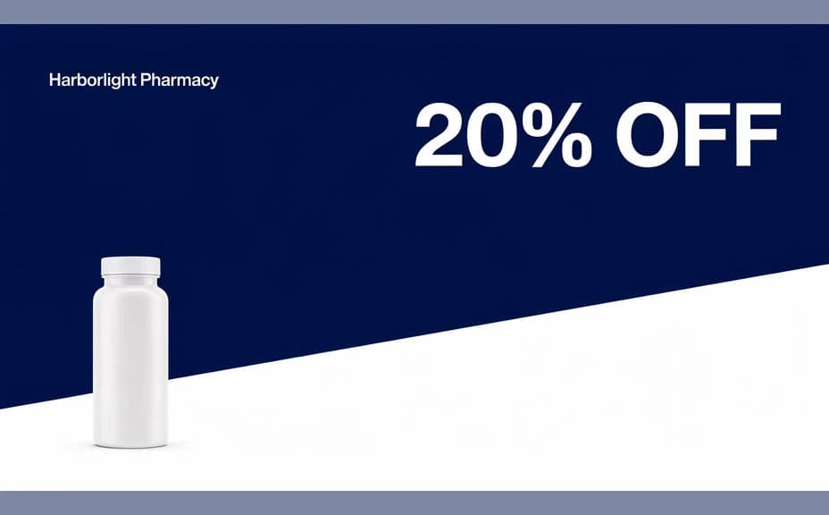
Two design options for the same pharmacy promotion, each showing the same store name and offer.
What makes a good pharmacy promotion graphic
| Quality | What it means | Why it matters |
|---|---|---|
| Clear offer | One short, specific offer line | Shoppers understand the deal from the aisle |
| Product in focus | A clean background behind the item | The customer knows what is being promoted |
| Shelf legibility | Type that reads at a few paces | The card works where it is actually placed |
| Responsible wording | Descriptive, not a health promise | The promotion stays accurate and compliant |
Morphic vs the traditional way
| Morphic | A product shoot and design studio | |
|---|---|---|
| Cost | Available on Morphic | Photography and studio design fees |
| Time | Retail-ready artwork in minutes | A shoot plus days of layout work |
| Skill needed | Describe it in plain language | Product photography and layout skills |
| Consistency | Regenerate every offer in one style | Manual rework for each promotion |
FAQs
Yes. Write the store name and the exact offer line in your prompt and the graphic renders around them. Regenerate whenever the promotion changes.
Yes. Describe your brand colours, logo placement, and font style, and the design renders to match. Keep the badge colour bright so the offer stands out.
Any placement you need. Specify a shelf card, a window poster, or a square social post, and the layout adapts to the size.
Yes. Keep the same style description and swap the branch name or offer so every location gets consistent artwork.
Keep the wording descriptive and avoid claiming health outcomes or comparing effectiveness. Medicine and supplement advertising is regulated in most markets, so check the rules that apply to your store before publishing.
Yes. Designs you generate with Morphic are cleared for commercial use across in-store print, window displays, and social channels.