What is a rebrand presentation?
A rebrand presentation makes the case for a new identity: the new look applied across the touchpoints a client actually cares about, shown next to the old one. It is where a rebrand either wins buy-in or stalls, because stakeholders approve what they can see, not what they have to imagine.
Morphic lets you build those touchpoint mockups from a description instead of designing each by hand. Describe how the new brand should appear on a storefront, a package, an app, or an ad, generate the visuals in your browser, refine them to the new system, and download in HD. The presentation shows the future rather than describing it.
List the touchpoints that will win the room
Decide where the new brand needs to be seen: signage, packaging, digital, social, print. Choose the few touchpoints that matter most to your stakeholders. A focused set of strong mockups convinces better than a sprawling one.
Generate the new brand on each touchpoint
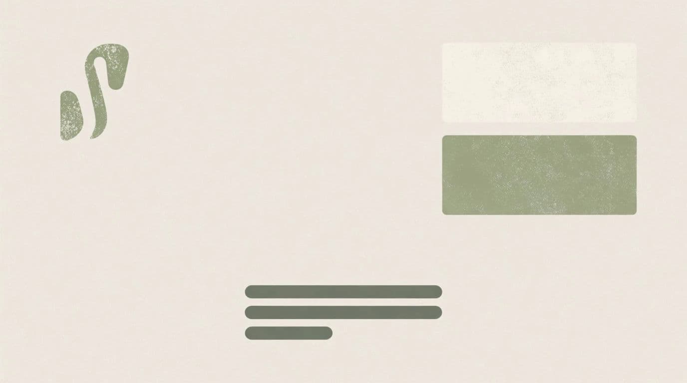
Describe the new identity applied to each surface: the palette, the tone, the styling on a product box or a shopfront. Generate the touchpoint mockups in your browser so stakeholders see the system in the real world, not as a logo on a white page.
Build the before and after pairs
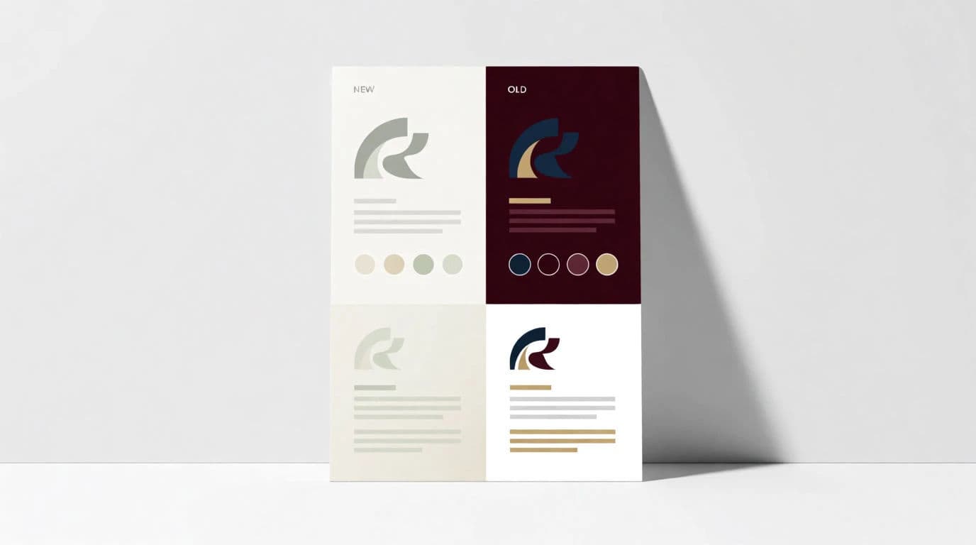
A rebrand lands hardest as a comparison. Recreate the current look for each touchpoint alongside the new one so the shift is unmistakable. Keep the framing identical between the two so the eye compares the design, not the angle.
Keep every mockup on the new system
Consistency is the proof that the new brand is a system, not a mood. Check that the palette, styling, and tone match across every touchpoint, and refine any that drift. Reuse the same descriptive language across prompts to hold it steady.
Size for the deck and export in HD
Adapt each visual to your slide format so nothing crops, and export in HD so the mockups stay crisp when projected. Order the touchpoints to build toward your strongest example.
The same company's identity, before and after the rebrand.
What makes a great rebrand presentation
| Quality | What it means | Why it matters |
|---|---|---|
| Real touchpoints | The brand shown where it will live | Stakeholders judge the identity in context |
| Clear comparisons | Before and after with matched framing | The improvement is obvious, not argued |
| System consistency | Every mockup shares the new rules | The rebrand reads as a system, not a whim |
| Presentation polish | Crisp visuals sized for the deck | The work feels credible and final |
Morphic vs mocking up by hand
| Morphic | Manual design mockups | |
|---|---|---|
| Cost | One browser tool | Design software and designer hours |
| Time | A full touchpoint set in a session | Days of building each mockup |
| Skill needed | Write a clear prompt | Mockup templates and design skill |
| Consistency | Same system across every mockup | Manual drift between surfaces |
FAQs
Choose the few that matter most to your stakeholders, such as signage, packaging, digital, and social. A focused set of strong mockups persuades better than trying to show everything.
It helps a lot. Showing the current look next to the new one, with matched framing, makes the improvement obvious rather than something you have to argue.
Reuse the same descriptive language for palette, tone, and styling across every prompt, then check each mockup and refine any that drift. Consistency is what proves it is a system.
Yes. Generate the identity applied to a real surface, like a storefront or a package, so stakeholders see it in context instead of as a logo on a blank page.
Export in HD and size each visual for your slide format. Starting from a clean generation keeps the mockups crisp when projected on a large screen.
Yes. Visuals you create with Morphic are yours to carry from the presentation into the rollout once the direction is approved.