What is a spa promotion graphic?
A spa promotion graphic is a single designed image that carries one offer, such as a seasonal package, a midweek rate, or a new treatment. Spas, salons, and wellness studios post them to social feeds, email headers, and reception screens, because a calm, well-composed image communicates the mood of the place as much as the deal itself.
With Morphic you describe the offer and the feeling you want, and get a finished layout in your browser. Name the treatment, the headline, the palette, and the imagery in plain language, refine the composition until it reads at a glance, and download in HD.
Settle on one offer
Choose a single promotion for the graphic rather than listing your whole menu. One clear message is what makes a viewer stop scrolling and read the detail.
Write the exact words you need
Decide the headline, the treatment name, and any short supporting line before you generate anything. Give Morphic those exact strings so the design is built around real copy rather than placeholder text.
Describe the mood and palette
Ask for the atmosphere you want, such as warm stone, soft steam, eucalyptus green, or candlelight on water. A spa graphic sells calm, so the palette and imagery should feel unhurried rather than loud.
Set the layout and hierarchy
Tell Morphic which line should dominate and where the supporting text sits, keeping generous space around each element. Clear hierarchy means the offer registers in a second, even on a small phone screen.
Export for every placement
Generate the sizes you actually post, such as a square feed tile, a vertical story, and a wide email banner. Download each in HD, cleared for commercial use and ready to schedule.
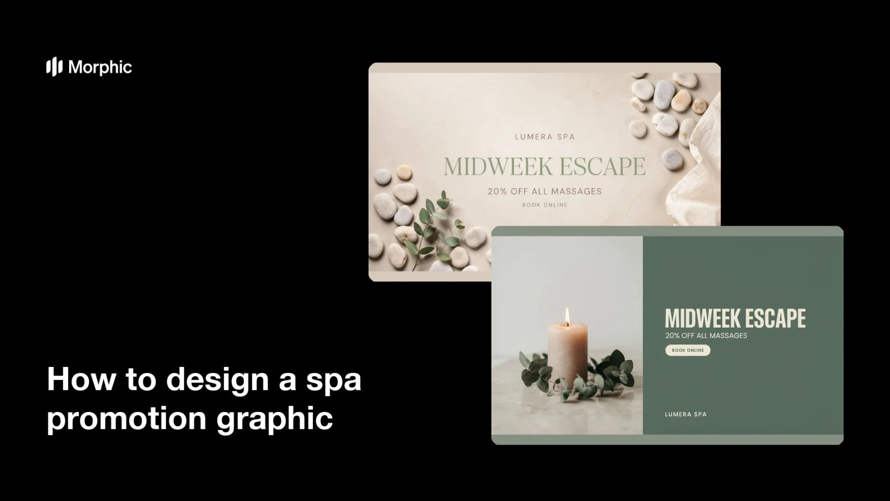
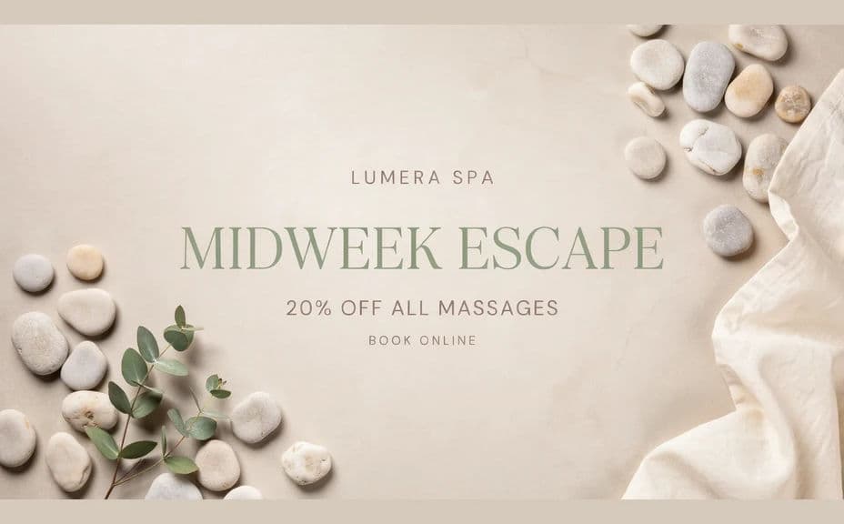
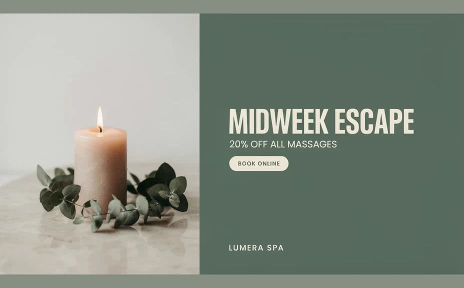
Two layout options for the same spa offer, so you can choose the one that suits the placement.
What makes a good spa promotion graphic
| Quality | What it means | Why it matters |
|---|---|---|
| One clear offer | A single promotion per graphic | A crowded design gets skipped instead of read |
| Calm palette | Soft, natural tones with room to breathe | The look should match how the visit feels |
| Readable text | The headline holds up at thumbnail size | Most people see it small, on a phone, in a feed |
| Consistent branding | The same type, colours, and tone every time | Repeat cues make the spa recognisable at a glance |
Morphic vs the traditional way
| Morphic | Hiring a designer | |
|---|---|---|
| Cost | Available on Morphic | Design fees for every seasonal promotion |
| Time | A finished layout in minutes | Briefing, drafts, and revision rounds over days |
| Skill needed | Describe it in plain language | Layout, typography, and design software skills |
| Consistency | Reuse the same description for each campaign | Style drifts between designers and briefs |
FAQs
Give Morphic the exact wording you want, kept short, and ask for crisp, legible type. Short strings render more reliably than long paragraphs, so trim the copy before you generate.
Yes. Describe your palette, the mood of your type, and the imagery you usually use, then reuse that same description across campaigns so everything stays on brand.
Produce a square for the feed, a vertical for stories, and a wide version for email or a website banner. Generating each size on purpose beats cropping one design and losing the headline.
Both work. A treatment in progress shows the service, while a still life of stones, oils, or foliage sets mood without needing a model release.
One. If you have several packages, make a separate graphic for each so every message gets its own clear headline and its own moment in the feed.
Yes. Downloads come without a watermark and are cleared for commercial use, so they are ready for paid social, email, and print at reception.