What is a webinar promo graphic?
A webinar promo graphic is the image you use to announce a live session across email, social, and landing pages. It carries the essentials at a glance, the topic, the date and time, and often the host, so people know what the event is and when to show up. Marketing teams and event organizers rely on it to drive registrations before the session goes live.
With Morphic you design this graphic from a text prompt in your browser. Describe the layout, the title, the date, and your brand colors, then adjust the wording and download in HD. You get a polished, on-brand promo without opening design software or waiting on a designer.
Set the core details
Write down the exact webinar title, the date and time, and the host name before you generate. Locking these first keeps the text on the graphic accurate and saves you a round of edits.
Describe the layout you want
Open Morphic and describe a clean promo: a bold title, a clear date badge, and space for a speaker headshot or a simple background. Ask for a couple of layout options so you can compare framing and hierarchy.
Apply your brand look
Ask for your brand colors, a matching accent for the date, and a font style that reads well at small sizes. Keep strong contrast between the text and the background so the title stays legible in a crowded feed.
Check the title and date text
Read every word on the graphic and confirm the title, date, and time are spelled and formatted correctly. Regenerate any layout where the type looks cramped or a character is off.
Export and place it
Preview the graphic at the sizes you will post, email header, social card, and landing hero. Download in HD, then drop it into your campaign.
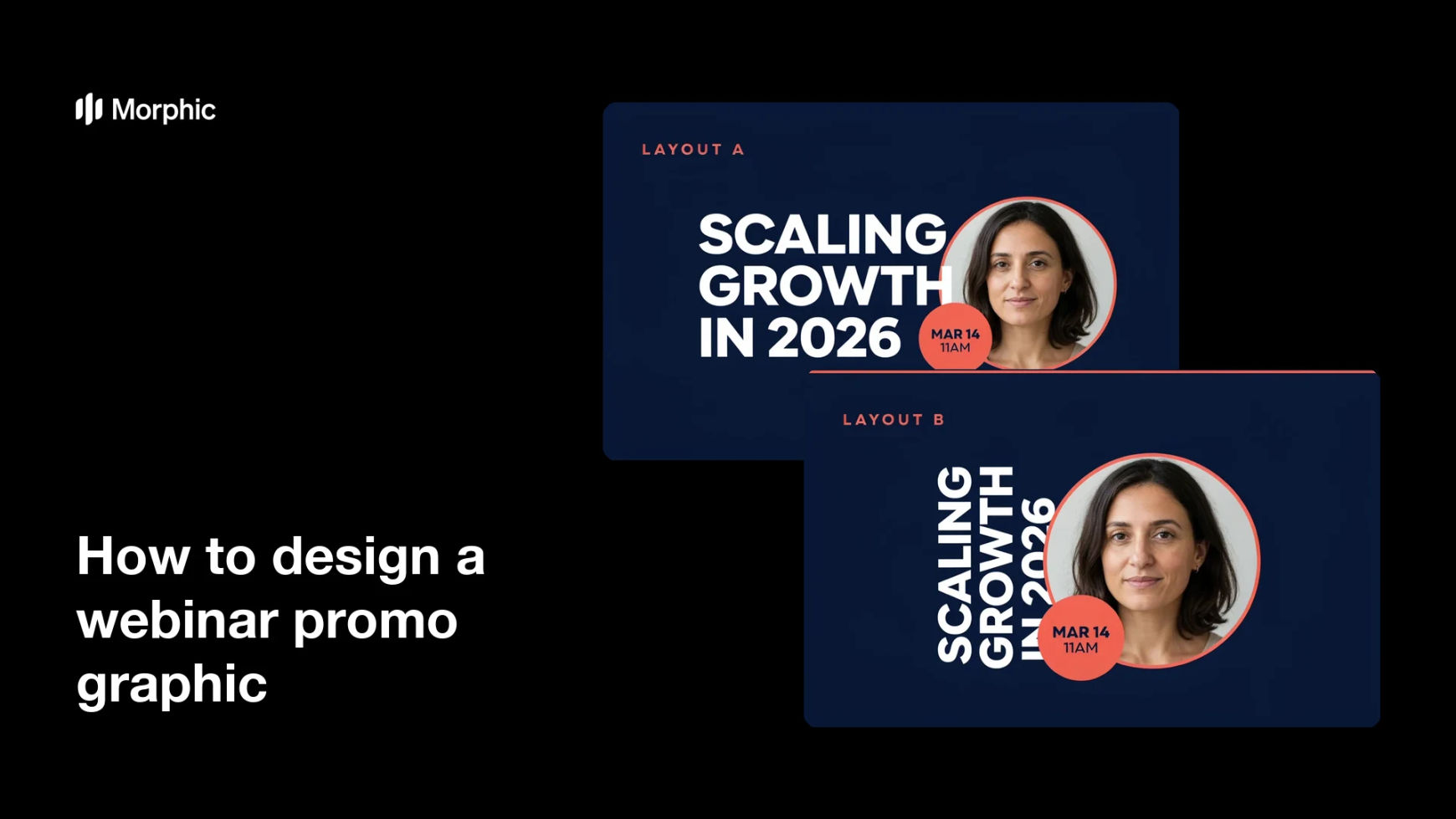
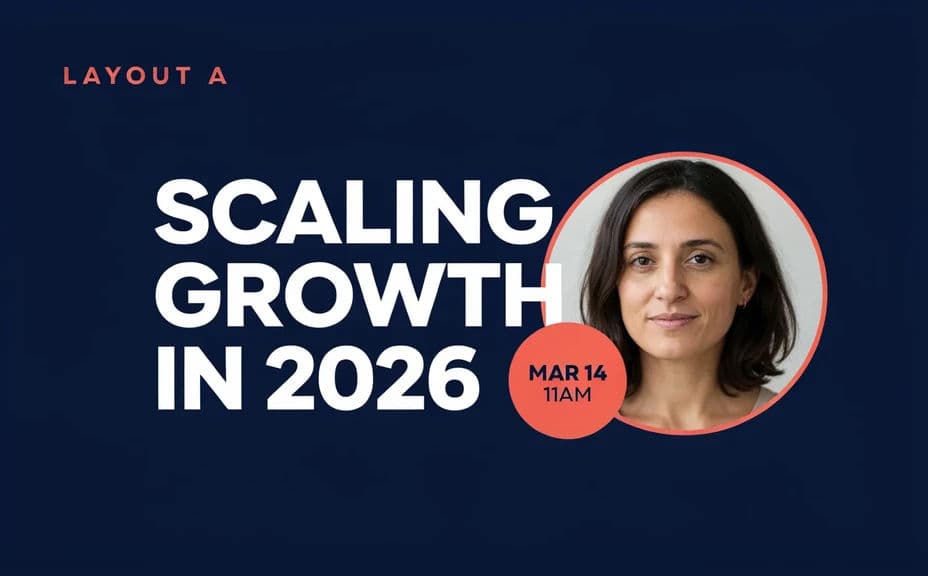
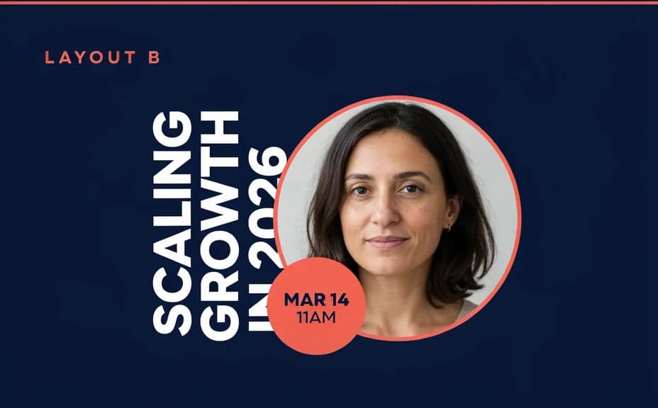
Two layout options for the same webinar promo, each carrying the title and date text.
What makes a great webinar promo graphic
| Quality | What it means | Why it matters |
|---|---|---|
| Clear title | The topic reads in one glance | People decide fast whether it is for them |
| Prominent date | The when is impossible to miss | Fewer no-shows and confused registrants |
| On-brand styling | Colors and type match your brand | The promo looks trustworthy and official |
| Legible at small sizes | Text stays sharp in a feed | The graphic still works as a thumbnail |
Morphic vs the traditional way
| Morphic | Design software or a designer | |
|---|---|---|
| Cost | Available on Morphic | Software subscription or design fee |
| Time | A finished promo in minutes | Hours of layout and revision |
| Skill needed | Describe it in plain language | Layout and typography skills |
| Consistency | Regenerate variations that match | Manual rework for each version |
FAQs
Yes. Provide the title, date, and time in your prompt, then check the rendered text and regenerate if any wording looks off before you publish.
Yes. Describe your brand colors, accent, and font style, and generate the promo to match. Keep contrast high so the text stays readable.
Yes. Describe each placement, email header, social card, or landing hero, and generate a version framed for it. The layout adapts to the shape you ask for.
Yes, if you prioritize legibility. Preview the graphic at posting size, keep high contrast, and regenerate any layout where the type feels cramped.
Describe the new date and regenerate. There is no manual redraw, so keeping the promo current takes moments.
Yes. Graphics you generate with Morphic are cleared for commercial use across your campaigns and marketing.