What is a whitepaper cover?
A whitepaper cover is the first page of a research or thought-leadership document, and often the thumbnail that represents it everywhere it is shared. It carries the title, a subtitle or category, and your branding, so a reader can judge the topic and credibility in a glance. Marketing and content teams treat it as the packaging that decides whether the download feels worth the exchange.
With Morphic you design this cover from a text prompt in your browser. Describe the layout, the title, and your brand look, compare a few options, then download in HD. You get a professional cover that matches your brand without opening design software.
Lock the title and subtitle
Write the whitepaper title and any subtitle exactly as they should appear. Locking the wording first keeps the text on the cover accurate and avoids a second pass of edits.
Describe the cover layout
Open Morphic and describe a clean cover: a bold title, room for a subtitle or category, and a background or graphic that fits the topic. Ask for a couple of options so you can compare hierarchy and mood.
Apply your brand look
Ask for your brand colors, logo placement, and a font style that reads well as a small thumbnail. Keep contrast strong so the title stands out wherever the cover is shown.
Check the title text
Read the title and subtitle on each option and confirm the spelling and formatting are correct. Regenerate any cover where the type looks cramped or a character is off.
Export and use it
Preview the cover at full size and as a small thumbnail to confirm it works at both. Download in HD, then set it as the document's first page and its share image.
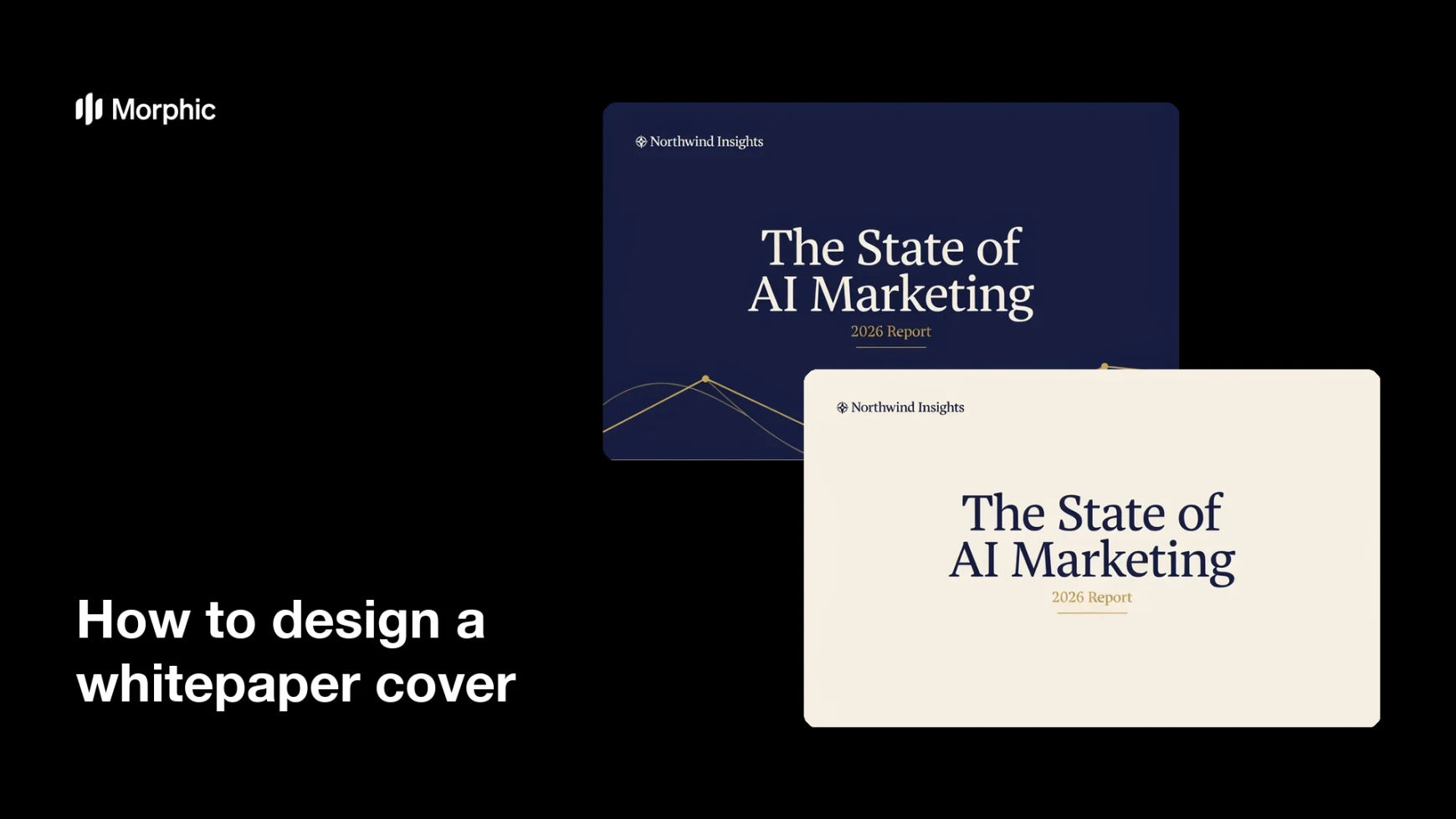
Two cover-design options for the same whitepaper, each carrying the title text.


What makes a great whitepaper cover
| Quality | What it means | Why it matters |
|---|---|---|
| Clear title | The topic reads instantly | Readers judge relevance in a glance |
| Works as a thumbnail | The cover holds up small | It represents the document everywhere it is shared |
| On-brand styling | Colors, logo, and type match | The document looks credible and official |
| Fitting tone | The visual suits the subject | The cover sets the right expectation |
Morphic vs the traditional way
| Morphic | Design software or a designer | |
|---|---|---|
| Cost | Available on Morphic | Software subscription or design fee |
| Time | A finished cover in minutes | Hours of layout and revision |
| Skill needed | Describe it in plain language | Layout and typography skills |
| Consistency | Regenerate options that match | Manual rework for each version |
FAQs
Yes. Provide the title and subtitle in your prompt, then check the rendered text and regenerate if any wording looks off before you publish.
Yes. Ask for several layouts of the same whitepaper and compare them side by side, then pick the one that reads best.
Yes. Describe your brand colors, logo placement, and font style, and generate the cover to match. Keep contrast high so the title stays legible.
Yes, if you prioritize legibility. Preview the cover small, keep high contrast, and regenerate any option where the title feels cramped.
Describe the new title and regenerate. There is no manual redraw, so keeping the cover current is quick.
Yes. Designs you generate with Morphic are cleared for commercial use across your documents and marketing.