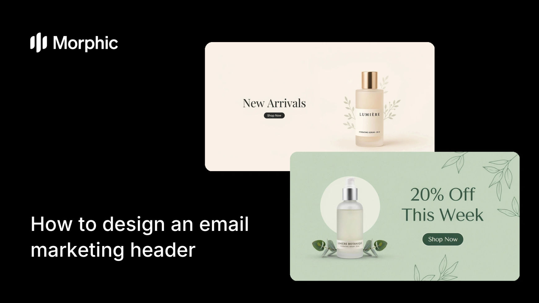
What is an email marketing header?
An email marketing header is the banner image at the top of a campaign email. It sets the tone before a single word is read and decides, in a crowded inbox, whether the message feels worth the reader's time. A sharp, on-brand header lifts the whole email; a generic one drags it down.
Morphic lets you generate a header built for your campaign instead of pulling a stock banner that almost fits. Describe the theme, the mood, and the space you need for a headline, generate options in your browser, refine the best one, and download it in HD. The header matches the email rather than the nearest available image.
Match the header to the email's purpose
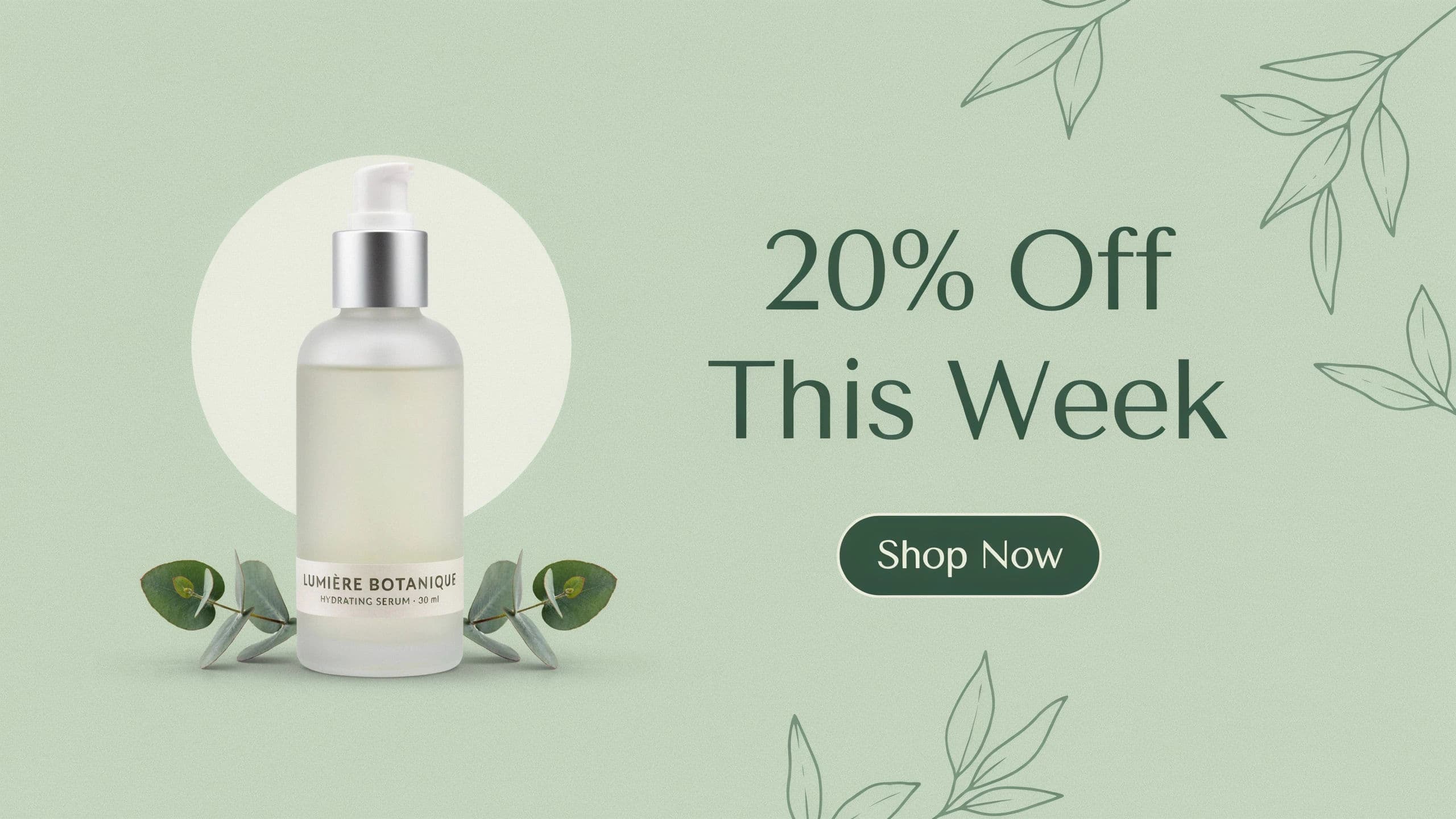
A sale, a product launch, and a newsletter each want a different feel. Decide the email's job first, then design the header to signal it instantly. The banner should tell the reader what kind of email this is before they read a word.
Design around the headline text
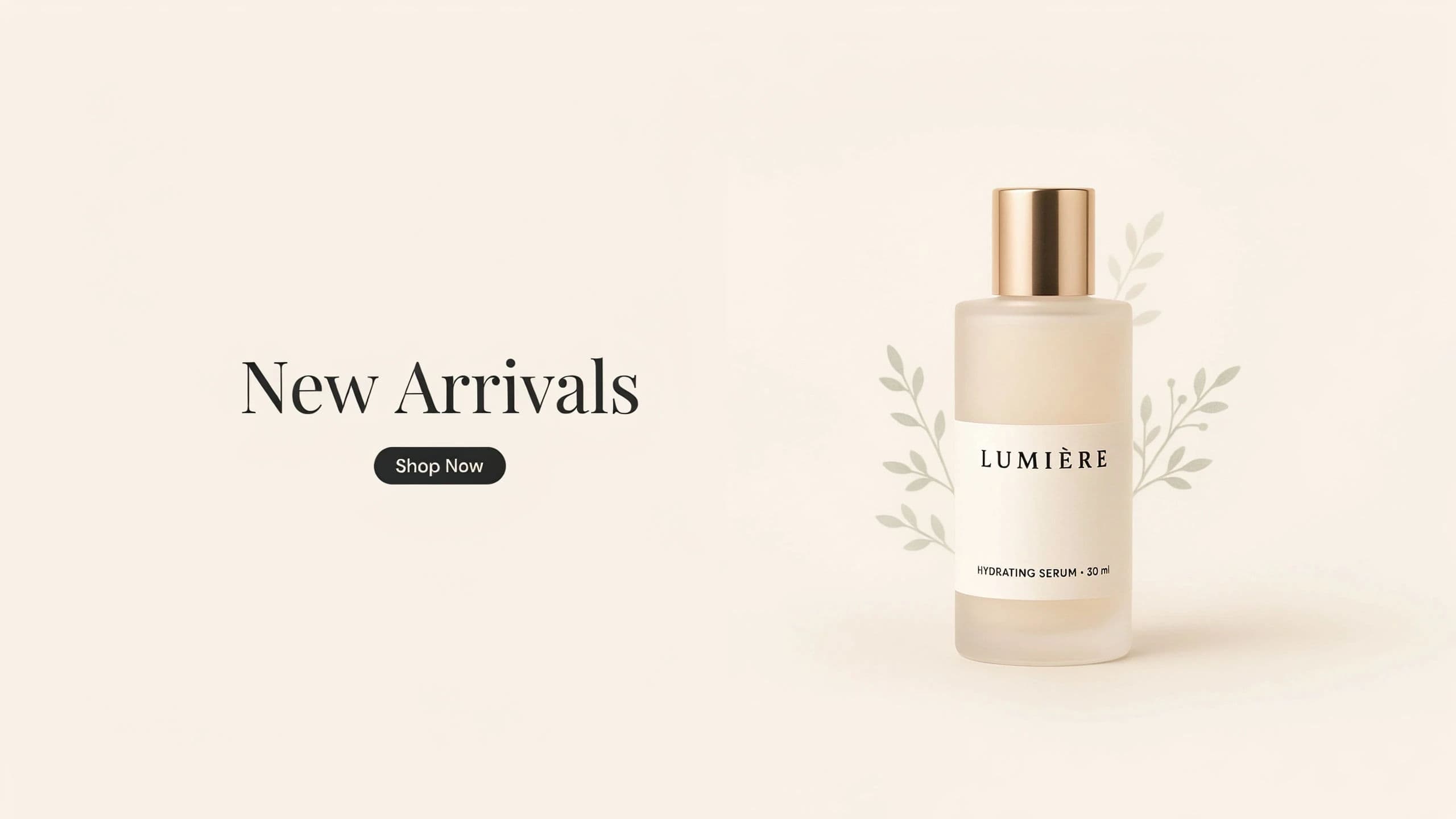
Many headers carry overlaid copy. Ask Morphic to keep one area clean so your headline stays readable, and plan the composition around where the text will sit. Negative space in the right spot is what keeps the message legible.
Generate and refine for brand fit
Describe the scene and mood, generate a few directions, then refine the winner until the palette and tone match your brand. Nudge colors and styling rather than restarting when a direction is close. The header should feel like part of your brand, not an insert.
Size it for inbox and mobile
Most emails are opened on a phone, so the header must read small. Adapt the image to a wide banner ratio and check it stays clear at a reduced size. Export in HD so it renders crisply on high-density screens.
Two header variants in the same brand style.
What makes a great email header
| Quality | What it means | Why it matters |
|---|---|---|
| Purpose signal | The header shows the email's job | Readers grasp the intent before reading |
| Readable text area | Clean space for the headline | The overlaid message stays legible |
| Brand fit | Colors and tone match your identity | The email feels cohesive, not stitched |
| Mobile clarity | Works small in an inbox | Most opens happen on a phone screen |
Morphic vs stock banners
| Morphic | Stock banner libraries | |
|---|---|---|
| Cost | One browser tool | Per-image licenses |
| Time | A custom header in a session | Hours searching for a near fit |
| Skill needed | Write a clear prompt | Search plus editing to fit the layout |
| Fit to campaign | Generate exactly your theme | Settle for the closest stock match |
FAQs
Ask for a clean area where the text will sit and design the composition around it. Negative space in the right place keeps the overlaid headline legible against the image.
Use a wide banner ratio and export in HD. Then check it at a reduced size, because most readers open the email on a phone and the header has to read small.
Yes. Refine the generated header until the palette and tone align with your brand, nudging colors and styling rather than starting over when a direction is close.
No. Design the header to signal each email's purpose, since a sale, a launch, and a newsletter each want a different feel. A matching header sets the right expectation.
Stock forces a compromise on the closest available image. Generating your own means the theme, mood, and text area match your campaign exactly.
Yes. Headers you create with Morphic are yours to use in your marketing emails and campaigns.