What is an esports team logo mockup?
An esports team logo mockup is a presentation of a team's mark as it would actually be seen, on a jersey, a stream overlay, a badge, or a social avatar. It shows the mascot or monogram alongside the team name so people can judge the mark in context rather than as a flat shape on a page. Team owners, org managers, and roster captains use it to align on a direction before anything is printed or coded into a broadcast package.
With Morphic you design this mockup from a text prompt in your browser. Describe the mascot, the colour scheme, the team name, and the surface it sits on, compare a few options, then download in HD. You get a presentable mockup without a design tool or a mockup template pack.
Settle the team name and mascot
Write the team name exactly as it should appear and pick the animal, symbol, or monogram behind the mark. Deciding both first keeps every option you generate on the same idea.
Describe the mark
Open Morphic and describe the logo itself: the mascot's angle, the level of detail, the outline weight, and the two or three colours you want. Ask for a couple of directions so you can compare an aggressive mascot against a cleaner geometric mark.
Place it on a surface
Say where the mark should be shown, such as a jersey chest, a hoodie, a stream banner, or a round avatar badge. Seeing it on a real surface exposes whether the detail survives at that size.
Check legibility and text
Read the team name on each option and confirm the spelling and letter spacing are correct. Shrink the mockup mentally to avatar size and regenerate anything that turns into mush.
Export and share it
Preview the mockup large and small to confirm the mark holds in both. Download in HD, then share the options with the team and generate more variants of the direction that wins.
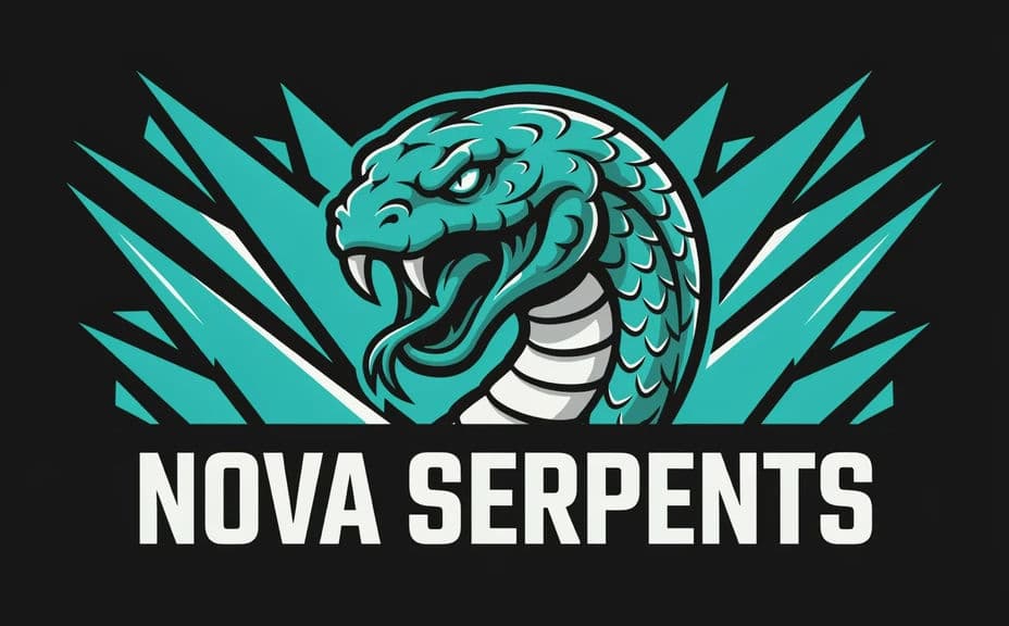
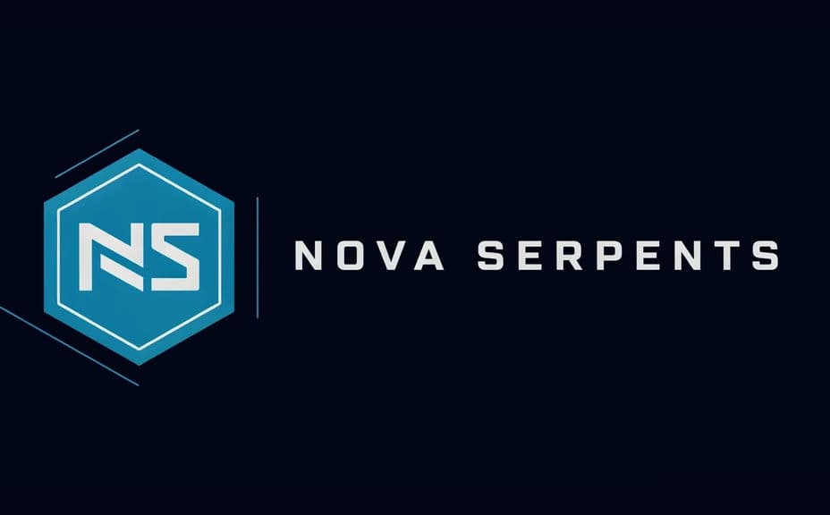
Two logo directions for the same invented team, each shown with the team name.
What makes a good esports team logo mockup
| Quality | What it means | Why it matters |
|---|---|---|
| Reads at avatar size | The mark survives being small | Most viewers see it as a tiny icon |
| Strong silhouette | The shape is recognisable in outline | The team is identifiable mid-stream |
| Correct team name | The wordmark is spelled right | Mistakes get screenshotted and shared |
| Shown in context | The mark sits on a real surface | Everyone judges the same realistic result |
Morphic vs the traditional way
| Morphic | Designer plus mockup templates | |
|---|---|---|
| Cost | Available on Morphic | Design fee and template licences |
| Time | A finished mockup in minutes | Days of drafts and mockup setup |
| Skill needed | Describe it in plain language | Vector and mockup editing skills |
| Consistency | Regenerate matching variants | Manual rework for every surface |
FAQs
Yes. Provide the name in your prompt, then check the rendered text and regenerate if the spelling or spacing is off.
Yes. Ask for several marks for the same team and compare them side by side, then develop the direction that reads best.
Yes. Describe the surface you want in the prompt, and generate the mockup with the mark placed there.
Yes. Name the colours in your prompt and ask for them to lead the mark, then check contrast at small sizes.
It is a mockup for deciding a direction. Once a direction wins, take it to your production files with the visual reference in hand.
Yes. Images you generate with Morphic are cleared for commercial use across your pitches, socials, and merchandise previews.