What is an out of home advert?
An out of home advert is a poster, billboard, or transit ad seen in the physical world, often from a distance and in seconds. That constraint changes everything: it must land one message with a bold image and very few words, because a passerby will not stop to read. Clarity beats detail every time.
Morphic lets you design one from a description while keeping that constraint front of mind. Describe a bold, simple scene with room for a short line of copy, generate options in your browser, refine for impact, and export in HD at the large size the format demands. You get a striking advert without a studio shoot.
Reduce the message to one idea
Out of home works only when a single idea reads in a glance. Decide the one thing the advert must say and cut everything else. A poster that tries to say three things says nothing to someone driving past.
Design for distance and scale
Ask Morphic for a bold subject, high contrast, and a clean background so the image reads from far away. Avoid fine detail that vanishes at scale. Generate a few directions and judge each by whether it works small, since if it reads as a thumbnail it will read on a billboard.
Leave room for a short headline
Plan clear space for a few words of copy. Ask for negative space where the line will sit so the headline stays legible against the image. Keep the copy short enough to absorb in the seconds a viewer has.
Export at large size in HD
Out of home is printed big, so quality matters. Adapt the image to the aspect ratio of your placement, whether a tall poster or a wide billboard, and export in HD so it holds up when enlarged. Check the composition at the final proportions before you send it to print.
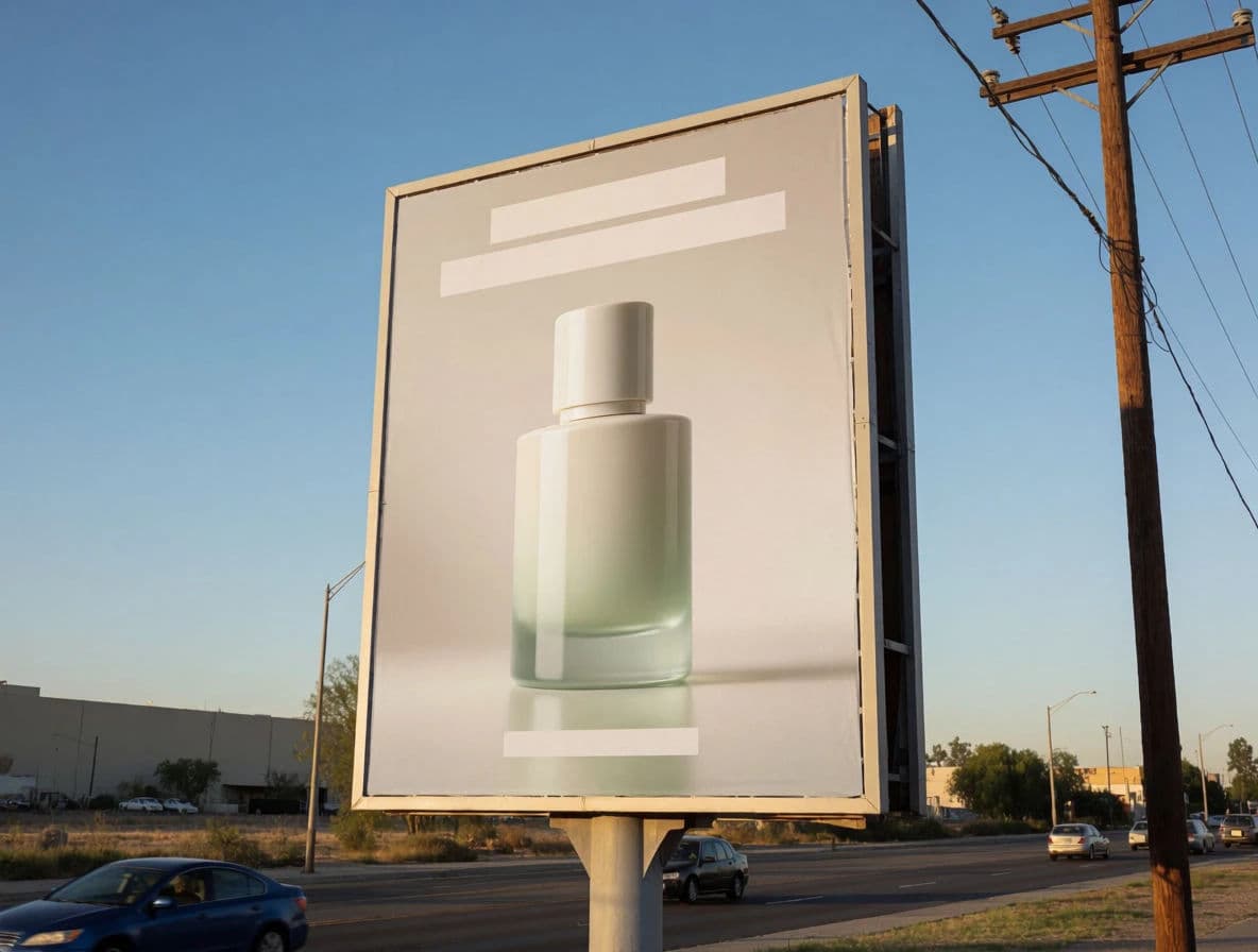
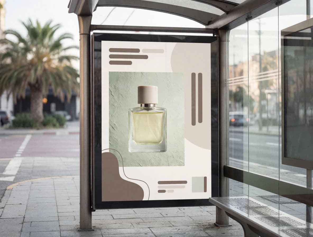
The same advert in two out-of-home placements.
What makes a great out of home advert
| Quality | What it means | Why it matters |
|---|---|---|
| One message | A single idea, clearly stated | It lands in the seconds a viewer has |
| Reads at distance | Bold subject and high contrast | The advert works from across a street |
| Minimal copy | A few words at most | Passersby absorb it without stopping |
| Print-ready scale | Sharp at large size | The image holds up when enlarged |
Morphic vs an agency production
| Morphic | Traditional OOH agency | |
|---|---|---|
| Cost | One browser tool | Concept, shoot, and design fees |
| Time | Concepts in a browser session | Weeks of rounds before artwork |
| Skill needed | Write a clear prompt | Art direction and large-format design |
| Iterations | Generate many directions fast | Limited concepts per budget |
FAQs
As little as possible, ideally a few words. A viewer sees it for seconds and often at speed, so one bold image and a short headline outperform anything wordy.
Ask for a bold subject, high contrast, and a clean background, and avoid fine detail. A quick test is whether the design still reads as a small thumbnail; if it does, it will read on a billboard.
Yes. Adapt the image to the aspect ratio of each placement, from a tall poster to a wide billboard, so the composition frames correctly at each shape.
Export in HD and check the composition at the final proportions before printing. Starting from a clean generation keeps the image holding up at large scale.
Plan negative space for it during generation. Asking for a clean area keeps the short headline legible against the image instead of fighting a busy background.
Yes. Adverts you create with Morphic are yours to run across your out of home placements.