What is a beauty brand flat lay?
A beauty brand flat lay is an overhead photograph of products arranged on a surface, styled with props, texture, and light to sell a mood as much as an item. It is the workhorse image of beauty marketing, filling feeds, banners, press kits, and retailer listings. Brands, salons, and creators rely on it because one well-composed overhead can carry a whole collection in a single frame.
With Morphic you create this shot from a text prompt in your browser. Describe the products, the surface, the props, and the light you want, then adjust the composition and download in HD. You get a styled overhead without renting a studio, sourcing props, or waiting on a photographer.
Choose what belongs in the frame
Decide which products lead and which supporting pieces set the mood, such as a compact, a brush, petals, or a folded cloth. A short, deliberate list keeps the composition calm instead of crowded.
Describe the surface and palette
Open Morphic and name the surface, such as warm marble, brushed linen, or soft matte paper, along with the colour story you want. The background sets the tone before anyone looks at a single product.
Set the light
Ask for the lighting you want, from soft diffused daylight with gentle shadows to a harder directional light for crisp edges. Light is what separates a styled flat lay from a snapshot of objects.
Compose the arrangement
Describe how items sit in the frame, such as a loose diagonal with breathing room or a tight grid with even spacing. Ask for a true overhead angle so nothing skews and the layout stays clean.
Refine and export
Adjust anything that pulls focus, whether that is a prop, a shadow, or the amount of empty space for copy. Download in HD, then use the image across your product pages, ads, and social channels.
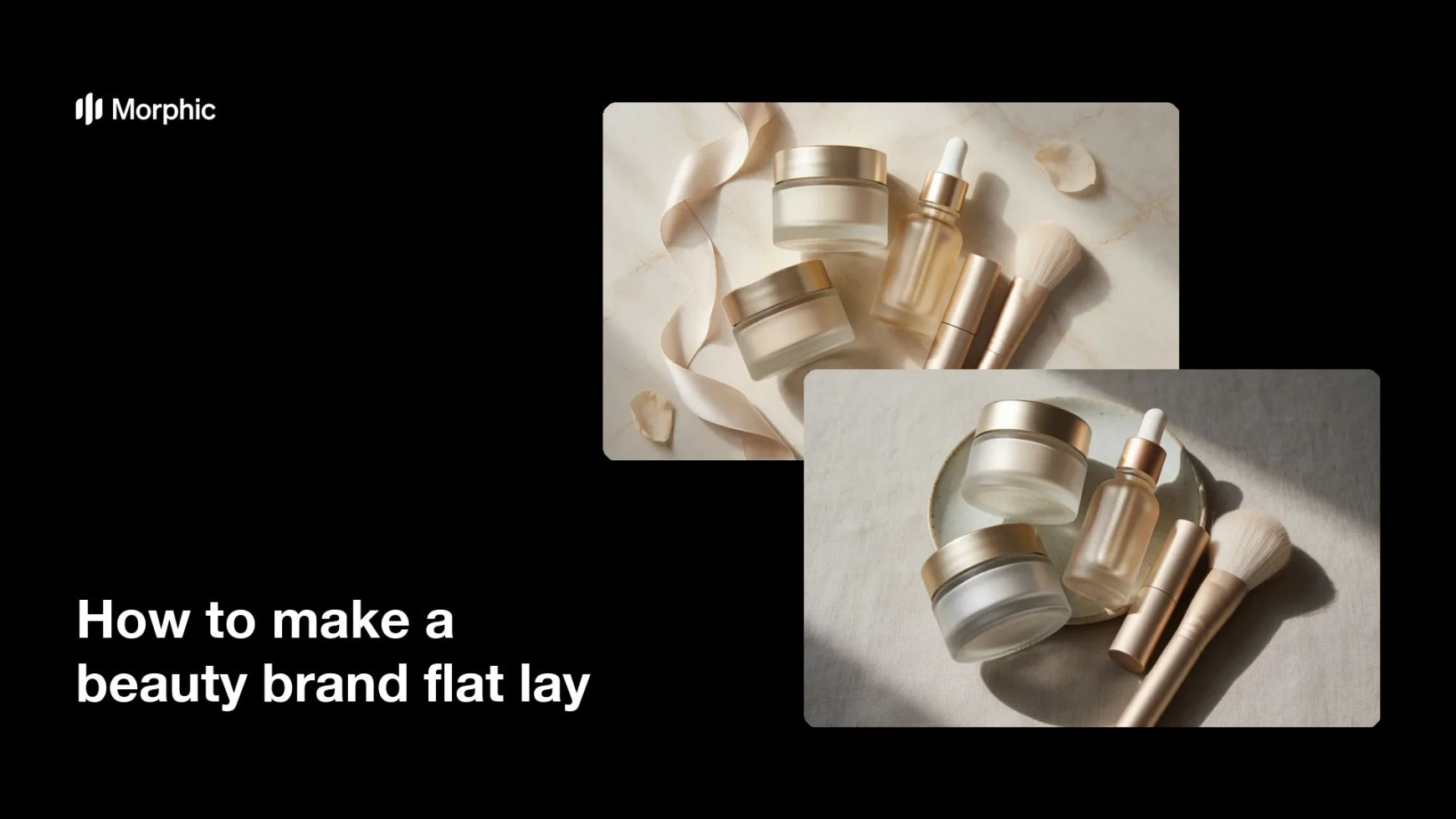
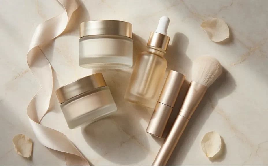
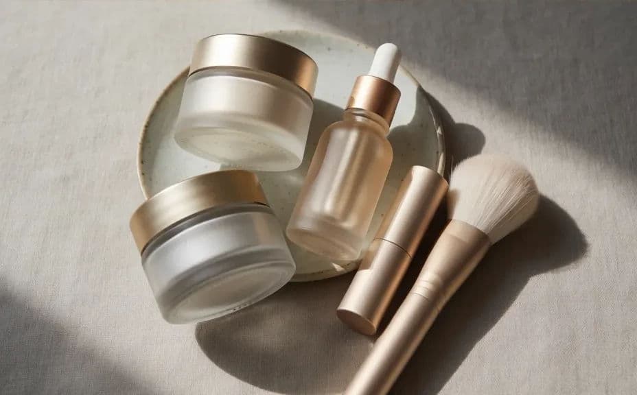
Two styling options for the same beauty brand flat lay, shot from overhead.
What makes a good beauty brand flat lay
| Quality | What it means | Why it matters |
|---|---|---|
| True overhead angle | The camera looks straight down | Products read cleanly with no skew |
| Controlled palette | Surface, props, and packaging agree | The image looks styled, not assembled |
| Soft, shaped light | Shadows fall gently and consistently | Textures and finishes stay believable |
| Room to breathe | Deliberate empty space in the frame | You can drop in copy or a logo later |
Morphic vs the traditional way
| Morphic | A studio product shoot | |
|---|---|---|
| Cost | Available on Morphic | Studio hire, props, and a photographer |
| Time | A finished image in minutes | A day of setup, shooting, and retouching |
| Skill needed | Describe it in plain language | Styling, lighting, and camera skills |
| Consistency | Regenerate a set in one look | Light and styling shift between sessions |
FAQs
Yes. Describe the bottle shapes, caps, finishes, and label style you use, then refine with follow-up prompts until the products match your line.
Enough to tell a story without crowding. Three to seven pieces usually reads well, with supporting props kept minimal.
Yes. Name the surface, such as marble, linen, or matte paper, and list the props you want, and the shot is composed around them.
Yes. Ask for negative space in a specific area, such as the upper third, so you can add a headline or logo afterwards.
Any placement you need. Specify the aspect ratio for a square post, a vertical story, a wide banner, or a print page.
Yes. Images you generate with Morphic are cleared for commercial use across your store, campaigns, and retail listings.