What is a financial chart graphic?
A financial chart graphic is a designed visual that presents figures (revenue, growth, allocation, cost breakdown) as a bar, line, or donut chart with a title and labels. Finance teams, analysts, and marketers use it in reports, decks, pitch documents, and social posts where a table of numbers would be ignored. Its job is presentation: making a set of figures readable at a glance and consistent with the rest of the brand.
With Morphic you design this graphic from a text prompt in your browser. Describe the chart type, the labels, the colour palette, and the mood, compare a few layouts, then download in HD. The figures you supply stay yours to check. Morphic handles the look, not the maths.
Decide what the chart has to say
Write down the single point the graphic should make, such as a trend over four quarters or a split across three categories. A chart with one clear message is far easier to design and far easier to read.
Prepare your labels and figures
List the exact axis labels, category names, and values you want shown, keeping them short enough to fit. Any numbers that appear in an example graphic are illustrative placeholders until you replace them with your own verified figures.
Describe the chart layout
Open Morphic and describe the chart type, the title, the label positions, and how much white space you want around the plot. Ask for a couple of layouts so you can compare which structure reads fastest.
Apply your brand palette
Ask for your brand colours across the series, a readable type style, and strong contrast between the bars or lines and the background. Consistent colour makes a set of charts look like one family rather than four separate files.
Check the labels and export
Read every label, axis marker, and figure on the graphic and confirm the spelling and values match your source. Regenerate anything that looks cramped or incorrect, then download in HD and drop it into your report or deck.
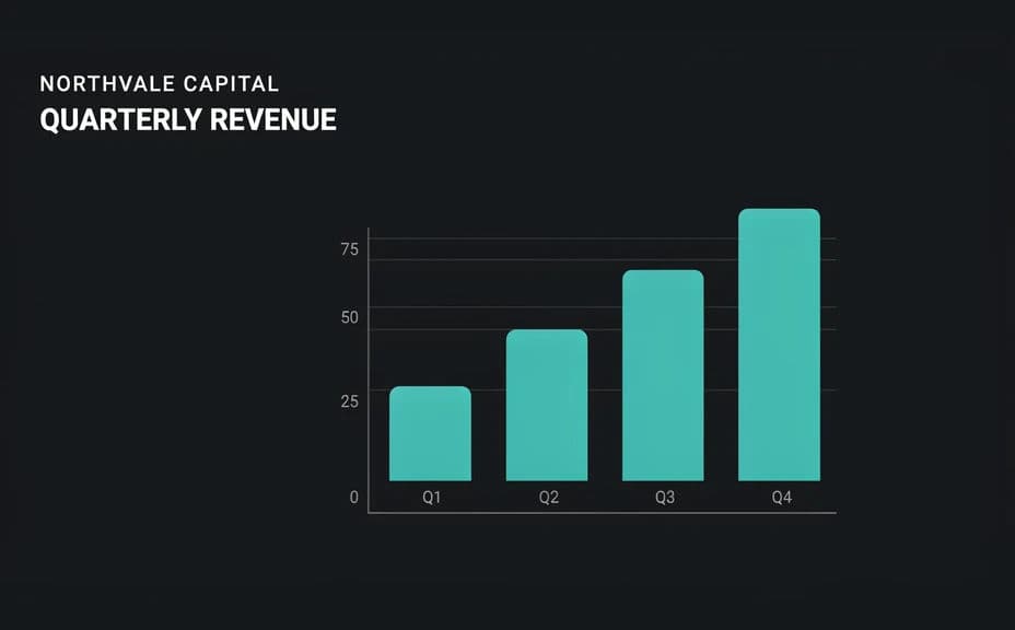
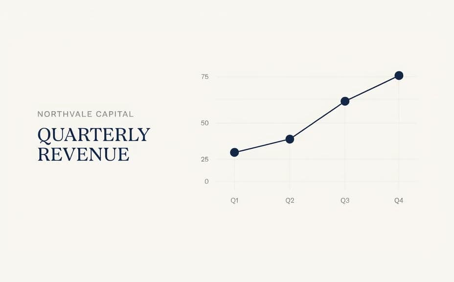
Two layout options for the same illustrative quarterly chart, each carrying its own labels.
What makes a good financial chart graphic
| Quality | What it means | Why it matters |
|---|---|---|
| One clear message | The chart makes a single point | Readers take the meaning in seconds |
| Legible labels | Axis text and figures are crisp | A misread label undoes the whole graphic |
| Honest presentation | Scale and framing are not distorted | Credibility depends on a fair reading |
| On-brand styling | Colours and type match your brand | A set of charts looks like one family |
Morphic vs the traditional way
| Morphic | Design software or a designer | |
|---|---|---|
| Cost | Available on Morphic | Software subscription or design fee |
| Time | A finished graphic in minutes | Hours of layout and restyling |
| Skill needed | Describe it in plain language | Chart design and typography skills |
| Consistency | Regenerate variants that match | Manual rework for every chart |
FAQs
No. Any values shown in an example are illustrative placeholders. Replace them with your own verified figures before you publish or present the graphic.
Yes. Provide the exact axis labels, category names, and title in your prompt, then read the rendered text and regenerate if anything is off.
Bars suit comparisons between categories, lines suit change over time, and donuts suit a simple split. Ask for the one that matches your message.
Yes. Describe your brand colours, type style, and background, and generate the graphic to match. Keep contrast high so the labels stay readable.
Yes. Reuse the same layout and palette description across each chart so the whole set reads as one consistent family.
Yes. Graphics you generate with Morphic are cleared for commercial use across your reports, decks, and marketing.