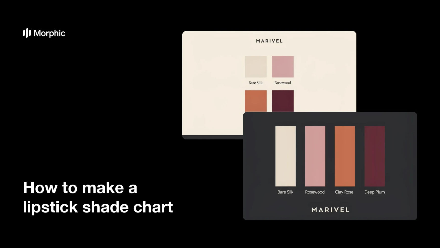
What is a lipstick shade chart?
A lipstick shade chart is a single graphic that lays out a lipstick range as labeled colour swatches so shoppers can compare tones side by side. Each swatch carries the shade name, and often the finish, so the difference between a warm nude and a cool berry is obvious at a glance. Beauty brands, makeup artists, and retailers use it on product pages, in look books, and in social posts to cut the guesswork out of choosing a shade.
With Morphic you build this chart from a text prompt in your browser. Describe the swatch layout, the shade names you want printed, and the palette, then refine the result and download it in HD. You get a clean, on-brand chart without opening design software or photographing every bullet.
List your shades and names
Write out the shades you want on the chart and the exact name for each one. Fixing the wording first keeps the labels accurate and stops you regenerating over a typo.
Choose a layout
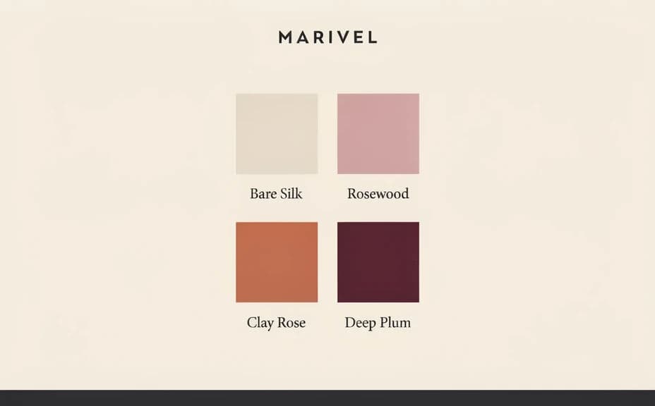
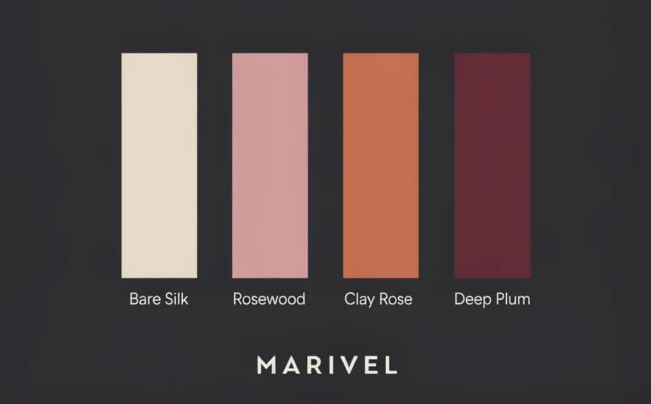
Open Morphic and describe the structure you want, such as a grid of swatch tiles or a row of vertical colour bars with names beneath. Specify the aspect ratio so the chart fits the product page, story, or print sheet it is headed for.
Describe the colours and finish
Name each tone in plain language, such as soft rose nude, brick red, or deep plum, and say whether the finish reads matte, satin, or glossy. Accurate colour description is what makes the chart useful rather than decorative.
Style it to your brand
Ask for your background tone, type style, and spacing so the chart matches the rest of your product imagery. Keep the swatches large and the labels high contrast so nothing gets lost at thumbnail size.
Check the labels and export
Zoom in and confirm every shade name is spelled correctly and sits with its own swatch. Download in HD, then place the chart on your product page or share it in your campaign.
Two layout options for the same lipstick range, each with the shade names printed.
What makes a good lipstick shade chart
| Quality | What it means | Why it matters |
|---|---|---|
| True-to-tone swatches | Each colour reads as the real shade | Shoppers trust what they see before buying |
| Readable shade names | Every label sits with its own swatch | Nobody orders the wrong tone by mistake |
| Even spacing | Swatches are the same size and rhythm | The range looks considered, not assembled |
| On-brand styling | Background and type match your identity | The chart fits your product imagery |
Morphic vs the traditional way
| Morphic | Studio swatching and design software | |
|---|---|---|
| Cost | Available on Morphic | Product samples, a shoot, and design time |
| Time | A finished chart in minutes | Days of swatching, editing, and layout |
| Skill needed | Describe it in plain language | Photography, retouching, and layout skills |
| Consistency | Regenerate the whole range in one style | Colour and lighting drift between shots |
FAQs
Yes. Give the exact shade names in your prompt and they render beside their swatches. Regenerate with new wording whenever the range changes.
As many as stay readable. A grid handles a large range comfortably, while a short row suits a capsule launch or a seasonal edit.
Yes. Describe each tone precisely, or reference a colour you already use, and adjust with follow-up prompts until the swatches match.
Yes. Say whether a shade is matte, satin, or glossy and the swatch renders with that surface, so the chart shows texture as well as tone.
Any placement you need. Specify the aspect ratio for a product page, a story, or a print sheet, and the layout adapts to fit.
Yes. Images you generate with Morphic are cleared for commercial use across your store, campaigns, and retail partners.