What is a perfume product photo?
A perfume product photo is a controlled studio shot of a fragrance bottle, built to make glass, liquid, and cap hardware look considered and expensive. Fragrance brands, retailers, and resellers rely on them for product pages, launch posts, and press kits, because a scent can only be sold through how the bottle looks and what it suggests.
With Morphic you describe the bottle and the set around it and get a finished studio image in your browser. Specify the glass, the liquid tone, the lighting, and the surface in plain language, refine the reflections until they look right, and download in HD.
Describe the bottle precisely
Name the shape, the glass finish, the liquid colour, and the cap material, such as a heavy rectangular flacon with amber liquid and a brushed gold cap. Detail here decides whether the product reads as premium or generic.
Choose the surface and set
Decide what the bottle sits on and what surrounds it, such as polished stone, brushed metal, rippled silk, or damp sand. The set carries the mood of the fragrance without needing a single word of copy.
Direct the lighting
Ask for the light you want on the glass, whether that is a soft window highlight down one edge or a hard directional beam that throws a long shadow. Glass photographs through its highlights, so naming them is what makes the shot look professionally lit.
Control reflections and shadow
Request clean reflections and a grounded contact shadow so the bottle sits in the scene rather than floating. Ask for a gentle reflection on the surface below when you want a more luxurious, showroom feel.
Export the crops you need
Generate a square hero for the product page, a vertical for stories, and a wider version with negative space for banners. Download each in HD, cleared for commercial use.
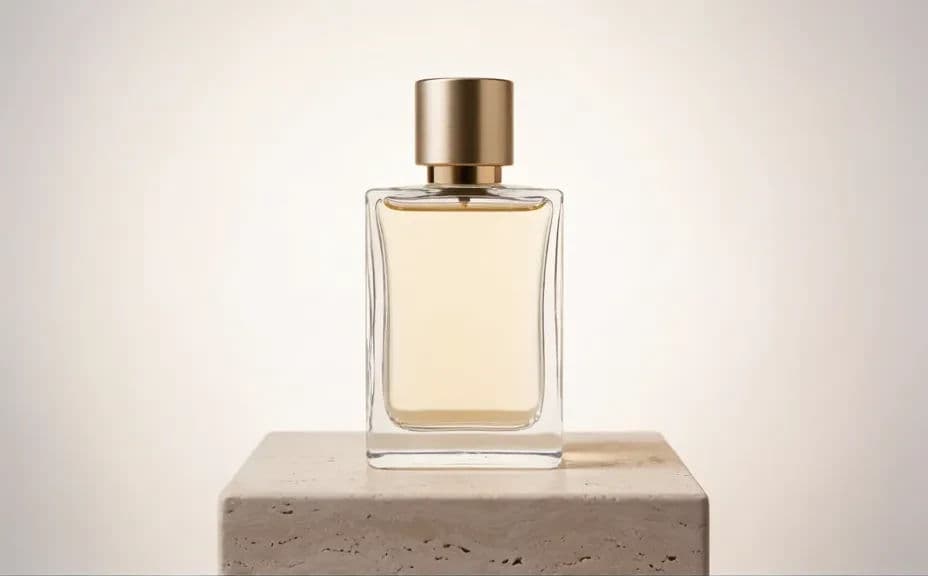
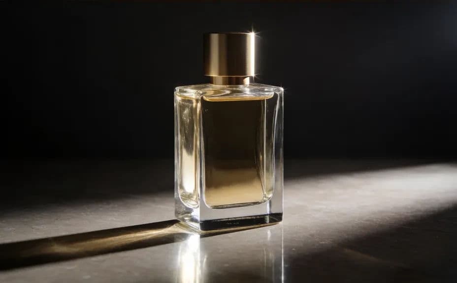
Two lighting and styling options for the same bottle, so you can pick the mood that fits the launch.
What makes a good perfume product photo
| Quality | What it means | Why it matters |
|---|---|---|
| Clean glass | Reflections look deliberate, not messy | Stray highlights make an expensive bottle look cheap |
| Grounded shadow | The bottle clearly sits on the surface | Without contact shadow the product looks pasted in |
| True liquid colour | The fragrance tone matches the real product | Colour shifts create returns and lost trust |
| Considered set | Surface and props suit the scent's character | The staging is what communicates a mood you cannot smell |
Morphic vs the traditional way
| Morphic | A product photography shoot | |
|---|---|---|
| Cost | Available on Morphic | Studio hire, photographer, and set building |
| Time | A finished hero shot in seconds | A shoot day plus retouching turnaround |
| Skill needed | Describe it in plain language | Lighting glass and heavy retouching experience |
| Consistency | Same treatment across a whole range | Setups drift between sessions and photographers |
FAQs
Describe the highlights directly, naming a bright edge along one side and a softer fill on the other. Glass reads as three-dimensional through its reflections, so specifying them is the fastest fix.
A simple surface in a tone that complements the liquid usually wins, such as pale stone for a fresh scent or dark marble for something heavier. Keep props minimal so the bottle stays the subject.
Yes. Reuse the same surface, lighting, and camera angle across every bottle so the range looks like a single collection on your product grid.
A soft reflection adds a premium, showroom feel, while a matte surface with a simple contact shadow feels more natural. Try both and match the one that suits the brand.
Square for the product page, vertical for stories, and a wide crop with space on one side for banner copy. Generate each on purpose rather than cropping a single image.
Yes. Images download without a watermark and are cleared for commercial use, so they suit product pages, marketplaces, and paid social.