What is a product comparison graphic?
A product comparison graphic lays two or more options side by side so shoppers can weigh features, sizes, or tiers at a glance. It is the image that turns a confusing choice into an easy one, and it works hard on listings, landing pages, and ads by helping buyers self-select the right product and buy with confidence.
With Morphic you make this graphic from a text prompt in your browser. Describe the products, the attributes, and your brand look, then adjust and download in HD. You get a legible, professional comparison without opening design software.
Choose what to compare
Decide which products or tiers sit side by side and which attributes matter, features, size, use case, price positioning. A focused set of rows keeps the graphic easy to scan.
Describe the comparison layout
Open Morphic and describe a side-by-side layout: product images or names across the top, attribute rows down the side, and clear cells for each value. Generate a couple of layouts and pick the cleanest.
Highlight the recommended option
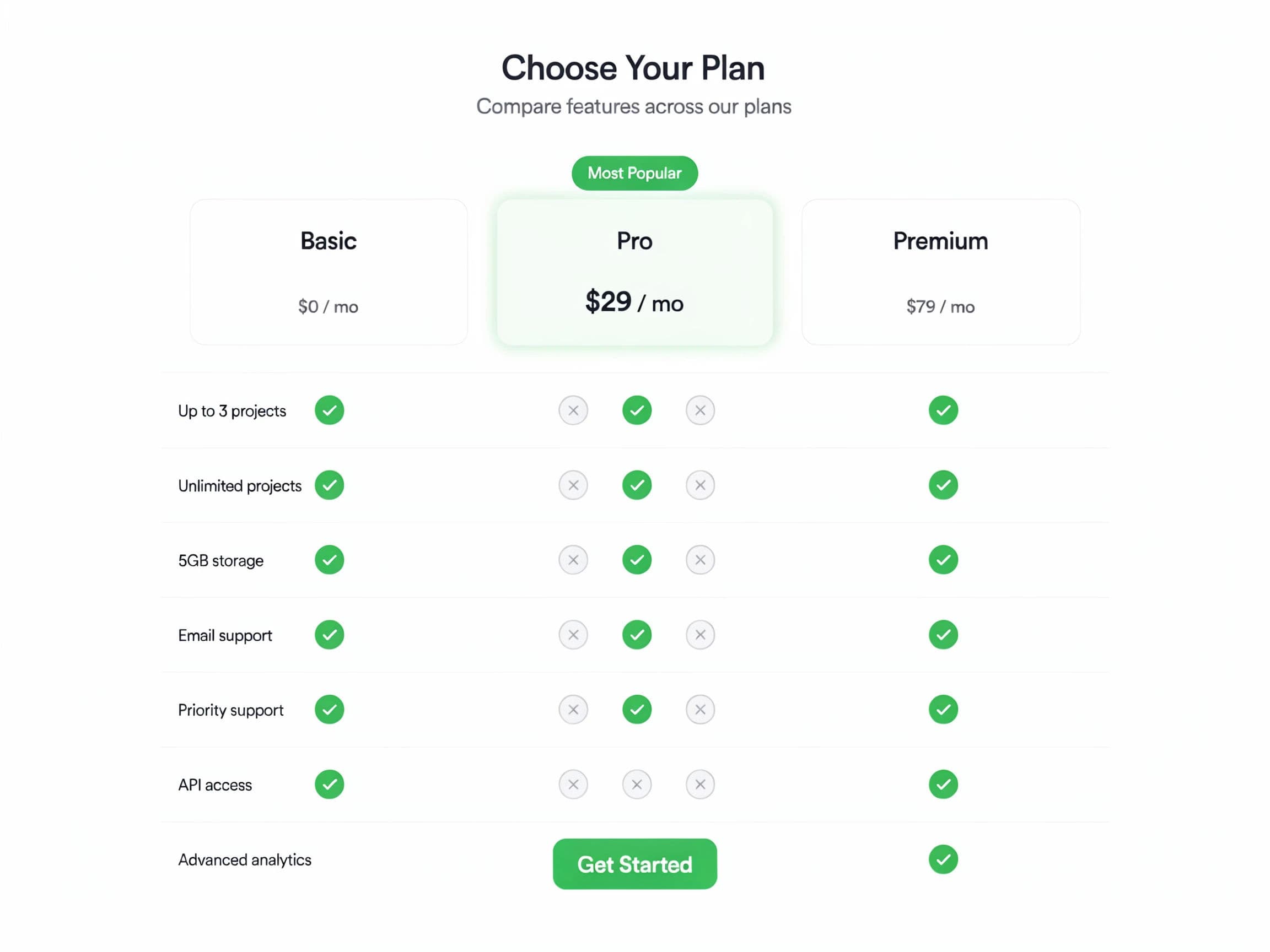
Prompt for one column to stand out, a highlighted header or accent, so buyers see your recommended pick. Guiding the eye reduces decision paralysis.
Apply brand styling and icons
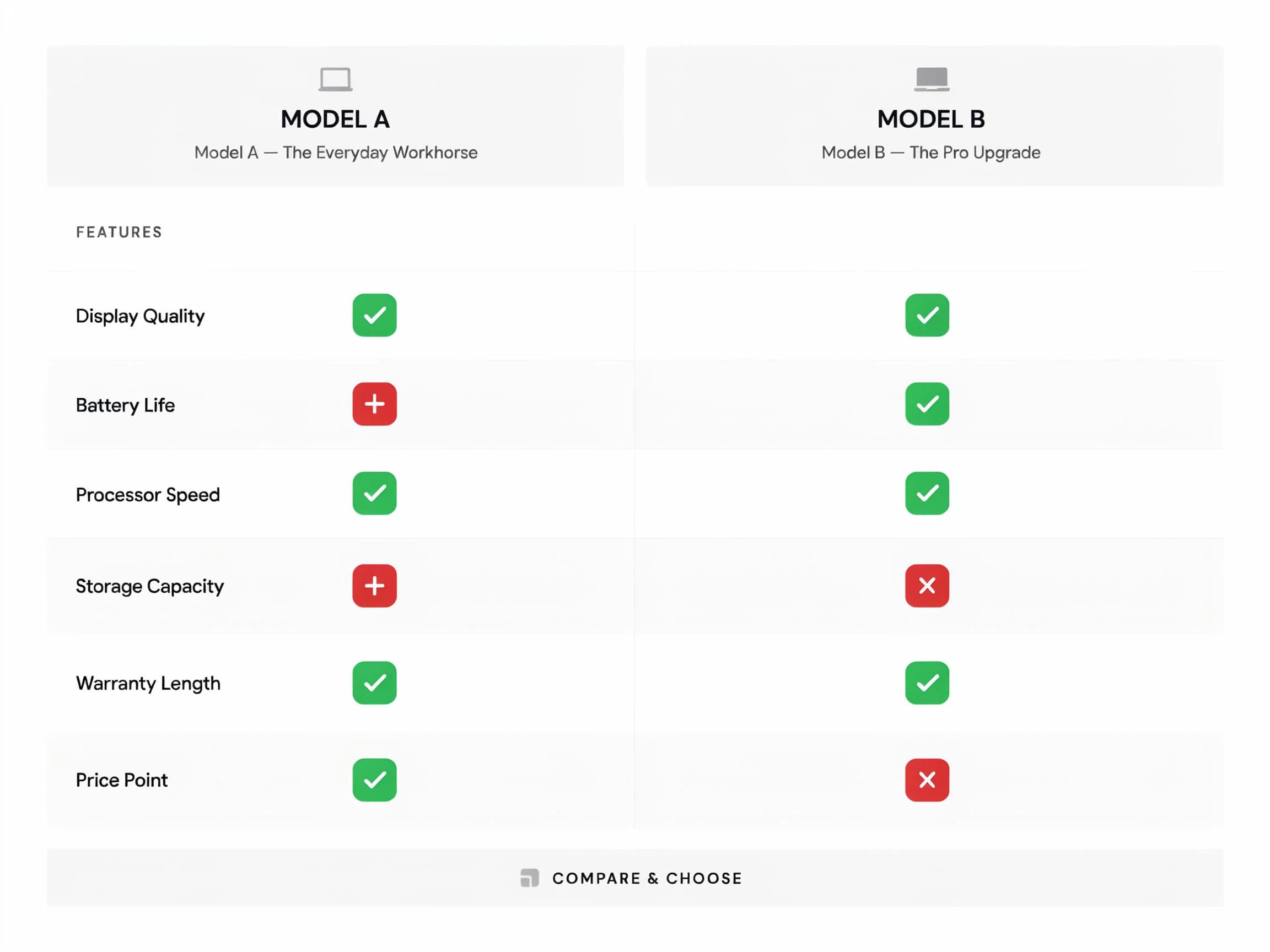
Ask for your brand colors and simple check or tick marks for yes or no attributes so the graphic reads instantly. Keep contrast high so it stays legible on mobile.
Check clarity and export
Preview at the size it will appear and confirm every label and value is readable. Download in HD, then place it on the listing or landing page.
Two comparison layouts: a three-tier column table and a simple two-product face-off.
What makes a great comparison graphic
| Quality | What it means | Why it matters |
|---|---|---|
| Easy to scan | Clean rows and columns | Buyers weigh options in seconds |
| Clear values | Every cell is unambiguous | No misreading that leads to the wrong pick |
| Guided choice | A recommended option stands out | Shoppers decide with less hesitation |
| Legible on mobile | High contrast at small sizes | The graphic works on every screen |
Morphic vs the traditional route
| Morphic | Design software or a designer | |
|---|---|---|
| Cost | Available on Morphic | Software subscription or design fee |
| Time | A finished graphic in minutes | Hours of layout and revision |
| Skill needed | Describe the layout in words | Layout and typography skills |
| Updates | Regenerate with new values | Manual edits for every change |
FAQs
As many as stay readable, usually two to four columns. Focus on the attributes that matter so the graphic is easy to scan rather than crowded.
Yes. Prompt for one column to stand out with a highlighted header or accent so buyers see your recommended pick and decide faster.
Yes, if you keep contrast high and the layout clean. Preview at listing size and regenerate if any cell looks cramped before publishing.
Yes. Ask for simple tick or check marks for yes or no attributes so shoppers read the comparison at a glance.
Describe the new values and regenerate. There is no manual redraw, so keeping the graphic current is quick.
Yes. Graphics you generate with Morphic are cleared for commercial use across your listings and marketing.