
What is a study schedule graphic?
A study schedule graphic is a visual weekly plan that maps subjects and revision blocks against days and time slots. Students use it above a desk, teachers hand it out before exam season, and tutors share it so families can see the plan at a glance. It works because a laid-out grid makes gaps and overloaded days obvious in a way a list never does.
With Morphic you make that planner from a text prompt in your browser. Describe the days, the time bands, the subject colours, and the layout you want, then adjust and download in HD. You get a clean, printable schedule without wrestling a spreadsheet into shape.
Map the week first
Write down the days you are covering, the time bands, and the subjects with the hours each one needs. Sorting the plan before you generate means the graphic only has to display a decision you have already made.
Describe the layout
Open Morphic and describe a weekly planner: days across the top, time slots down the side, and coloured blocks for each subject with the subject name inside. Ask for two layout options so you can compare a grid against a column-per-day treatment.
Choose a colour system
Assign one colour per subject and keep it consistent down the whole schedule, with breaks in a lighter neutral. A steady colour code lets you read the week's balance without reading a single label.
Check the labels and slots
Read each day heading, time band, and subject label and confirm they match your plan. Regenerate any version where labels overlap, a slot is missing, or the type is too small to read from a desk.
Export and pin it up
Preview the schedule at the size you will use, A4 for a folder, A3 for a wall, or a phone wallpaper crop. Download in HD, then print it or set it as your lock screen.
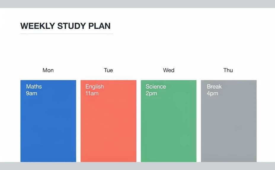
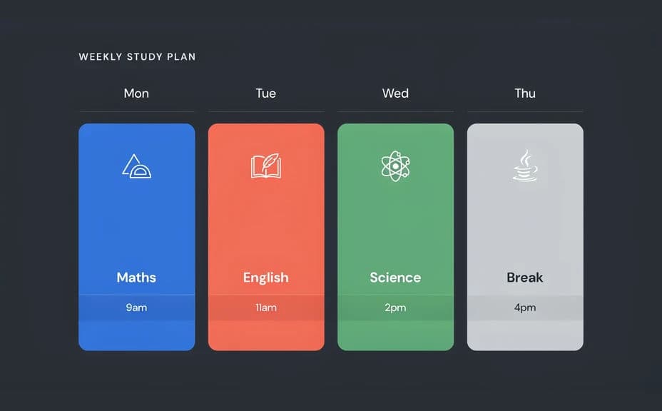
Two design options for the same weekly study plan, each showing the subject blocks and time labels.
What makes a good study schedule graphic
| Quality | What it means | Why it matters |
|---|---|---|
| Readable grid | Days and time slots line up clearly | You find today's plan in a second |
| Consistent colour code | One colour per subject throughout | The week's balance is visible at a glance |
| Honest spacing | Breaks and gaps are shown, not hidden | The plan stays realistic enough to follow |
| Large labels | Subject names read from across a room | The schedule works pinned above a desk |
Morphic vs the traditional way
| Morphic | Spreadsheets or hand drawing | |
|---|---|---|
| Cost | Available on Morphic | Software subscription or planner purchase |
| Time | A finished planner in minutes | An evening of formatting cells |
| Skill needed | Describe it in plain language | Spreadsheet or layout skills |
| Consistency | Regenerate a matching planner each term | Manual rework every time the plan changes |
FAQs
Yes. Give the days, time bands, and subject names in your prompt, then read the rendered labels and regenerate if anything is wrong.
Yes. Name a colour for each subject and ask for it to stay consistent across the whole grid.
Yes. Describe a monthly grid instead of a weekly one and generate it in the same style so both planners match.
Yes, if you download in HD and preview at final size. Check the smallest labels before printing a wall copy.
Yes. Ask for a tall crop sized for a phone screen and keep the labels large so the plan stays readable.
Yes. Images you generate with Morphic are cleared for commercial use, including printed classroom materials.