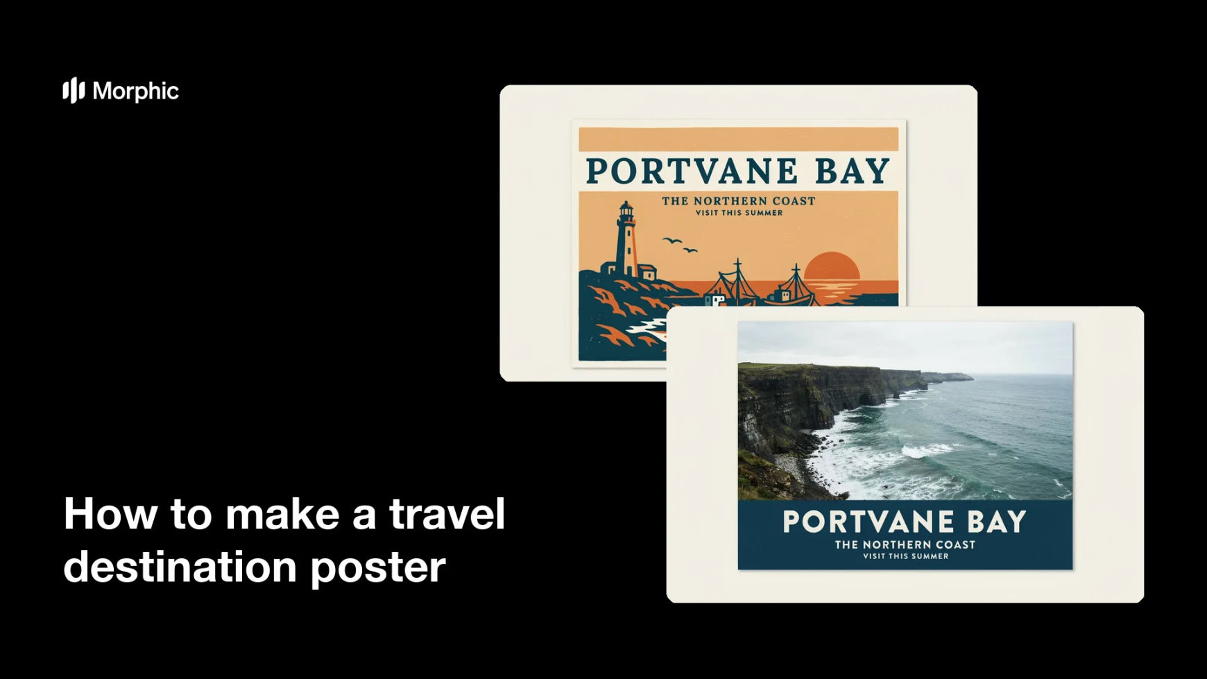
What is a travel destination poster?
A travel destination poster is a single illustrated or photographic panel that sells a place in one glance. It pairs a strong view of the destination with the place name and a short line of type, in the tradition of railway and airline travel posters. Tourism boards, hotels, tour operators, and print shops use them for campaigns, walls, and merchandise.
With Morphic you make a travel destination poster from a text prompt in your browser. Describe the destination, the art style, and the words you want on the poster, then refine the layout and download in HD. You get a print-ready panel without hiring an illustrator or opening design software.
Choose the destination and view
Open Morphic and name the place along with the specific view you want, such as a coastline, a mountain range, or a city skyline. A single clear landmark reads better on a poster than a crowded scene.
Pick the art style
Describe the look you want, from flat mid-century travel illustration to a bold photographic treatment. The style sets the mood faster than any other choice on the poster.
Set the type
Give the exact words you want rendered, usually the place name and a short subtitle, and ask for crisp, legible lettering. Keeping the text short helps it stay readable from across a room.
Balance the layout
Ask for clear space between the artwork, the title, and the poster edges so nothing feels cramped. Review the result and shift the title higher or lower until the composition settles.
Export and print
Confirm the spelling, the colours, and the margins at full size before you finish. Download in HD, then send it to print or use it across your campaign.
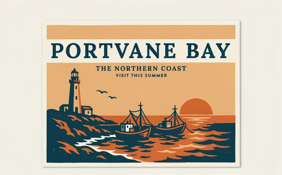
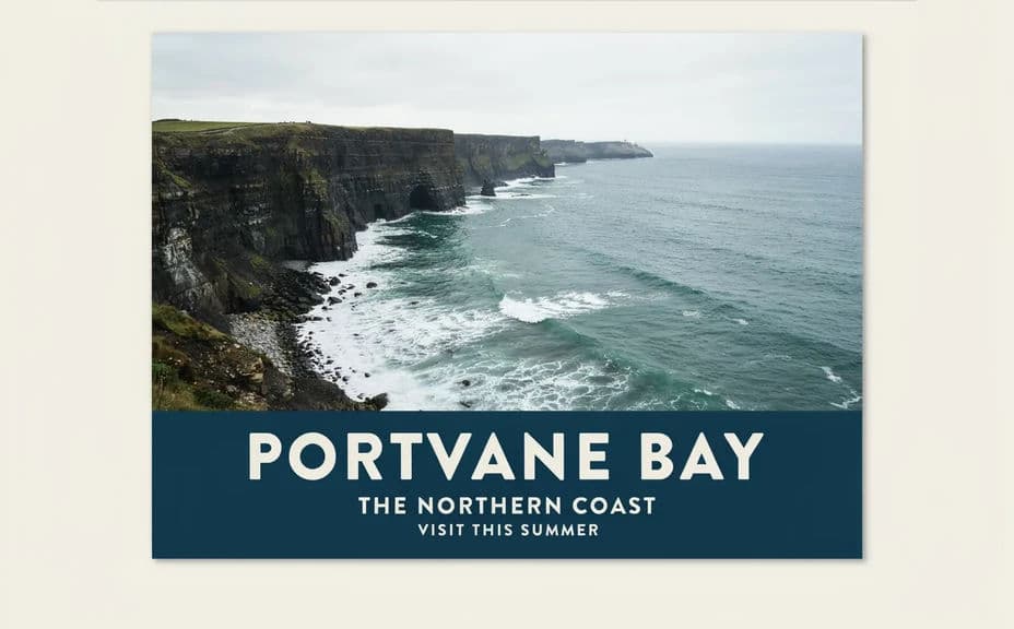
Two poster designs for the same destination, with different layouts and colour treatments.
What makes a good travel destination poster
| Quality | What it means | Why it matters |
|---|---|---|
| One clear subject | A single landmark or view leads the frame | The destination reads from a distance |
| Legible type | Short, correctly spelled, well spaced | The place name is the point of the poster |
| Strong palette | A few colours used with intent | The poster feels designed, not assembled |
| Clean margins | Art and text sit inside safe edges | Nothing is lost when the poster is trimmed |
Morphic vs the traditional way
| Morphic | Hiring an illustrator or designer | |
|---|---|---|
| Cost | Available on Morphic | Illustration and design fees per poster |
| Time | A finished poster in minutes | Days or weeks of briefs and revisions |
| Skill needed | Describe it in plain language | Illustration and layout skills |
| Consistency | Regenerate a matching poster for every destination | Each poster is redrawn from scratch |
FAQs
Yes. Give the exact words in your prompt and ask for crisp, legible lettering, then check the spelling at full size before you download.
Yes. Keep the same style, palette, and layout description across prompts, and change only the place, so the posters work together as a series.
Yes, if you download in HD and leave clear margins around the artwork and type. Ask for extra space at the edges when you plan to trim or frame it.
Yes. Describe the era and treatment you want, such as flat mid-century shapes and limited colours, and the design follows that direction.
Regenerate with the exact strings repeated in the prompt and ask for short, correctly spelled text. Fewer words give a cleaner, more reliable result.
Yes. Designs you create with Morphic are cleared for commercial use across your campaigns, prints, and merchandise.