What is an educational infographic?
An educational infographic explains one concept visually, breaking it into labelled sections a learner can follow without a teacher narrating every step. It combines a heading, a few short labels, and simple diagrams or icons so the structure of an idea is visible at a glance. Teachers, tutors, and course creators use them for handouts, wall displays, revision sheets, and slide inserts.
With Morphic you build that infographic from a text prompt in your browser. Describe the concept, the sections you want, and the labels that should appear, compare a couple of layouts, then download in HD. You get a printable, share-ready graphic without laying out a single box by hand.
Reduce the concept to a few sections
Decide on three to five sections and the short label for each one before you generate. An infographic that tries to cover everything stops being readable, so trim first.
Describe the layout and the labels
Open Morphic and describe the heading, the number of sections, and the exact short label for each. Say whether you want a column, a cycle, or a stepped flow so the structure matches the idea.
Set the visual style
Ask for a clean palette, simple icons, and generous spacing so each section stays distinct. Keep the style consistent with your other classroom materials so the set feels related.
Proof every label
Read each label and heading closely and confirm the spelling and order are correct. Regenerate any version where text is cramped, duplicated, or hard to read at print size.
Export and share
Preview the graphic at both full size and reduced size to check it survives printing and screen sharing. Download in HD and hand it out, project it, or drop it into your deck.
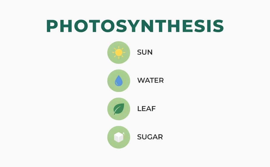
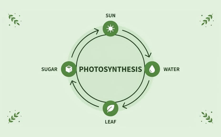
Two layout options for the same educational infographic, each carrying the same heading and section labels.
What makes a good educational infographic
| Quality | What it means | Why it matters |
|---|---|---|
| One clear idea | The graphic explains a single concept | Learners retain a focused message |
| Legible labels | Short text at a readable size | The infographic works printed and projected |
| Logical flow | Sections follow the order of the idea | The eye moves the way the concept does |
| Calm styling | Limited colours and generous spacing | Nothing competes with the information |
Morphic vs the traditional way
| Morphic | Design software or a template | |
|---|---|---|
| Cost | Available on Morphic | Software subscription or design fee |
| Time | A finished infographic in minutes | Hours of drawing and aligning boxes |
| Skill needed | Describe it in plain language | Layout, icon, and typography skills |
| Consistency | Regenerate a matching graphic per topic | Manual rework for every new lesson |
FAQs
Yes. List the heading and each section label in your prompt, then proof the rendered text and regenerate anything that came out wrong.
Three to five works best. Beyond that the labels shrink and the graphic stops being readable at a glance.
Yes. Generate at a portrait page ratio and download in HD so the labels stay crisp on paper.
Yes. Describe the same palette, icon style, and type treatment you use elsewhere so the infographic joins the set.
Regenerate with the correct wording called out in the prompt. Always proof labels before printing a class set.
Yes. Graphics you generate with Morphic are cleared for commercial use, including paid courses and published material.