What is an investment infographic?
An investment infographic is a single graphic that explains an investing concept or a portfolio structure using labelled panels, simple charts, and short captions. Educators, fintech marketers, and communications teams use it to make a dense topic scannable in a social post, a slide, or an explainer page. Its job is to organise ideas visually, not to substitute for the underlying document or the numbers behind it.
With Morphic you design that graphic from a text prompt in your browser. Describe the panels, the labels, and the visual style, compare a couple of layouts, then download in HD. Any figures in a generated graphic are illustrative placeholders, so you replace them with your own reviewed data before publishing.
Write the concept and the labels
Decide the single idea the graphic explains and write the short labels for each panel. A tight label list keeps the layout readable and the rendered text accurate.
Describe the layout in Morphic
Open Morphic and describe the infographic: a headline, three or four labelled panels, and simple chart shapes arranged on a clear grid. Ask for two layouts so you can compare how the information flows.
Apply your brand look
Ask for your brand colors, a restrained palette, and type that stays readable when the graphic is scaled down. Strong contrast matters most, since infographics are often viewed small on a phone.
Treat the figures as placeholders
Read every label and confirm the wording is correct, and remember that any percentages or values shown are illustrative rather than real data. Replace them with figures your team has checked before the graphic is published.
Export and publish it
Preview the graphic at full size and small to confirm the labels stay legible at both. Download in HD, then use it in your post, deck, or article.
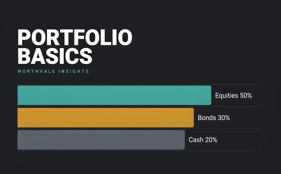
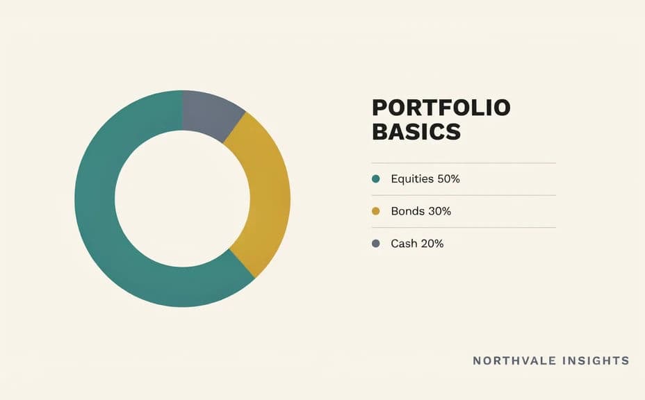
Two layout options for the same investment infographic, each with illustrative placeholder figures.
What makes a good investment infographic
| Quality | What it means | Why it matters |
|---|---|---|
| One clear idea | The graphic explains a single concept | A crowded infographic teaches nothing |
| Legible labels | Short text that reads when scaled down | Most viewers see it small on a phone |
| Honest presentation | Placeholder figures marked as illustrative | Readers should never mistake a graphic for reported data |
| On-brand styling | Colors and type match your other material | Consistency makes the source recognisable |
Morphic vs the traditional way
| Morphic | A designer or charting software | |
|---|---|---|
| Cost | Available on Morphic | Design fee or software subscription |
| Time | A finished layout in minutes | Hours of drafting and revision rounds |
| Skill needed | Describe it in plain language | Layout and information design skills |
| Consistency | Regenerate variants in one style | Manual rebuild for each new graphic |
FAQs
No. Any figures, percentages, or chart values in a generated graphic are illustrative placeholders. Replace them with data your team has verified before you publish.
Morphic makes visuals, not financial advice. Keep the graphic to explaining a concept, and have anything that could be read as a recommendation reviewed by the people responsible for your compliance.
Yes. Give the exact label wording in your prompt, then read the rendered text and regenerate anything that is misspelled or cramped.
Yes. Ask for two or three arrangements of the same content and pick whichever guides the eye most clearly.
They will if you prioritise legibility. Preview the graphic at a small size, keep contrast high, and regenerate any version where the text tightens up.
Yes. Designs you generate with Morphic are cleared for commercial use across your posts, decks, and articles.