Color
Grade the picture in Compose: exposure, white balance, curves, color wheels and LUTs, and how to match shots to each other.
Select a clip and open the 'Adjust' tab in the right panel. This is a colorist's panel rather than a row of filters, so you set what you want rather than picking a look off a shelf.
Grading does two jobs: fixing shots that came out wrong, and making shots that belong together look like they were shot together. Do them in that order.
Basic correction
'Basic correction' is open by default and handles most work:
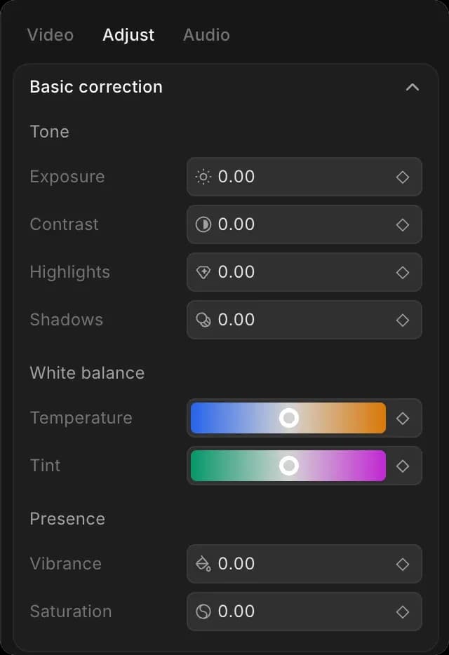
- 'Tone': exposure makes the whole picture brighter or darker, contrast widens the gap between light and dark, and highlights and shadows change the bright and dark parts on their own
- 'White balance': temperature makes it warmer or cooler, tint corrects a green or pink cast
- 'Presence': saturation changes how strong the colors are, vibrance does the same but leaves skin tones alone
Work down that list, because each setting changes what the next one is reacting to:
- Select the clip and open the 'Adjust' tab
- Set 'Exposure' until the picture is the right brightness
- Correct the cast with 'Temperature', then 'Tint'
- Add 'Contrast' if the picture looks flat
- Pull 'Highlights' down if the bright parts are blown out
- Set 'Saturation' or 'Vibrance' last
Hold the backslash key at any point to compare against the original.
Common fixes
| The problem | What to reach for |
|---|---|
| Too dark or too bright overall | Exposure |
| Flat and lifeless | Contrast, then a little vibrance |
| Blue or orange cast | Temperature |
| Green cast from indoor lighting | Tint |
| Bright parts blown out | Highlights down |
| Colors too strong | Saturation down, not vibrance |
| Skin looks wrong after a grade | Hue curves, leaving the rest alone |
Advanced grading
More sections sit below, closed until you need them:
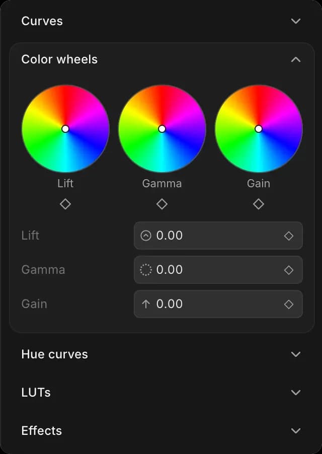
- 'Curves': bend the relationship between input and output brightness, for fine control over exactly where contrast lands
- 'Color wheels': push shadows ('Lift'), midtones ('Gamma') and highlights ('Gain') toward a color independently, which is how you get warm highlights over cool shadows
- 'Hue curves': change one color without touching the others, like cooling a sky and leaving the skin alone
- 'LUTs': load a saved look and apply it in one go, at a strength you set, so it can sit under your own grade rather than replacing it
- 'Effects': sharpen, blur, vignette, film grain, glow and chroma key
Curves also cover the black and white points and gamma, which is where you set how dark the darkest part of the picture should be.
Effects
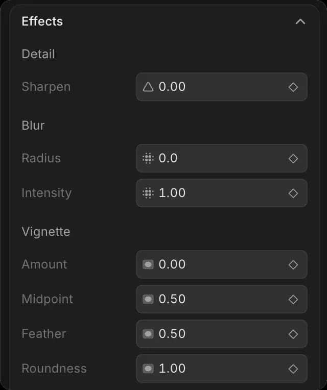
Open 'Effects' at the bottom of the 'Adjust' tab. Every setting has a diamond, so an effect can build across a shot instead of sitting at one strength. See Motion and framing for how keyframes work.
| Effect | What you can set |
|---|---|
| 'Sharpen' | Amount |
| 'Blur' | Radius, intensity |
| 'Vignette' | Amount, midpoint, feather, roundness |
| 'Film grain' | Amount, size |
| 'Glow' | Intensity, radius, threshold, warmth |
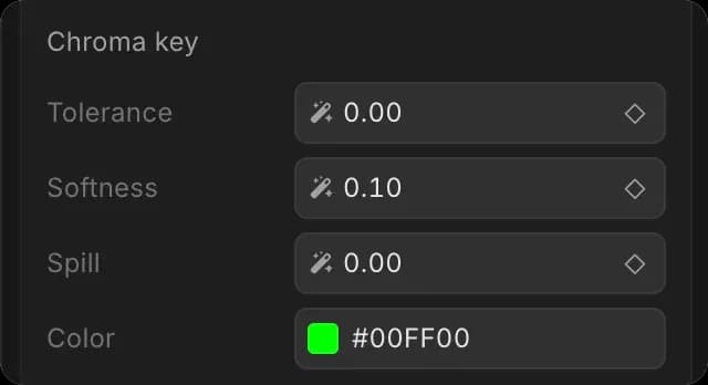
| 'Chroma key' | Color, tolerance, softness, spill |
'Chroma key' is green-screen keying: set 'Color' to the backdrop, raise 'Tolerance' until it disappears, then use 'Softness' for the edge and 'Spill' to remove the green reflected onto your subject. Put the keyed clip on a lane above whatever should show through.
A LUT is a look someone already built. Use one as a starting point and correct the shot underneath it first, or it will land differently on every clip.
Matching shots
Grade one clip until you like it, then bring the others to it. Working shot by shot from scratch is slower and ends up inconsistent.
Hold the backslash key to see the clip without your changes. Let go and they come back. It is the fastest way to tell a grade from a habit, and worth doing before you decide a shot is finished.
Using Copilot
Grading a run of clips the same way is repetitive, which is what Copilot is quicker at. Try 'make all the outdoor shots warmer and lift the shadows a little', or 'match the color on these three clips to the first one'.
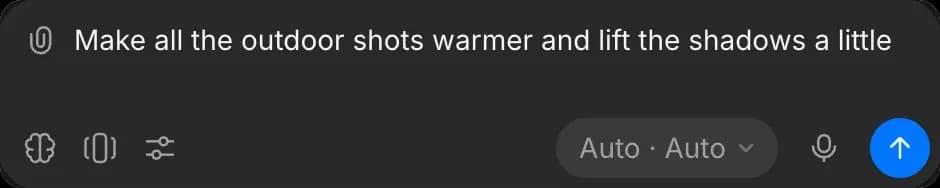
It can also apply a named look across a run of clips, such as film, noir, vintage or teal and orange, then leave each setting open for you to adjust. See Edit with Copilot.
Tips
- Frame and crop before you grade. Cropping changes what the color settings are reacting to.
- Judge color on a calm frame, not the brightest one in the clip.
- Small moves add up. If a setting is at an extreme, something earlier in the order is usually wrong.
That's how you grade in Compose on Morphic. Reach for it when shots that belong together do not look like they were shot together.
If you have any trouble or have any questions, feel free to reach out. We're happy to help. Write to us at support@morphic.com.