What Ideogram 4.6 is for
Ideogram 4.6 is the image model Ideogram released on November 19, 2026. Ideogram built it for precise editing, and it keeps the family's strength in putting exact words into images. That makes it a strong pick for designs that carry copy and get revised: posters, menus, packaging, ads and covers.
On Morphic, Ideogram 4.6 runs on every paid plan, for text to image and for edits, at standard resolution or 2K. Every example in this guide was made on Morphic with Ideogram 4.6, from the prompt shown.
Getting every word right in Ideogram 4.6
Put every word you want printed in quotation marks, and say where each line goes: at the top, below it, in a round badge at the bottom right. Ideogram 4.6 follows reading order well, so list the lines top to bottom.
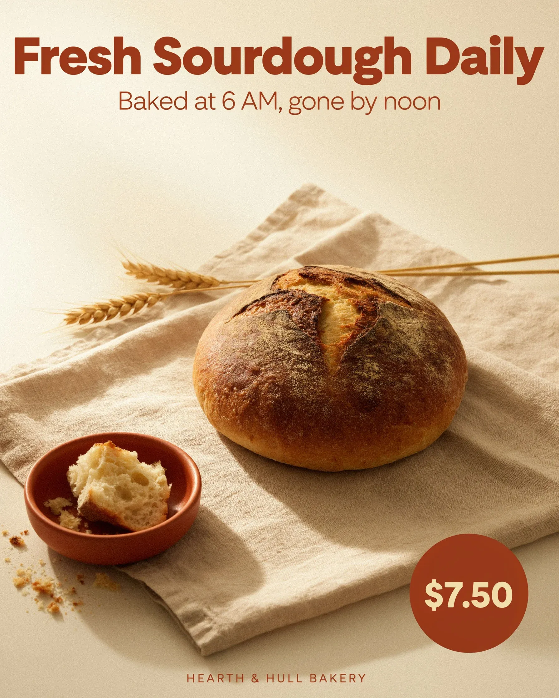
A clean social media ad for a neighborhood bakery. Top: headline "Fresh Sourdough Daily". Middle: subline "Baked at 6 AM, gone by noon". Bottom right: a round price badge reading "$7.50". A crusty sourdough loaf on a linen cloth, soft morning window light, cream and terracotta palette, modern sans-serif type.
Describe the lettering by its look, such as a bold condensed sans or a warm serif, rather than naming a typeface.
Stopping extra text in Ideogram 4.6
Ideogram 4.6 turns a short prompt into a fuller design, and on Morphic that step is always on. The result is often good, but it adds its own lines: the bakery above gained a shop name, and the poster below gained a venue, an address and a cover charge. Close the prompt by saying what else may appear.
 Only these lines
 No limit
Same prompt, one closing sentence apart. Made with Ideogram 4.6.
A bold concert poster for an indoor jazz night. Large headline text at the top reads "MIDNIGHT BRASS". Below it, smaller text reads "Friday 14 March · Doors 8 PM". Deep navy background, warm brass-gold geometric shapes, a stylized trumpet silhouette, flat graphic print look with subtle paper grain. These two lines are the only text in the image: no venue, no address, no prices, no other words.
Proofread every result anyway. An invented line can carry a name, a date or a price that is not yours.
Setting long copy with Ideogram 4.6
Ideogram 4.6 can set a short paragraph, not just a headline. Give it the exact text and a simple layout: a title, a rule, a block of body copy. Keep the paragraph to a few sentences, and leave room around it.
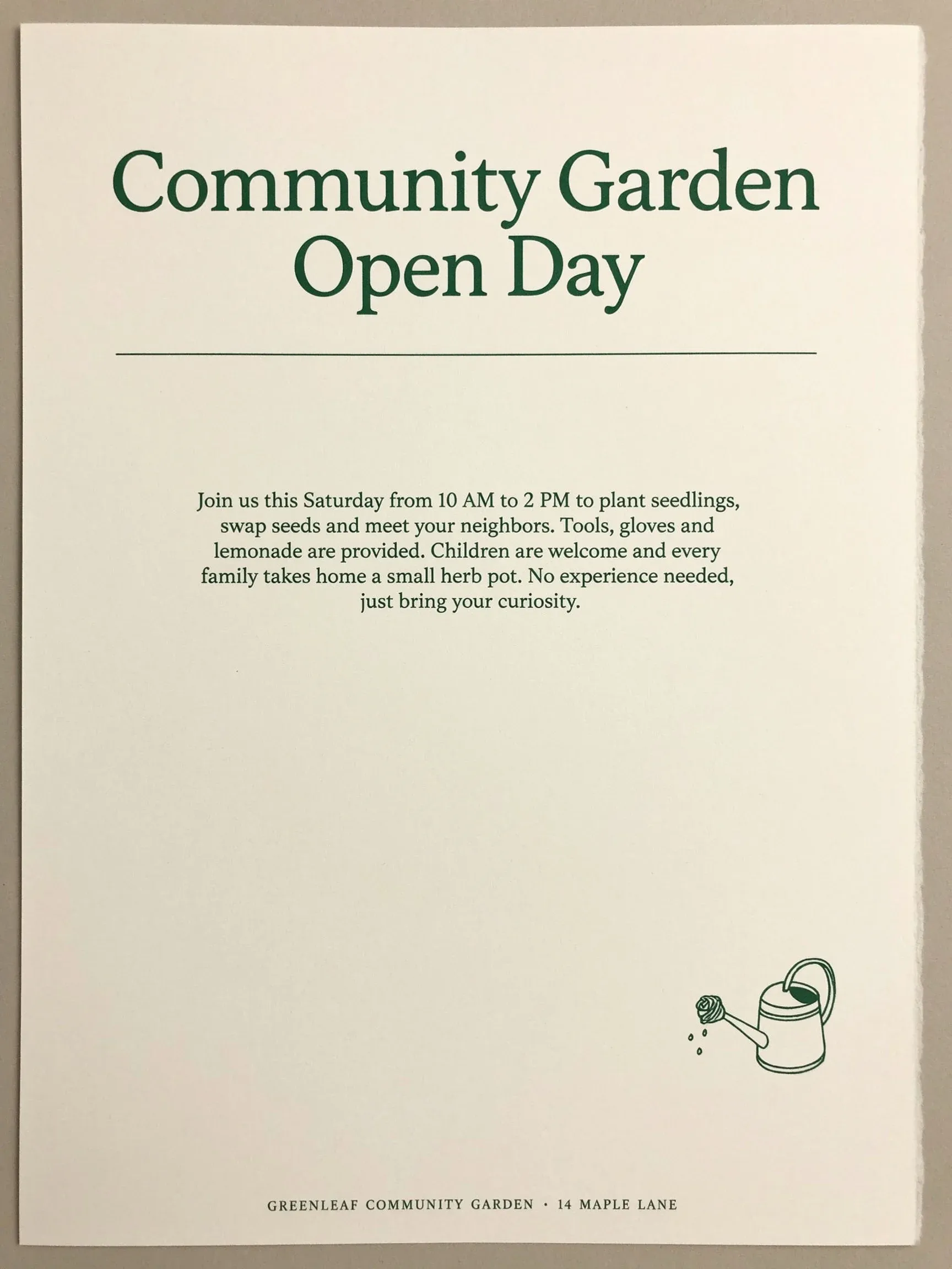
A minimalist printed flyer on an off-white page. Title at top: "Community Garden Open Day". Below the title, a paragraph of body text reads exactly: "Join us this Saturday from 10 AM to 2 PM to plant seedlings, swap seeds and meet your neighbors. Tools, gloves and lemonade are provided. Children are welcome and every family takes home a small herb pot. No experience needed, just bring your curiosity." A small line drawing of a watering can in the bottom corner, dark green ink.
Editing one line of text with Ideogram 4.6
To update copy on a finished design, open it in image to image with Ideogram 4.6 and name the old words, the new words and what stays. Leave the aspect ratio on auto: the image keeps its own shape and runs as a precise edit, which changes the line and leaves the rest of the design in place.
 Edited
 Original
Drag the slider: only the last dish changed. Made with Ideogram 4.6.
Replace the words "Rhubarb tart" with "Lemon posset". Keep the price $8, every other dish, the type and the layout exactly the same.
Pick an aspect ratio only when you want a new shape, such as turning a portrait ad into a square post. The model then rebuilds the layout to fit, so check every line again.
Swapping or recoloring an object with Ideogram 4.6
The same habit works on photos. Name the object, the change and everything that has to stay: the room, the light, the face, the pose.
 Edited
 Original
The sofa changed; the window, table and plant did not. Made with Ideogram 4.6.
Swap the grey linen sofa for a cognac leather sofa of the same size. Keep the room, the table, the plant, the window and the light exactly the same.
Ideogram 4.6 matches the hue of a color you ask for, but in our test an exact hex code came out darker than asked. For brand colors, check the result against your swatch.
Choosing a quality level in Ideogram 4.6
Morphic offers three quality levels for Ideogram 4.6, and resolution is set separately.
| Low | Medium | High | |
|---|---|---|---|
| Best for | Fast drafts and layout tests | Most finished work | Final detail and hero images |
| Text accuracy in our tests | Headline spelled right | Headlines, paragraphs and fine print right | Headline and date line right |
| Default | Yes |
Draft at Low to settle the layout and the words, then run the keeper at Medium or High in 2K.
Ideogram 4.6 limits and good practice
- Proofread every line. Spelling is strong, and invented extra lines are the most common surprise.
- Keep non-Latin scripts short. Arabic and Hindi came out malformed in our tests; accented Latin letters were fine.
- Use 2K for anything you will print or crop.
- Use Ideogram Vector for SVG logos and icons.
- Make one change per edit, and say what stays.
Open the Canvas and run these prompts on Ideogram 4.6 next to another image model to compare.