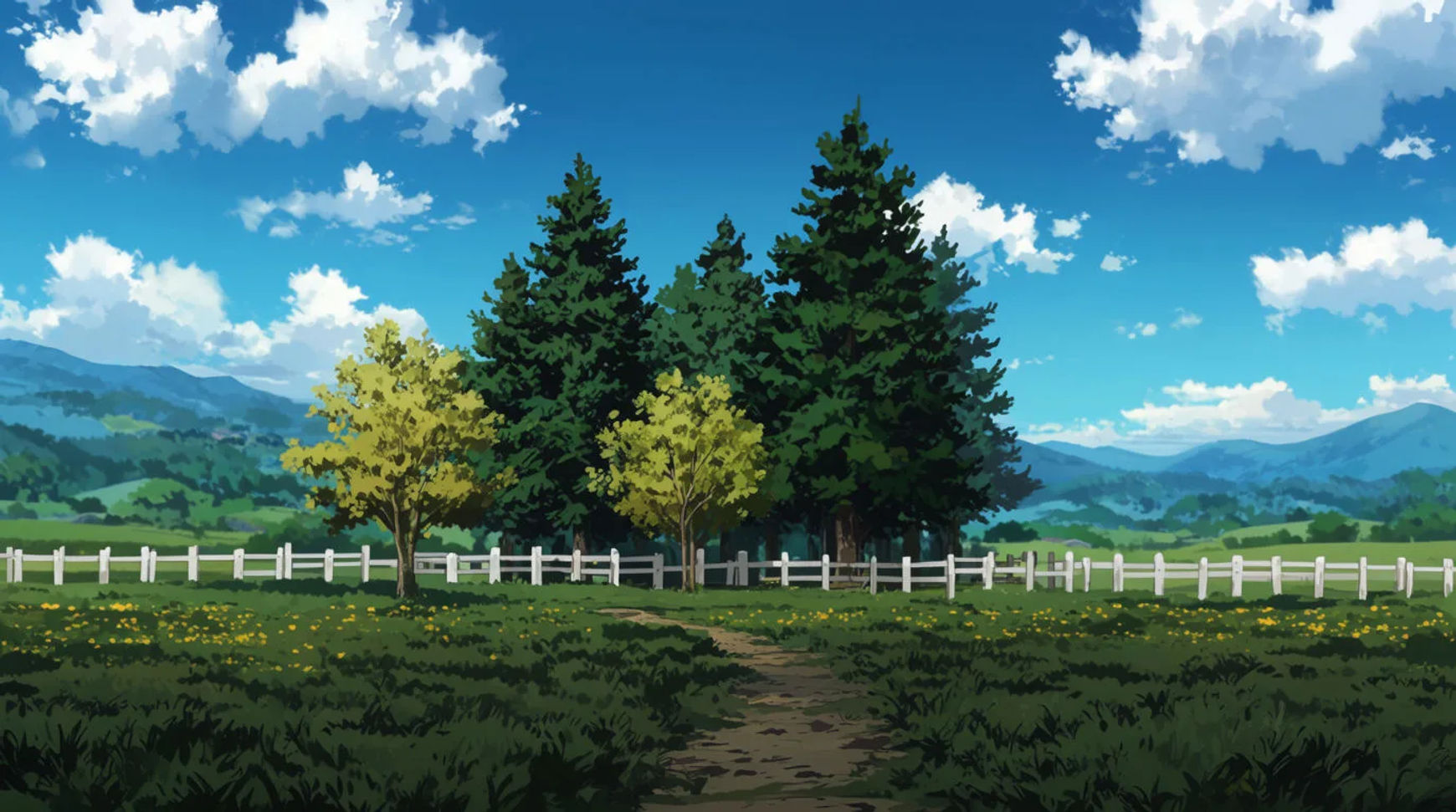
Anime is as much a color language as a drawing style. Flat, saturated color, hard-edged shadows, and skies that do a lot of emotional work are what make the look instantly readable, often more than the line art itself. "Anime" here is a broad art style, like watercolor or film noir, so you can describe and generate it by its visual qualities without naming any specific series, studio, or character, which is also what keeps a published prompt safe to reuse.
Here are the palettes that define the style and how to brief each one.
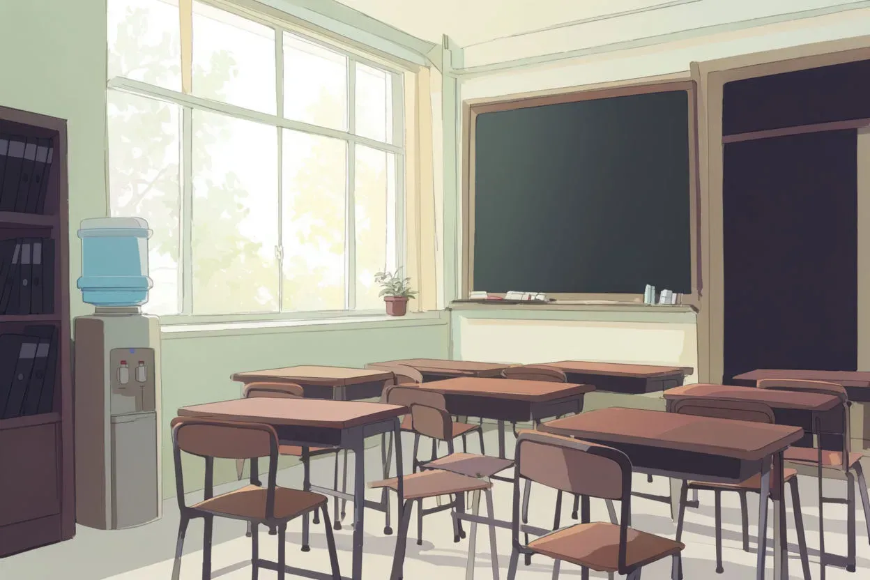
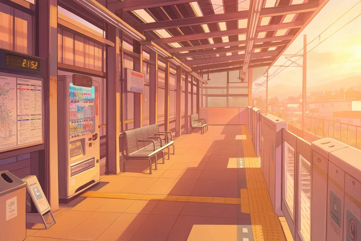
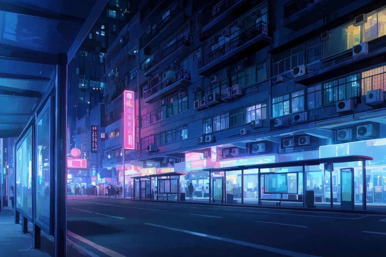
The palettes that define the anime look
Each of these pairs a palette with a shading approach. In anime, how light is separated matters as much as the colors themselves.
| Palette | The colors | Mood it carries |
|---|---|---|
| Soft slice-of-life | Pastel blues, warm cream, gentle green | Calm, everyday, warm |
| Vivid daytime | Saturated sky blue, clean white clouds, fresh green | Bright, hopeful, energetic |
| Golden hour | Amber, rose, long warm shadows | Nostalgic, tender, reflective |
| Neon night | Deep navy base with electric pink and cyan accents | Charged, urban, dramatic |
| Moody muted | Desaturated blues and greys, low contrast | Melancholy, quiet tension |
| Fantasy vivid | Jewel tones, glowing highlights, high saturation | Magical, heightened, epic |
Why anime color reads the way it does
Two things make anime color distinctive. First, flat shading: light is rendered as a few hard bands rather than smooth gradients, which keeps colors clean and graphic. Second, expressive skies and backgrounds: the environment often carries the emotional color while characters stay relatively simple, so a scene's mood is set by its sky and light more than by its subject.
That is why naming the light and the time of day does so much work in an anime prompt. "Golden hour" or "neon-lit night" sets the whole palette before you have described a single object.
How to brief an anime palette
Build the prompt in two layers, the style, then the palette:
- Style layer: "anime-style illustration, cel shading, clean line art, flat color".
- Palette and light: the specific colors plus the time of day ("vivid daytime sky, saturated blue and white, bright even light" or "neon night, deep navy with electric pink and cyan accents").
- Shading detail: "hard shadow edges, a single highlight band" to lock the flat look.
A full example: "Anime-style illustration of a quiet train platform, cel shading, clean line art, golden-hour palette of amber and rose with long warm shadows, soft highlight band." It describes the style and palette precisely while naming nothing proprietary.
Put it into practice
Choose the time of day and mood first, since in anime those set the palette almost on their own, then lock the flat shading so the colors stay clean. Generate a few and compare before you settle. When you want a whole series to match, hold your best frame as a reference so every image shares the same color logic.
Get the colors to land with how to specify colors in AI image generation, choose harmonies that hold together in AI illustration color schemes, keep one look across a set with consistent AI image styles, or start generating with the AI color palette generator. For live-action looks instead, see movie color palettes.