Every image model
One workspaceWebsite shots you can build
Build a website mockup in three steps
- 01
Open Morphic
Sign up and start creating on a free-flowing, infinite visual canvas.
- 02
Upload your screens
Drop in a desktop, tablet, and phone capture and describe the device set and the scene.
- 03
Generate and export
Each screen maps to its device in one scene with soft light. Try more arrangements, then export.
Use cases
Web design presentations
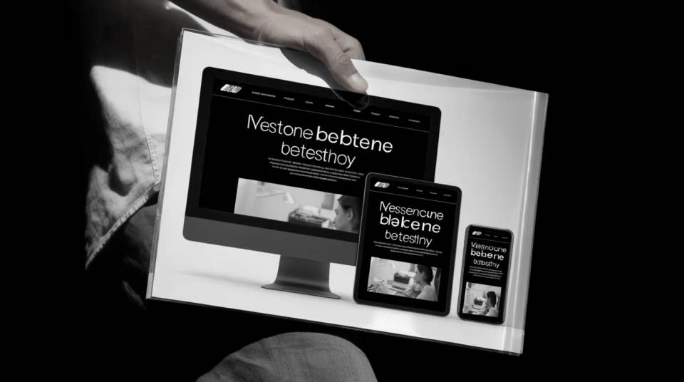
Hand a client a finished-looking site instead of a flat comp. Show the design as a full desktop, tablet, and phone set so they see it adapt across screens in one image. It makes a proposal feel built rather than sketched, which is often what moves a sign-off.
Freelance portfolios and case studies
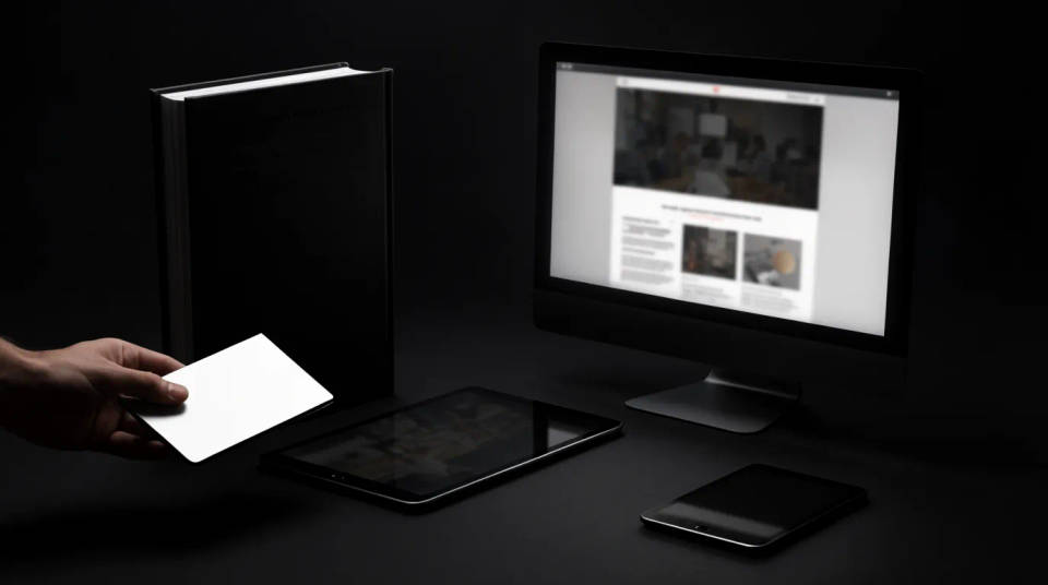
Present past work as photographed product shots. Use a desktop monitor hero for the case study cover and a responsive lineup to prove the site works on every screen. The consistent device set across projects makes a portfolio read as one polished, coherent body of work.
Agency pitches and decks
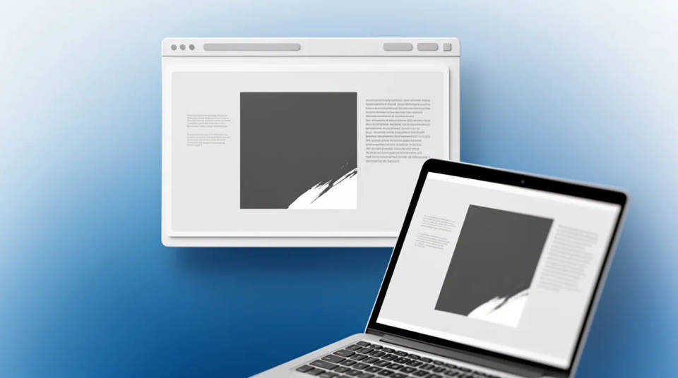
Fill a pitch deck with hero visuals that sell the craft. A browser window floating on a soft gradient makes a clean title slide, and a laptop-and-phone pair tells a cross-device story on one page. Swap the screens and rerun as the design iterates through review.
Responsive design showcases
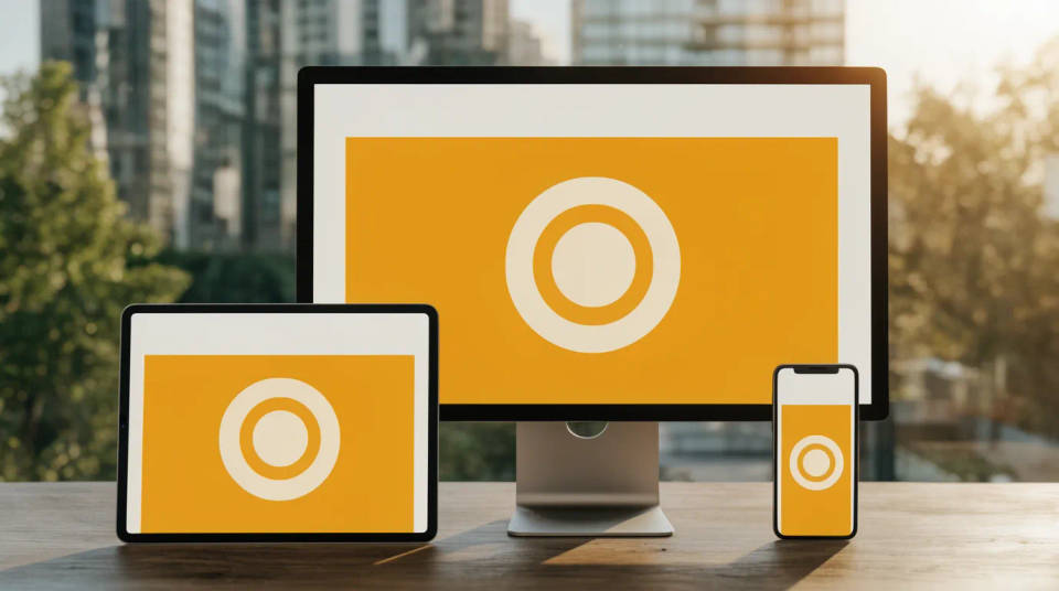
Prove a layout holds from a wide monitor down to a phone. A stacked responsive shot lines up the same page at three widths so a stakeholder sees the breakpoints without opening dev tools. Feed each device its own capture and the set shows the real adaptive behavior.
Prompt examples
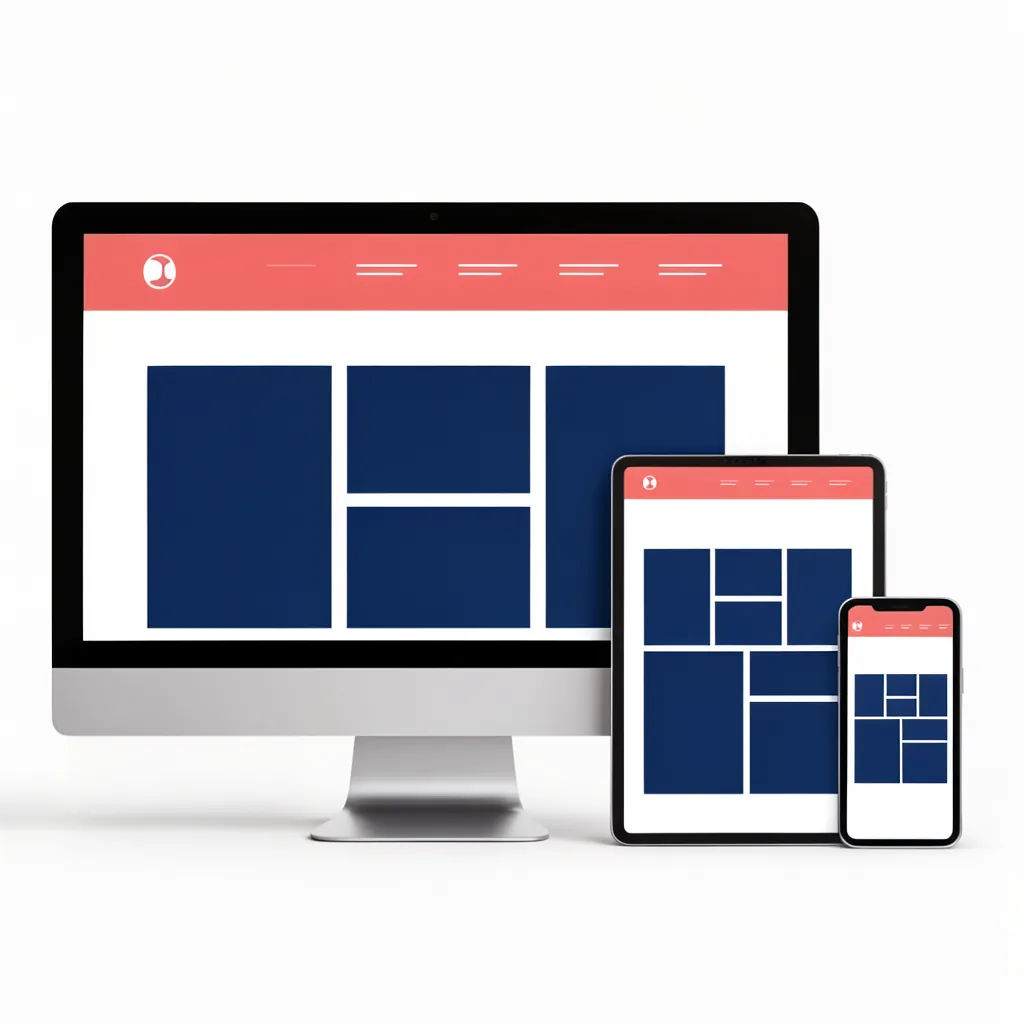
Full responsive set
Show my site as a desktop monitor, tablet, and phone set on a clean studio surface, soft even light
Edit prompt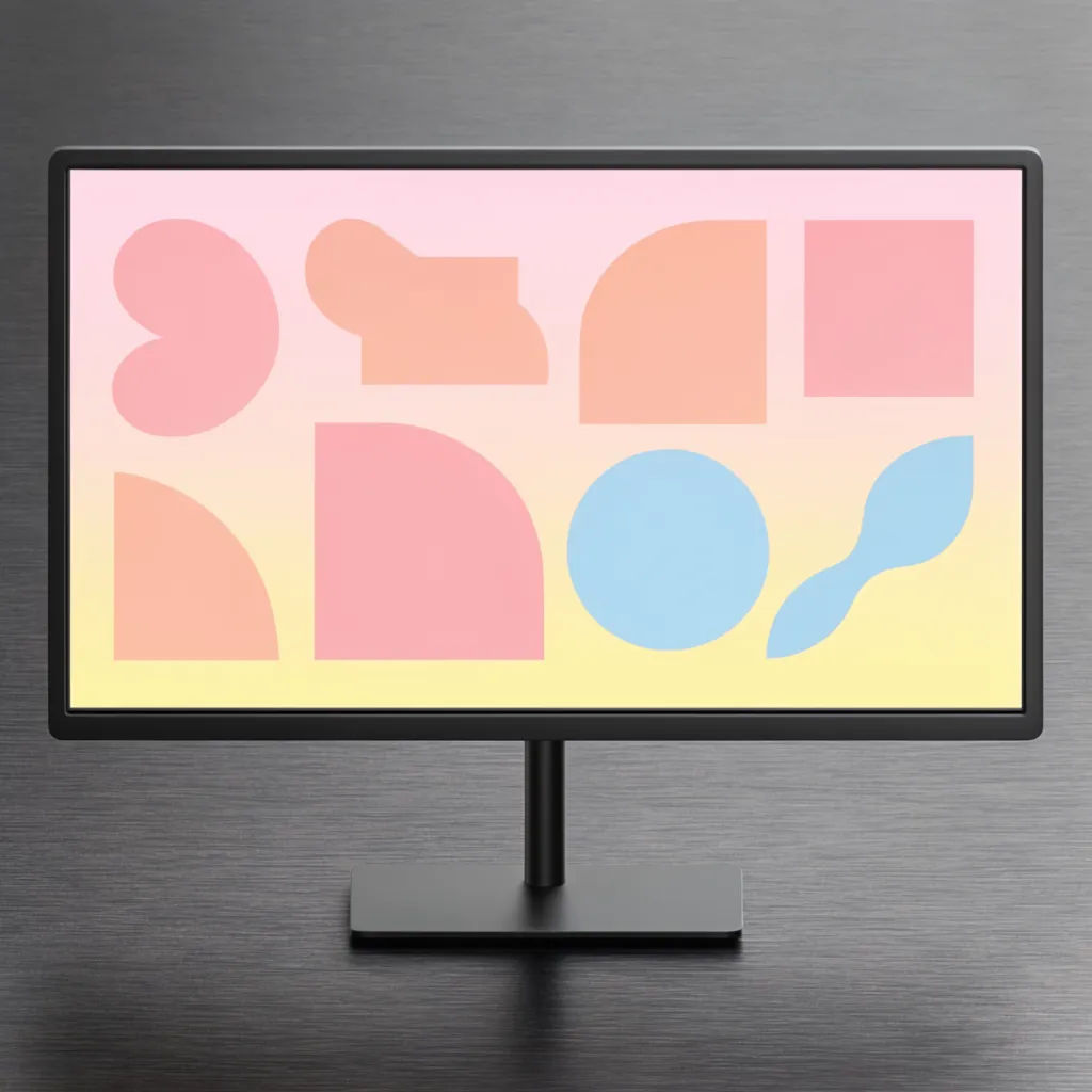
Desktop monitor hero
Frame my desktop screen in a slim monitor on a tidy desk, head-on, soft daylight, subtle glow
Edit prompt
Browser window float
Show my page in a floating browser window with soft shadow on a pale gradient, clean landing hero
Edit prompt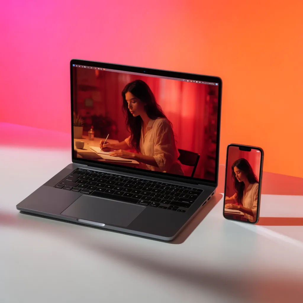
Laptop and phone pair
Place my desktop screen in a laptop beside a phone with the mobile view, desk setup, warm light
Edit prompt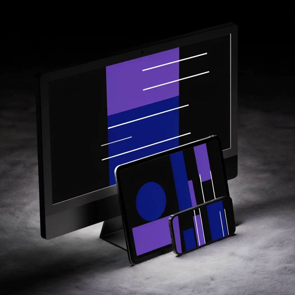
Stacked responsive
Stack my desktop, tablet, and phone screens overlapping on a soft surface to show the responsive layout
Edit prompt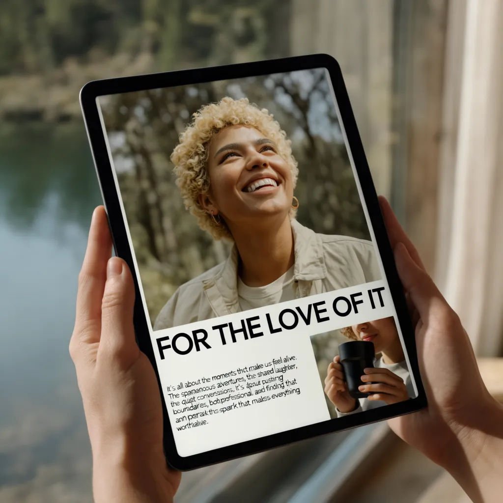
Tablet in hands
Show my tablet view held in two hands at a slight angle, blurred room behind, soft window light
Edit prompt
Cinematic storyboard
Share a scene description with character references. Get a full storyboard with shot angles and mood.
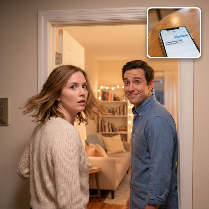
Messages to cinematic scene
Dramatize any text conversation into a cinematic multi-shot video.

Title sequence
Generate a professional film title card from scratch, with optional cinematic animation.

Chibi sprite animation
Turn any photo or description into an animated chibi sprite. Dance, jump, wave, attack, and more.
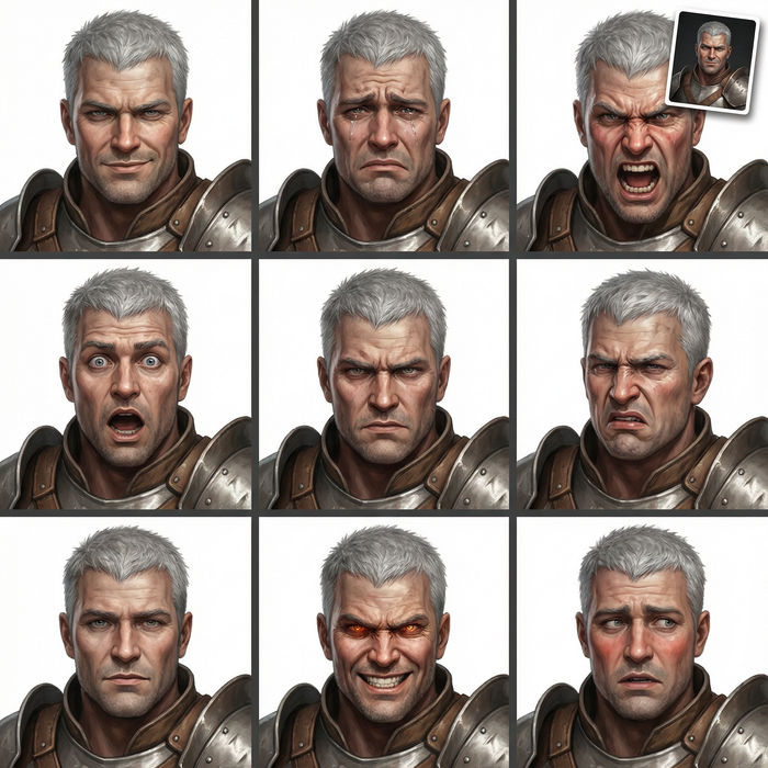
Expressions
Take any character image and generate 6 distinct facial expressions on a single reference sheet.
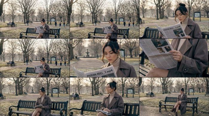
3x3 storyboard
Feed in a single image. Get 9 cinematic beats laid out as a 3x3 storyboard grid.
All on Morphic
Your complete web mockup stackModels
Nano Banana 2, Flux 2 Pro, ChatGPT Images, Grok Imagine, Recraft, Seedream, and more. Swap models when screen text or a reflection needs to render cleaner.
Laptop mockup generator
Focus on a single laptop scene when one device carries the story better than a full set.
Phone mockup generator
Show just the mobile view on a handset in a real setting for a focused app shot.
Image to image
Upload your screens and generate the device set and scene around them, the method behind every shot here.